Emmanuelle Moureaux Architecture + Design have designed a colorful boxy exterior for the Nakaaoki Branch of the Sugamo Shinkin Bank in Tokyo, Japan.

From the architects
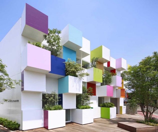
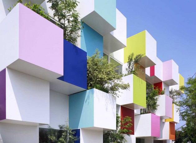
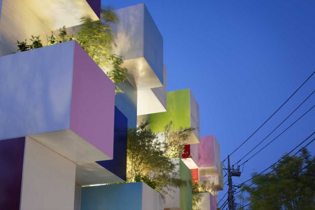
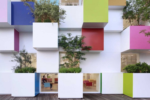
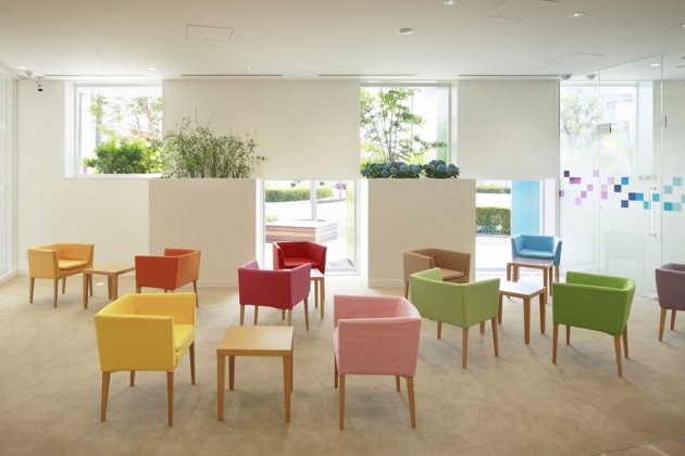
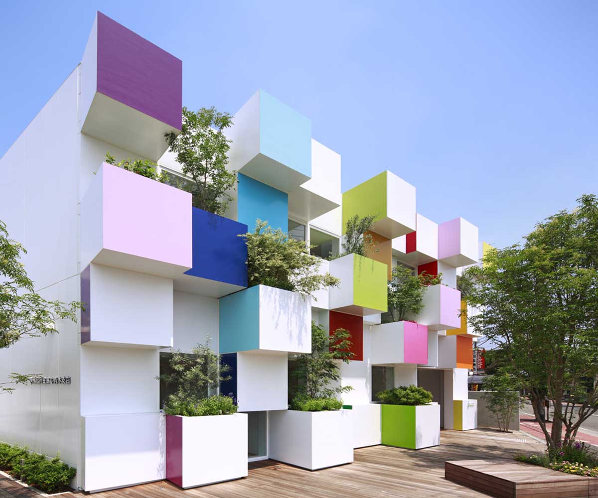
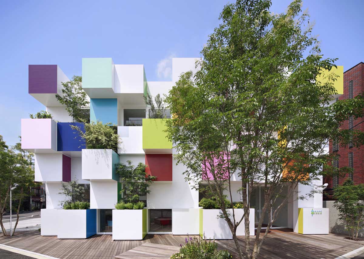
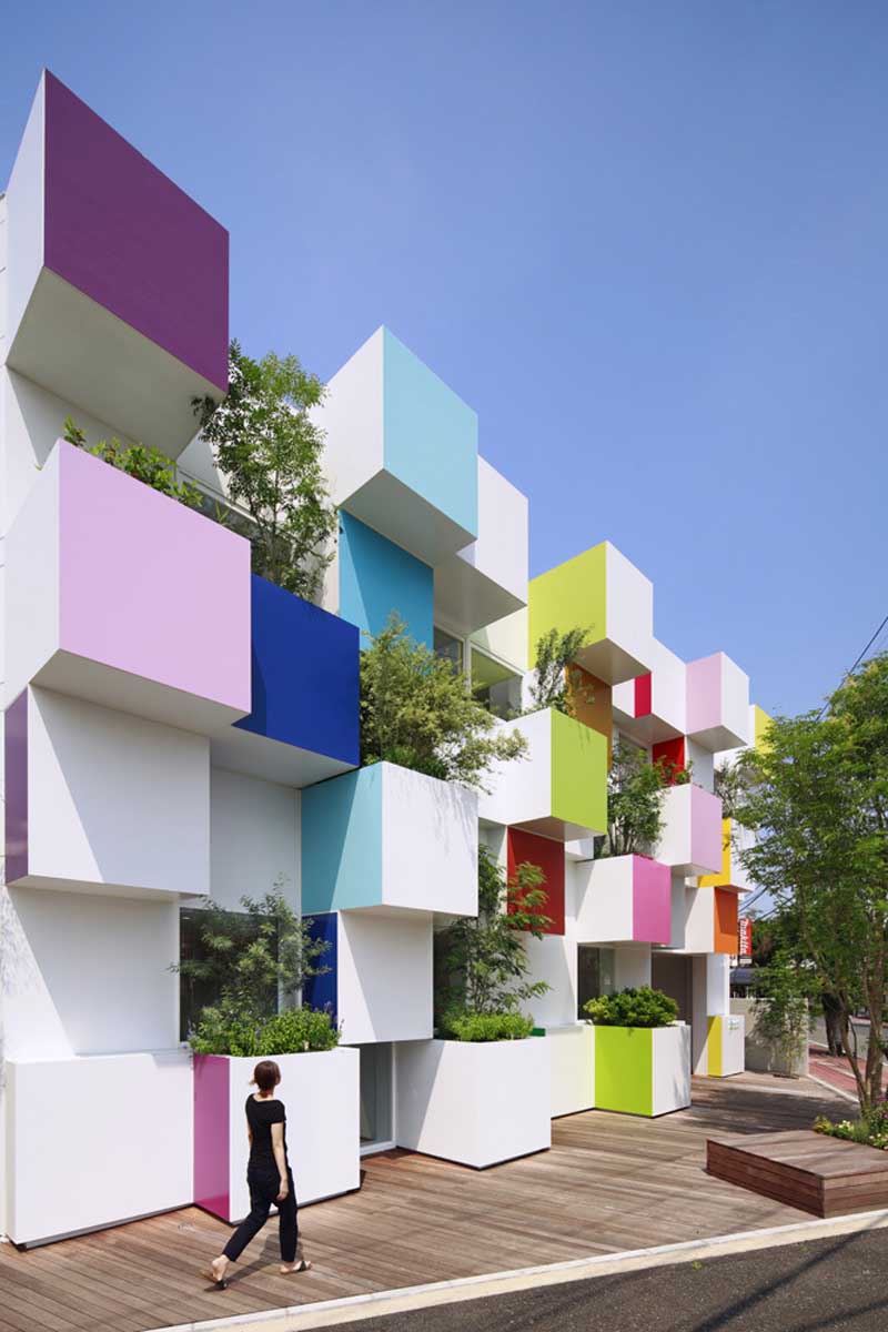
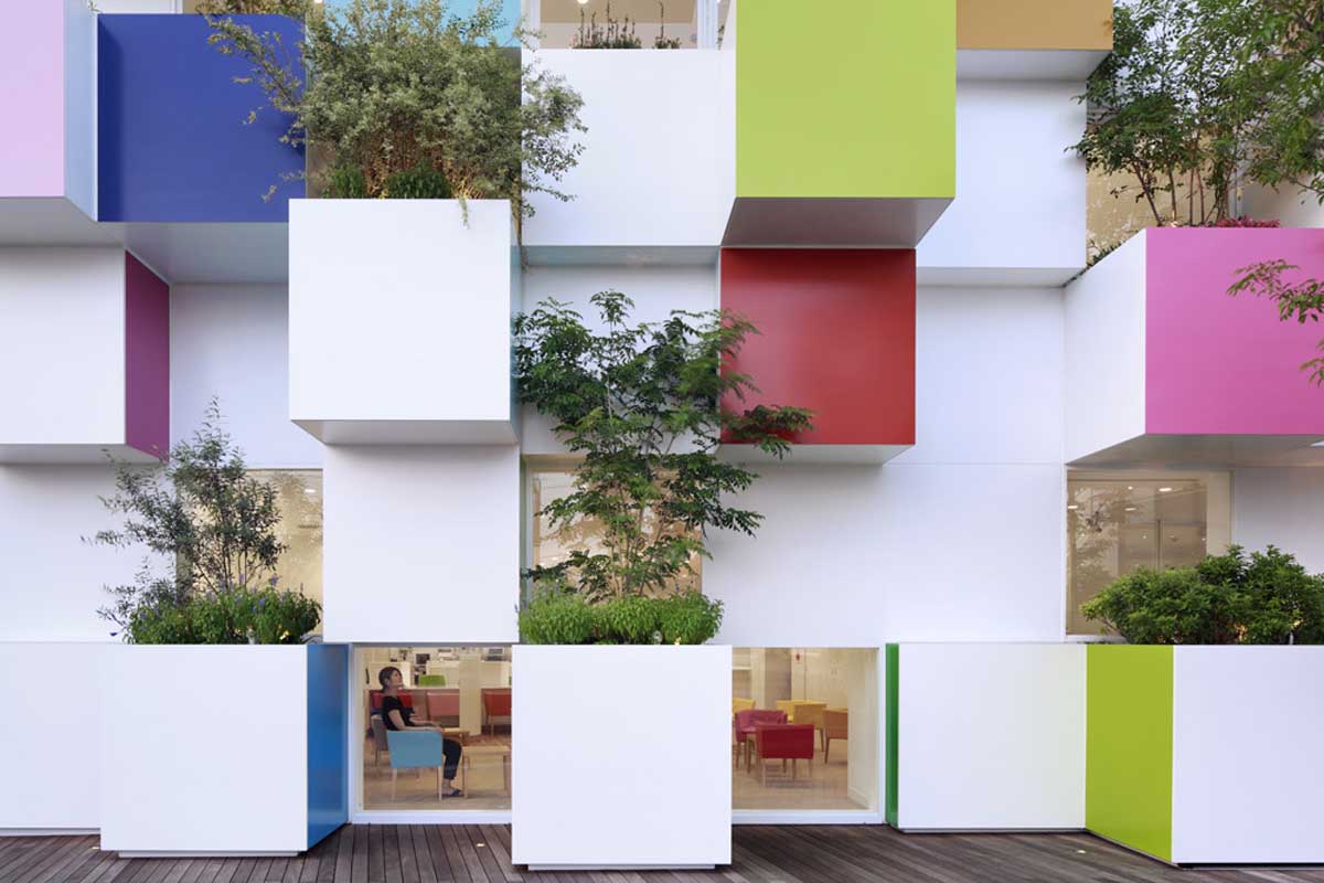
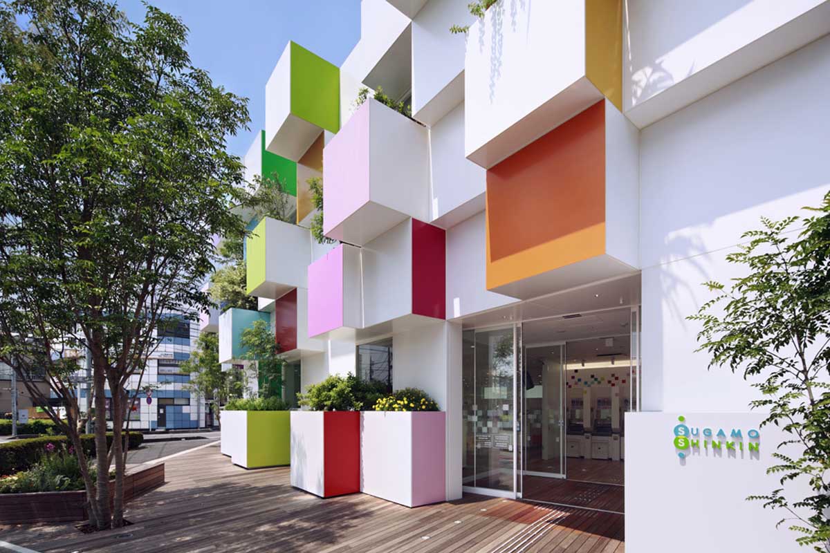
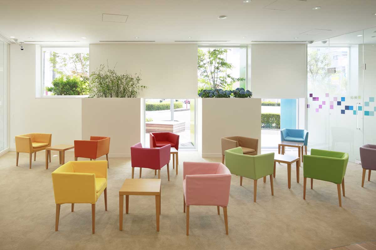
The site is located on the corner of major intersection, where there is a frequent movement of cars, bicycles and people. Taking this unique location as a characteristic, the facade is designed to be rhythmical that changes expression as people see from different angles. Colors appear in and out from the rhythmical repetition of cubes, dancing like musical notes playing rainbow melody. The facade is composed of cubes of four different depths. Small elevated gardens are built inside 12 cubes, where the seasonal changes in nature are expressed by seasonal flowers like marigold, lavender, and growing trees such as olive tree. Gardens can be seen from the open space on the first floor, and from the financing section and cafeteria on the second floor. Sunlight is filtered through the foliage of elevated gardens on the South facing facade, providing a harmonious and warm atmosphere inside the bank. The colors, flowers and trees appear in and out from the repetition of floating cubes, playing rainbow melody. The melody spreads happiness and comfort to visitors and to the people in the local community.


Architect: Emmanuelle Moureaux Architecture + Design
Photography by Daisuke Shima – Nacasa & Partners