When a couple who divide their time between New York and Vancouver asked Falken Reynolds to re-imagine their loft, the goal was to merge two worlds: the structured, urban character of Brooklyn and the light, livable atmosphere of Vancouver.
The result is a carefully layered apartment that feels both refined and relaxed, a study in how texture, tone, and restraint can turn a simple city loft into a home with heart.
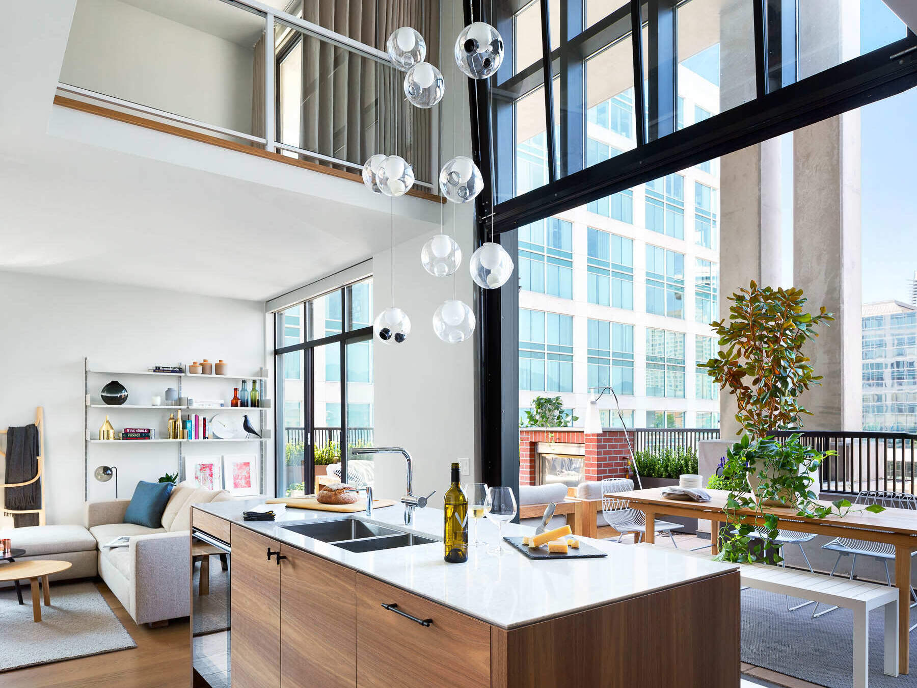
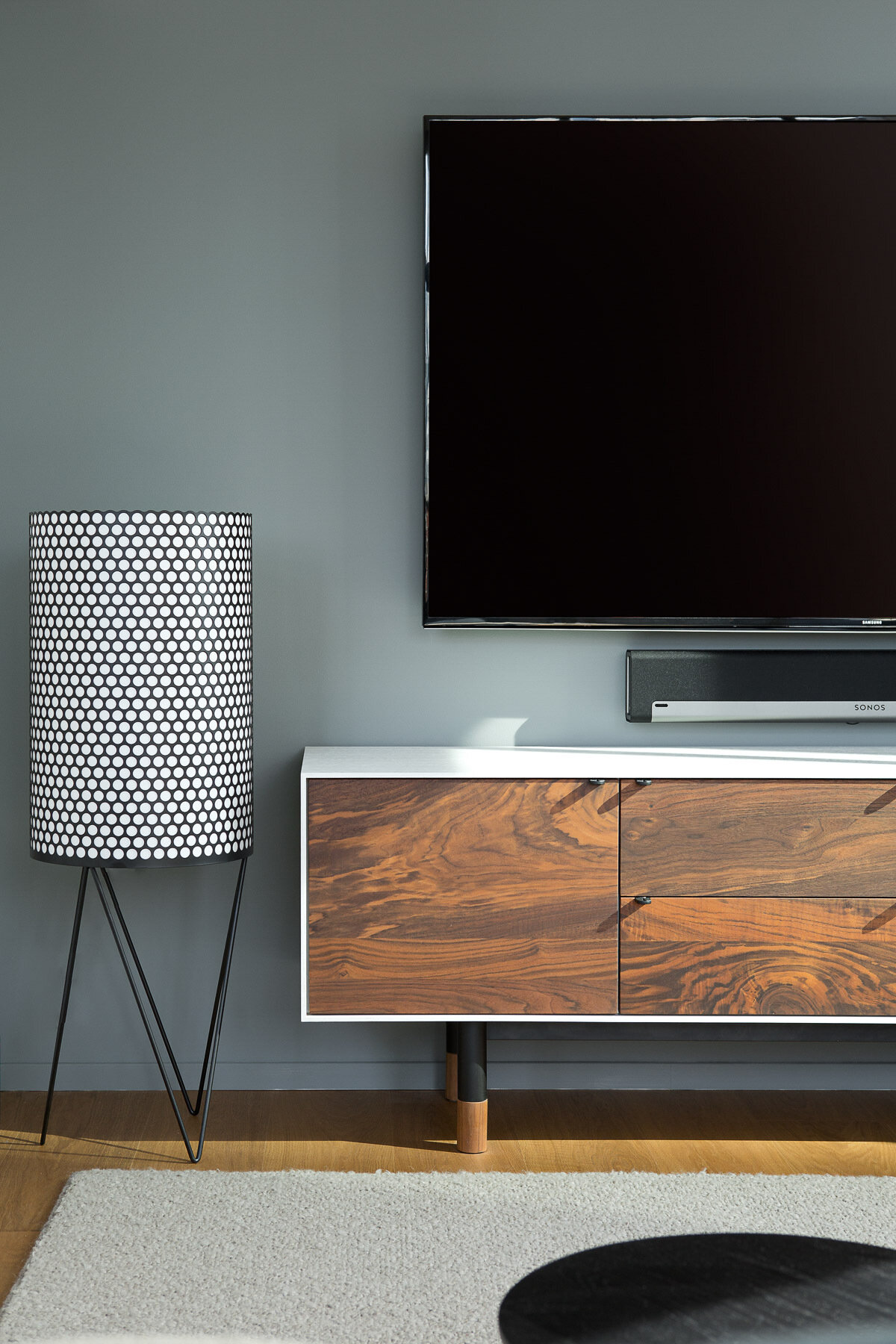
1. Channel industrial inspiration without going cold
The design draws loosely from the iconic warehouse lofts of Brooklyn, but Falken Reynolds softened the formula. Instead of exposed brick and rough finishes, the loft relies on black-framed windows, crisp white surfaces, and clean architectural lines to suggest structure and discipline.
The contrast of cool materials with gentle light sets the tone. There’s a sense of order and balance, steel and glass meet wood and daylight. It’s industrial design that feels lived-in, not hard-edged.
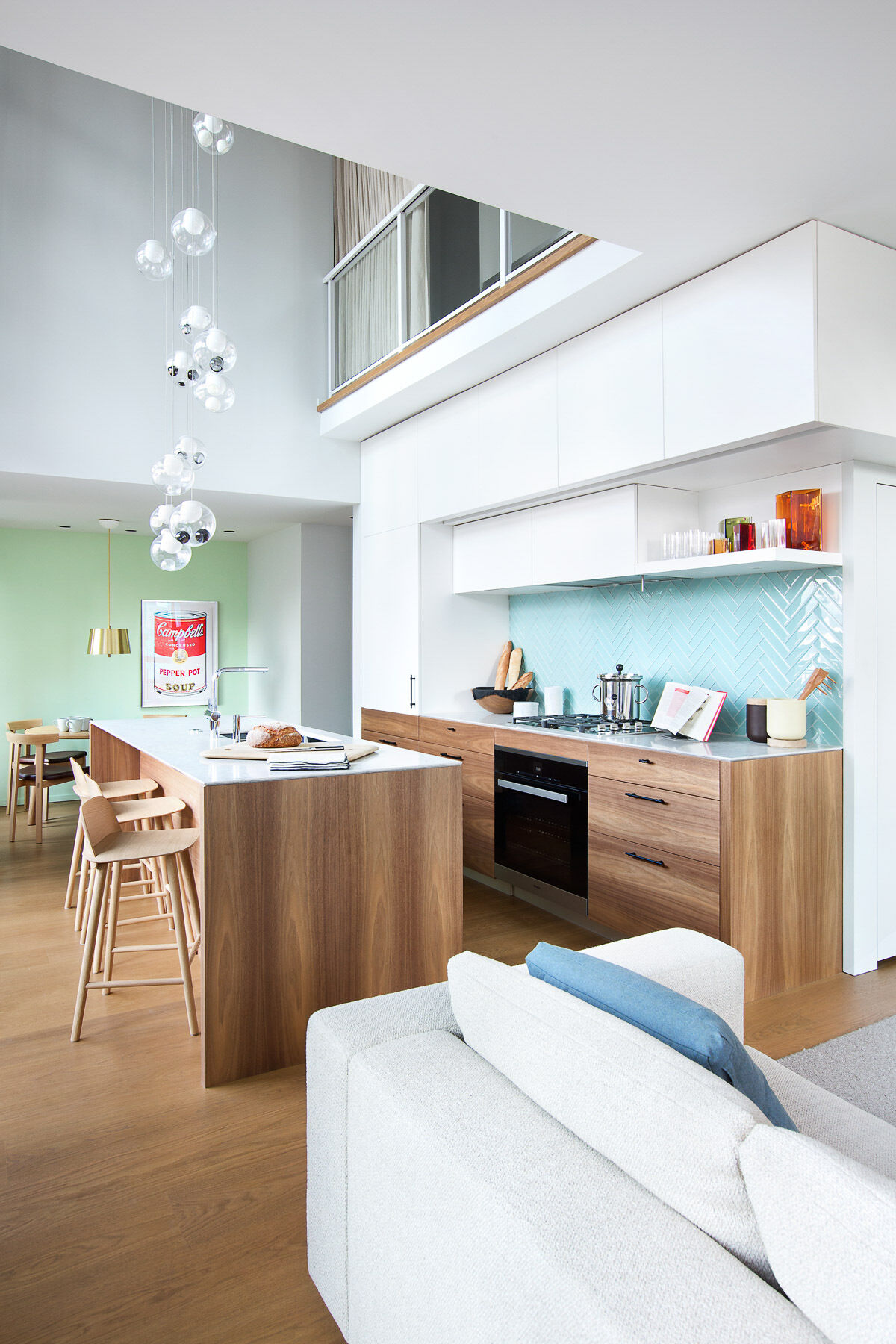
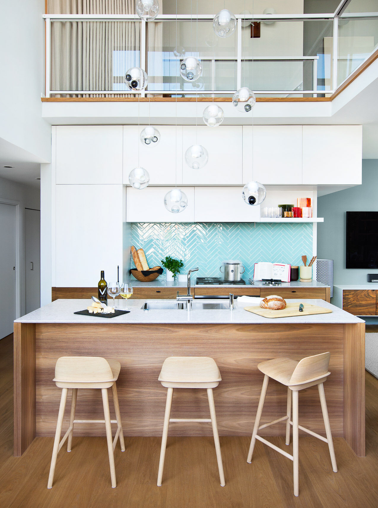
2. Blend your kitchen into the background
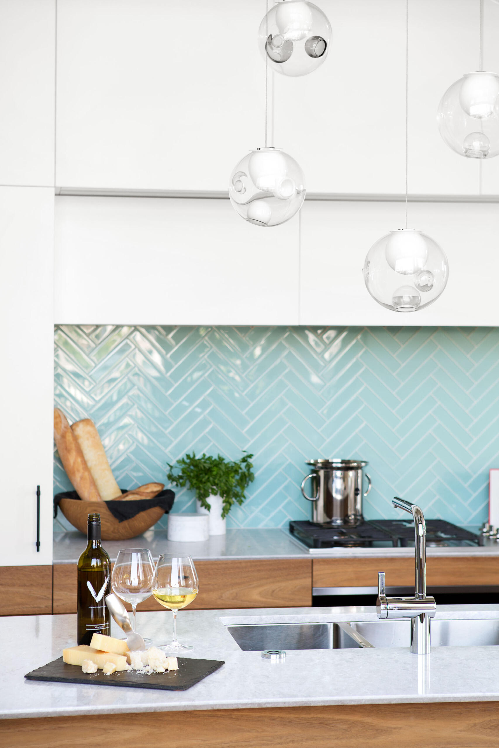
The kitchen is sleek and understated, designed to disappear when not in use. White upper cabinets flow seamlessly into matching white walls and thin countertops, blurring the line between storage and surface. The effect is calming, visually expanding the room without adding clutter.
Then comes the surprise: a backsplash of bright blue tiles. Against the neutral surroundings, that single block of color becomes the focal point, confident but controlled.
3. Mix modern polish with natural texture
Wood runs quietly through the entire apartment, grounding the modern surfaces with warmth. The kitchen island and lower cabinetry are wrapped in walnut, their tone deep enough to feel rich but still light enough to catch the natural glow from the windows.
The island is functional and sculptural at once, with a built-in wine fridge, deep storage, and a sleek overhang that allows stools to tuck beneath it. It’s a piece that connects cooking, dining, and conversation.
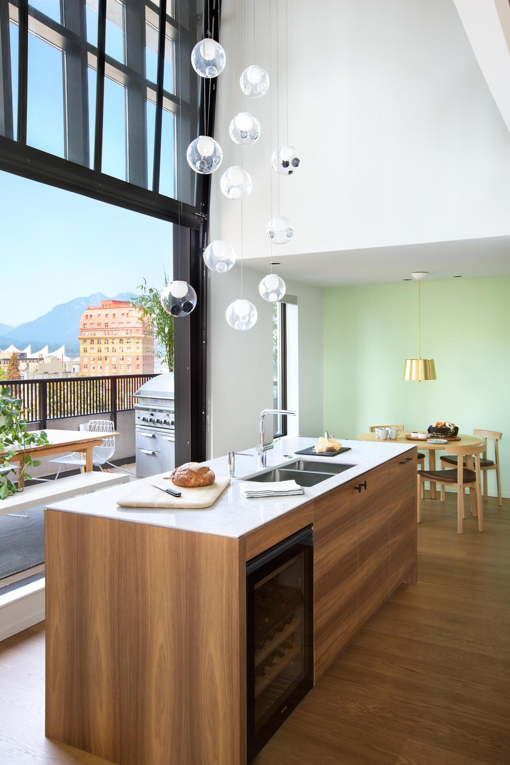
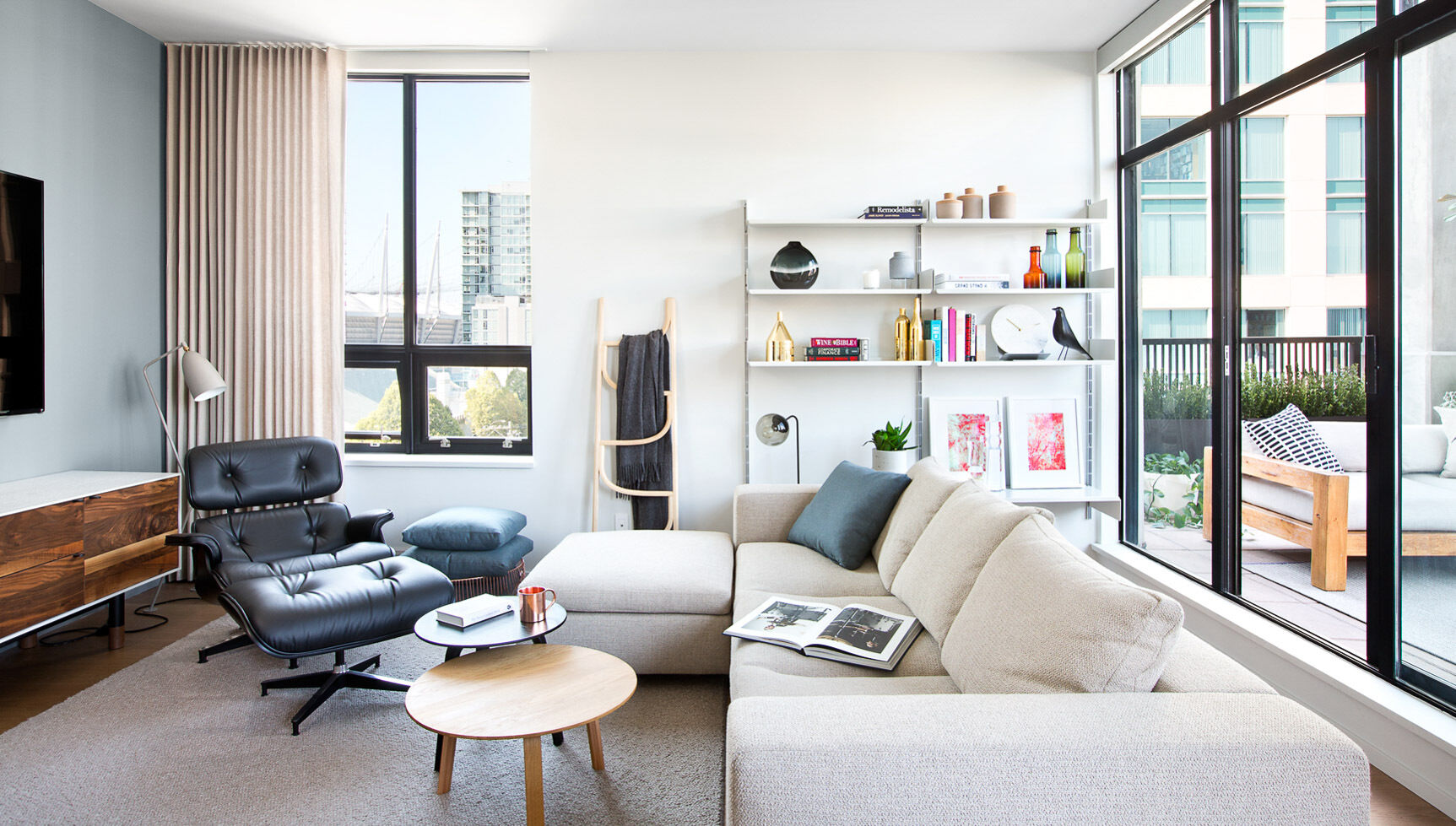
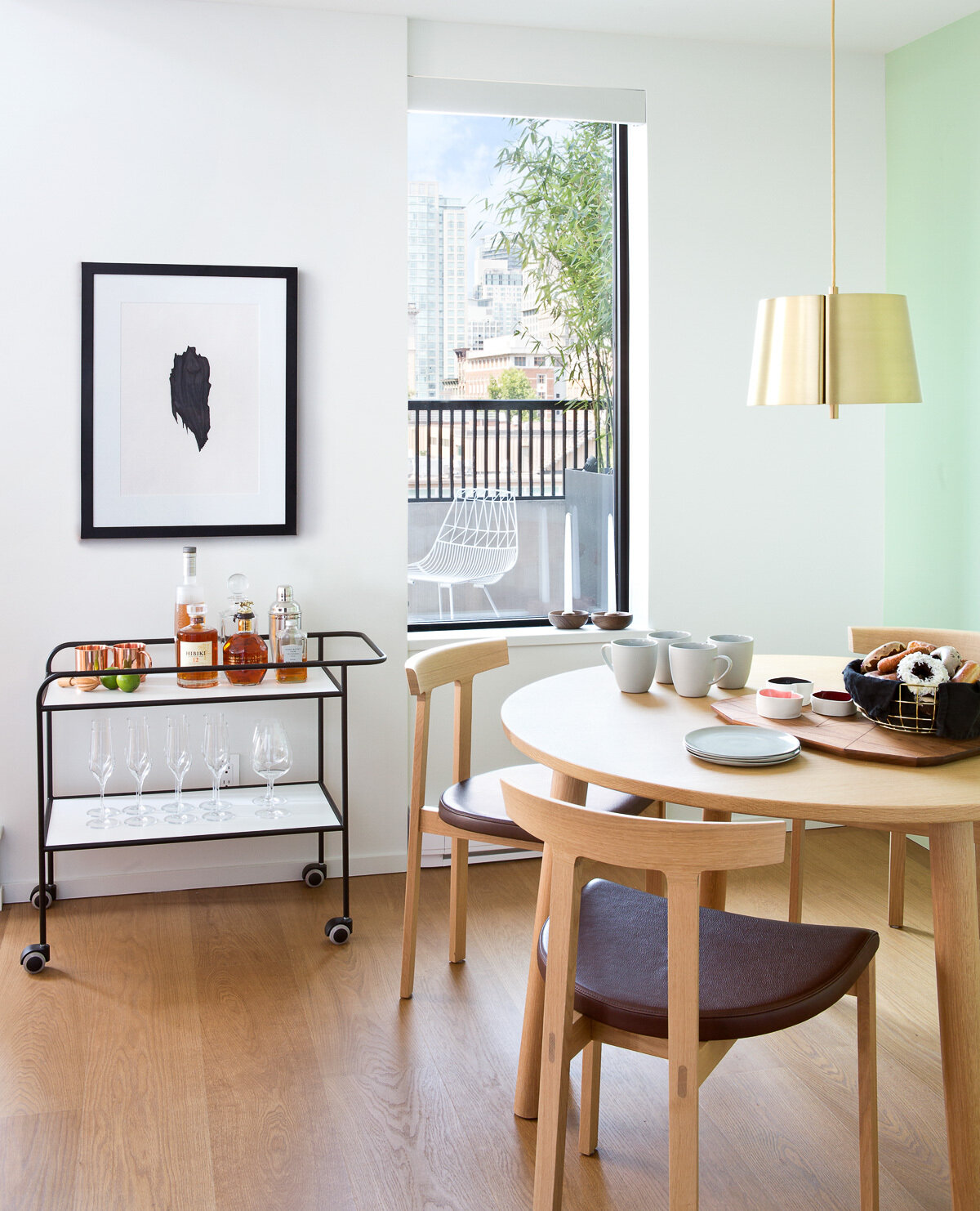
4. Use color as quiet contrast
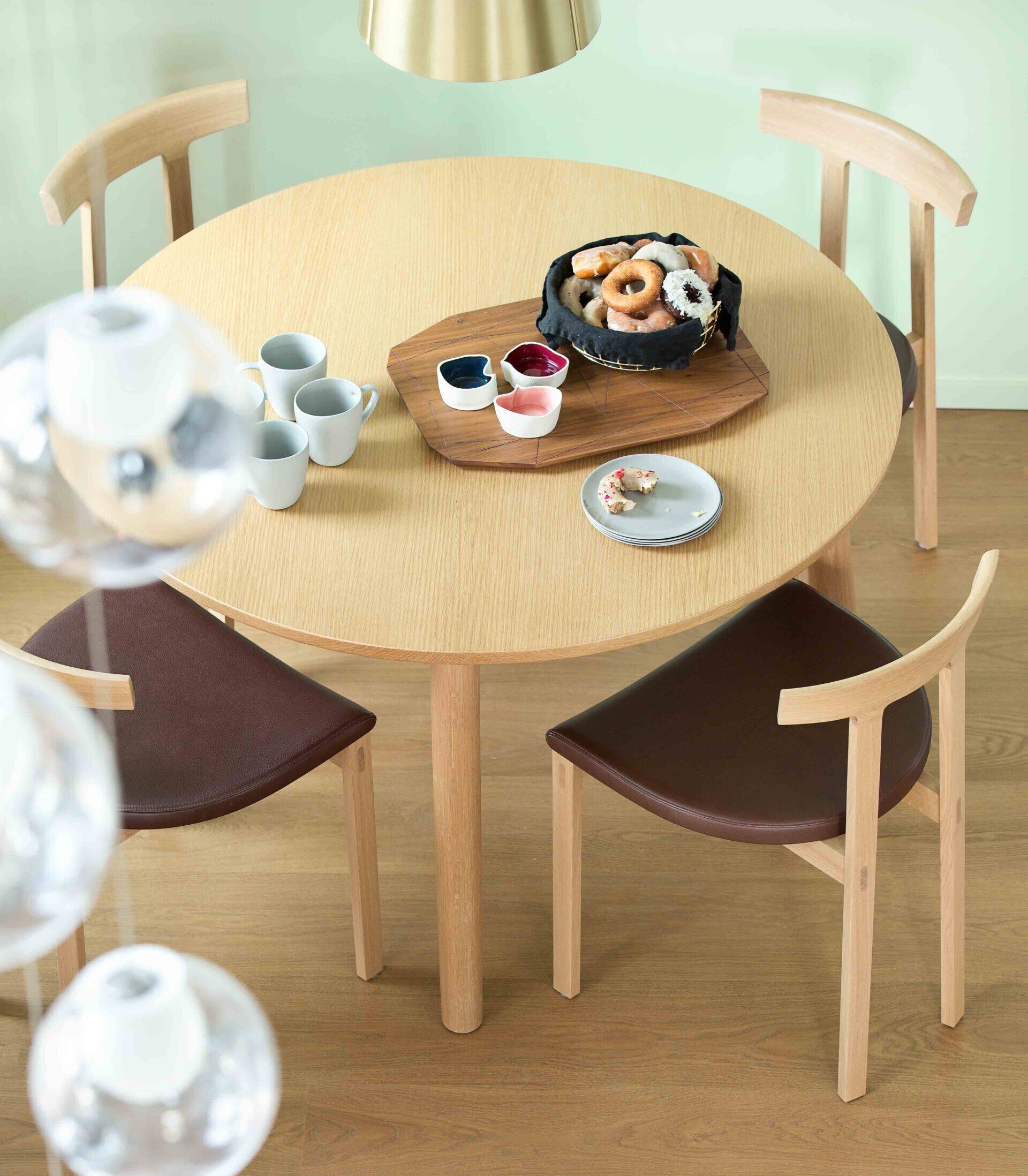
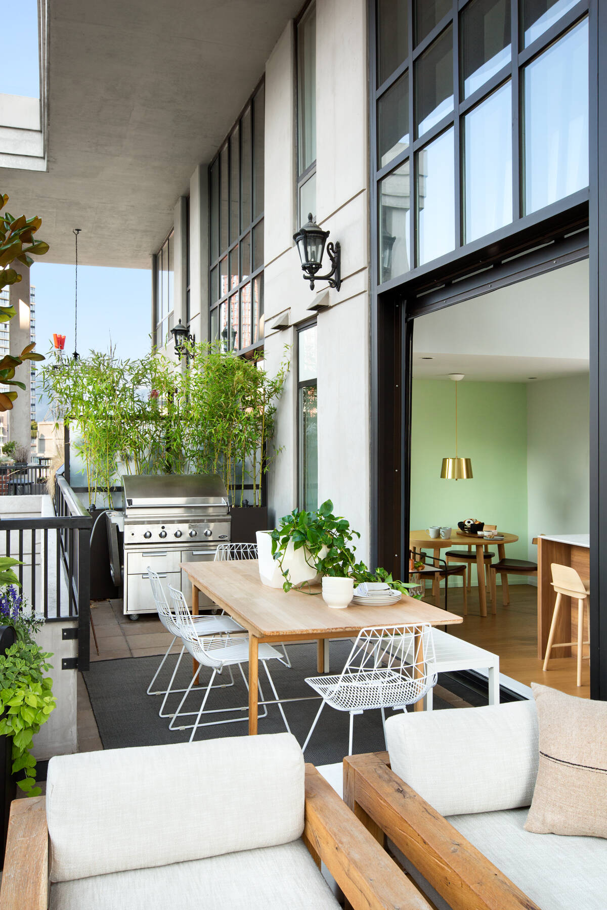
Elsewhere, color is used sparingly but with intent. A light green wall in the dining area provides a subtle shift in tone without interrupting the flow of white and wood. It creates just enough variation to define the zone while keeping the palette calm.
Black-framed artwork and a simple bar cart tie back to the dark steel elements in the windows and furniture, uniting the palette. The message here is restraint, when you repeat small contrasts throughout a space, you create harmony without having to match everything.
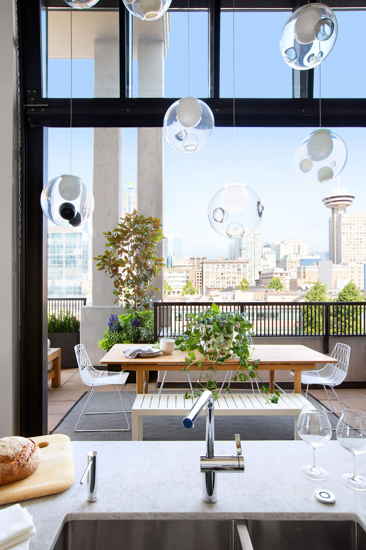
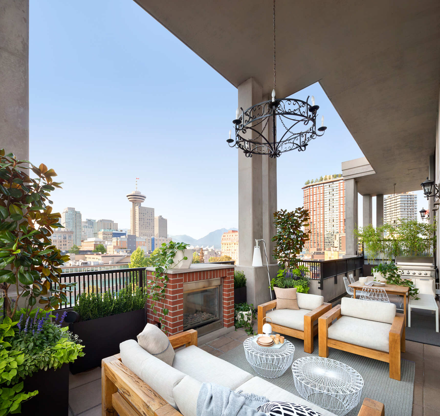
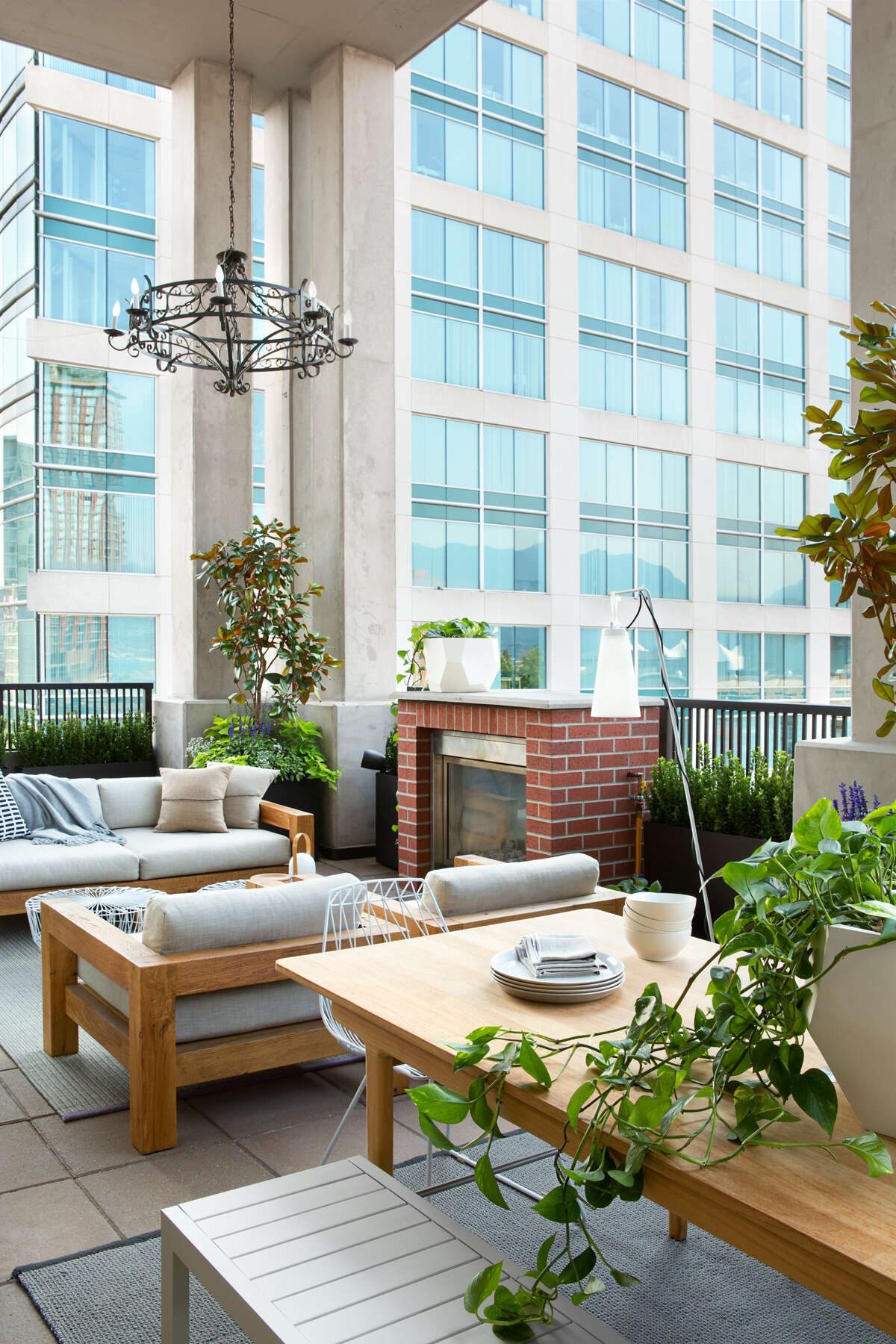
5. Make the outdoors part of the room
The loft’s most striking feature is how effortlessly the interior connects to the balcony. Oversized black-framed windows lift up completely, turning the main living area into an open-air pavilion. Suddenly, the line between indoors and outdoors disappears.
Outside, views of downtown Vancouver set the backdrop for a fully functional living zone. There’s a BBQ and dining area for hosting, plus a fireplace and lounge seating for quiet evenings. It’s a clever use of space in an urban setting, one that adds not just square footage, but quality of life.
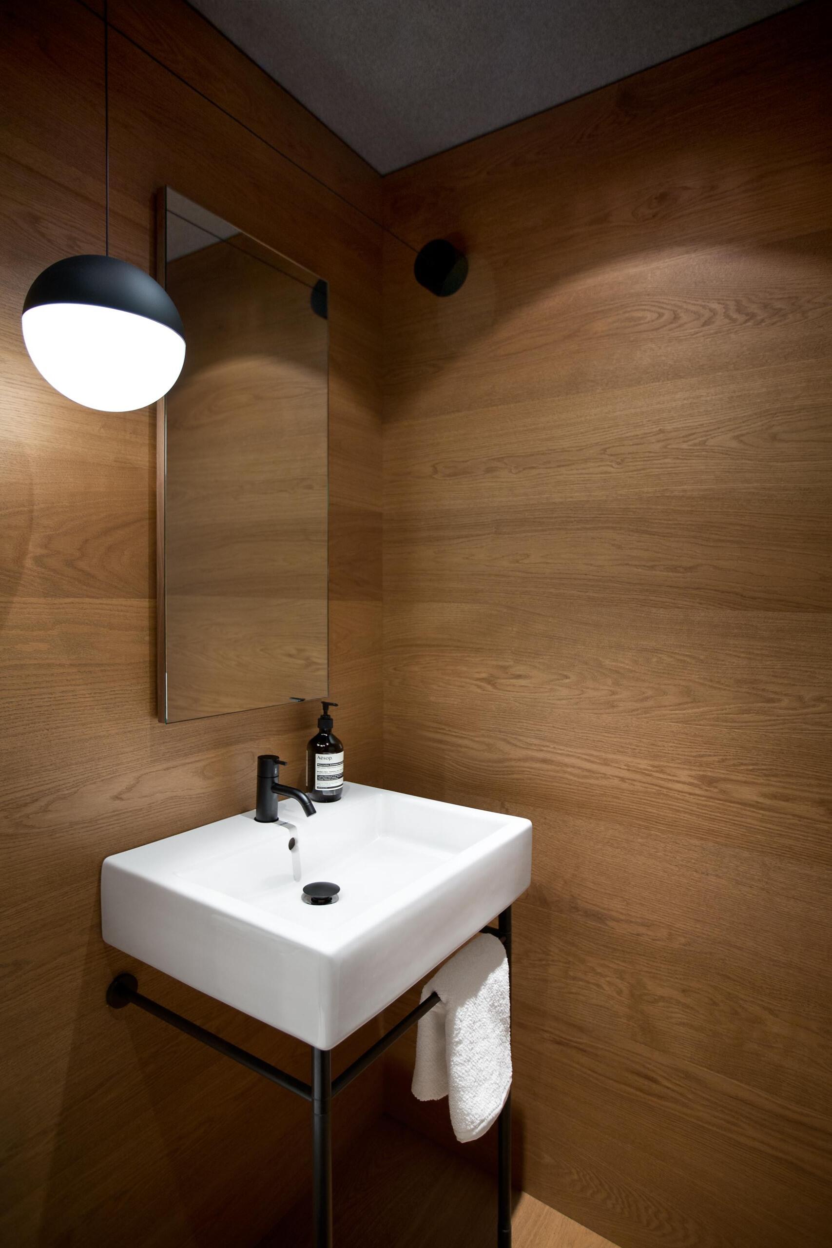
6. Layer materials for intimate spaces
Even in the smaller rooms, Falken Reynolds used texture to create mood. The powder room is wrapped in warm wood, its walls feeling cocoon-like rather than confined. Black accents, like the pendant light, echo the loft’s larger palette of black, white, and timber, maintaining visual continuity.
It’s a reminder that compact spaces benefit most from strong material choices. When you can’t expand with size, expand with tone, texture, and light instead.
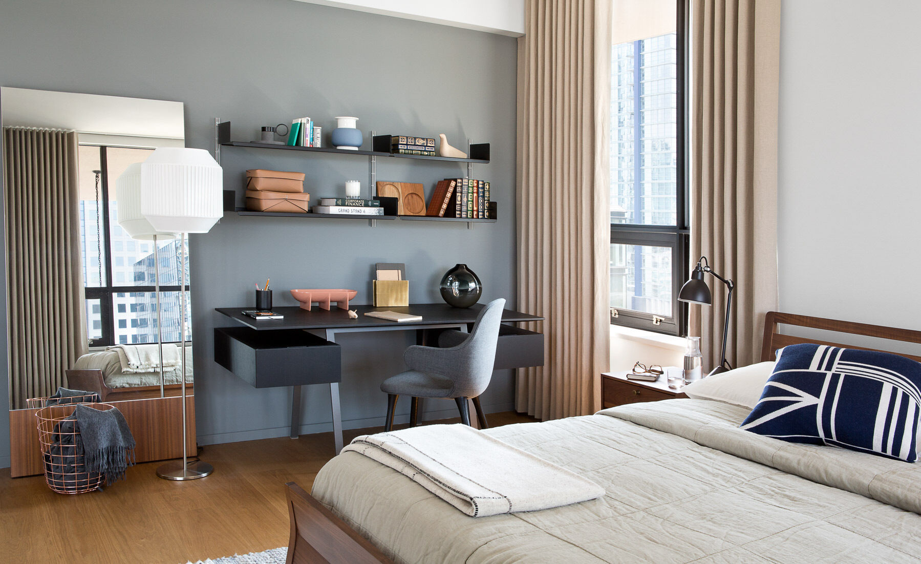
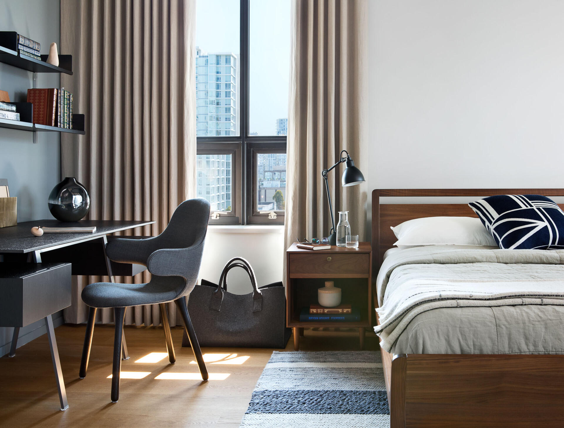
7. Keep private areas cohesive
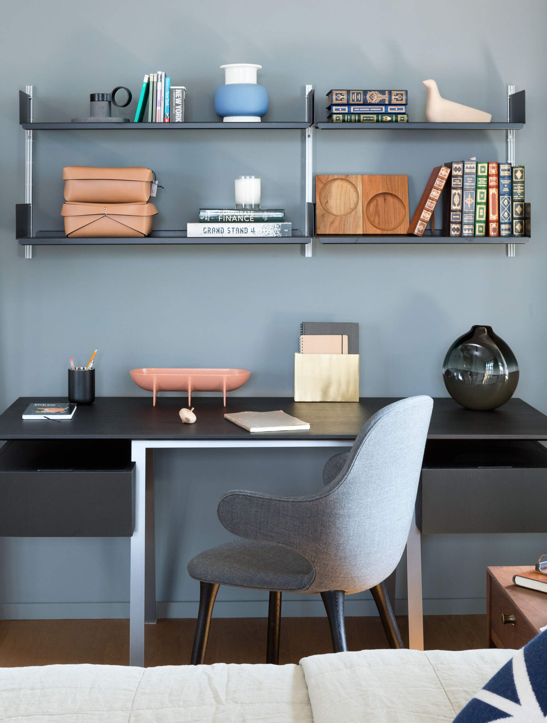
Upstairs, the bedroom and bathroom extend the same palette but soften the energy. A simple wood bed frame and side tables feel tactile and grounded, while a small workspace with open shelving tucks neatly beside the window. Every surface serves a purpose without overwhelming the calm.
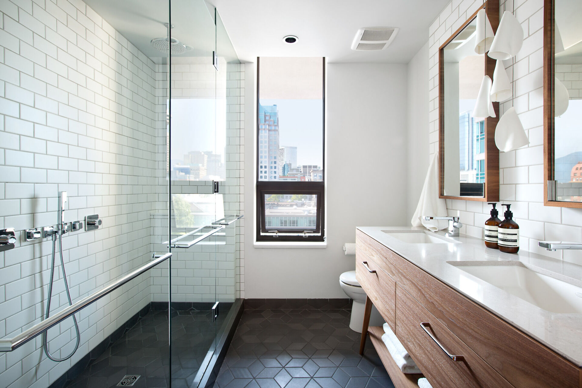
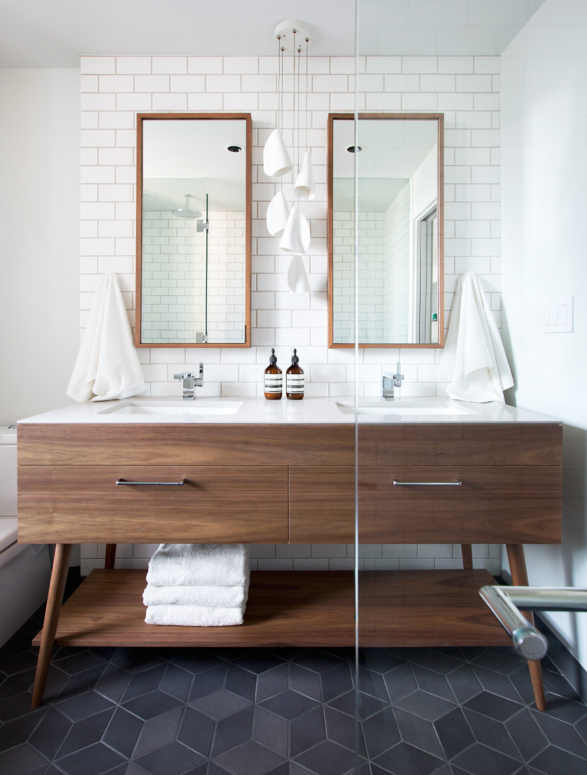
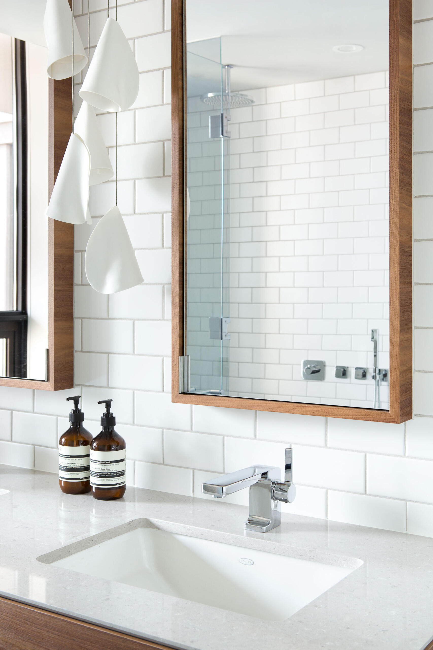
In the bathroom, white subway tiles climb the walls while dark grey geometric floor tiles anchor the space. A wood vanity with dual sinks mirrors the materials used below, giving the entire loft a sense of connection and flow.
Takeaway: Balance creates warmth
This Vancouver loft captures the sweet spot between industrial and inviting. By balancing hard materials with soft tones, and open spaces with warm texture, Falken Reynolds designed a home that feels effortless yet deeply considered.
It’s a reminder that good design isn’t about choosing between character and comfort, it’s about knowing how to make them live together.