From the street, this Victorian cottage in Melbourne looks much like its neighbours. Traditional, compact, and quietly familiar. But step through the front door and the story unfolds in a very different way.
Designed by ROAM Architects, the home has been carefully reworked to suit a growing family, all while working within the constraints of an unusually long and skinny site. With the house only one room wide, bringing light into the center of the home was one of the biggest challenges. The solution was both simple and effective. A north facing courtyard was placed right in the middle of the plan, allowing daylight to filter deep into the interior and creating new visual connections between spaces.
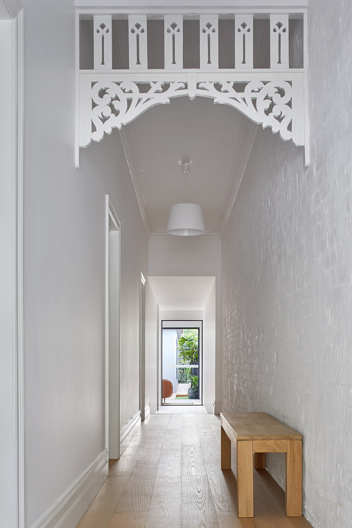
A hallway that leads you through the old and into the new
Inside, a white hallway stretches from the front of the house to the rear, gently guiding you from the original Victorian rooms toward the modern extension. Some of the home’s original features remain, grounding the space in its history while setting up a clear contrast with what lies ahead.
This long corridor reinforces the narrow nature of the site, but the light from the central courtyard keeps it feeling open rather than enclosed.
A wrap around bench that shapes daily life
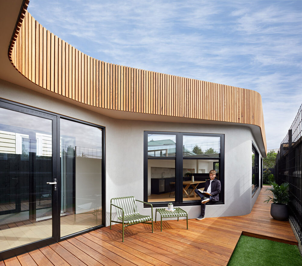
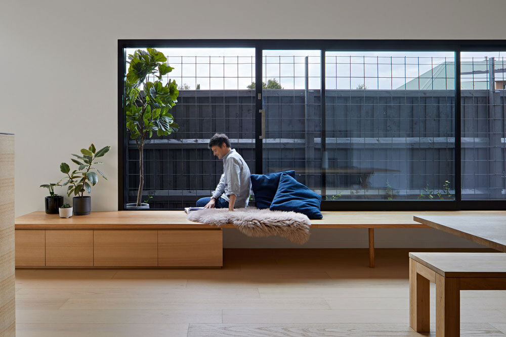
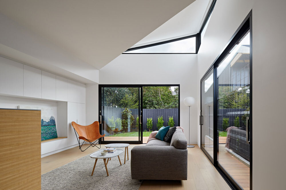
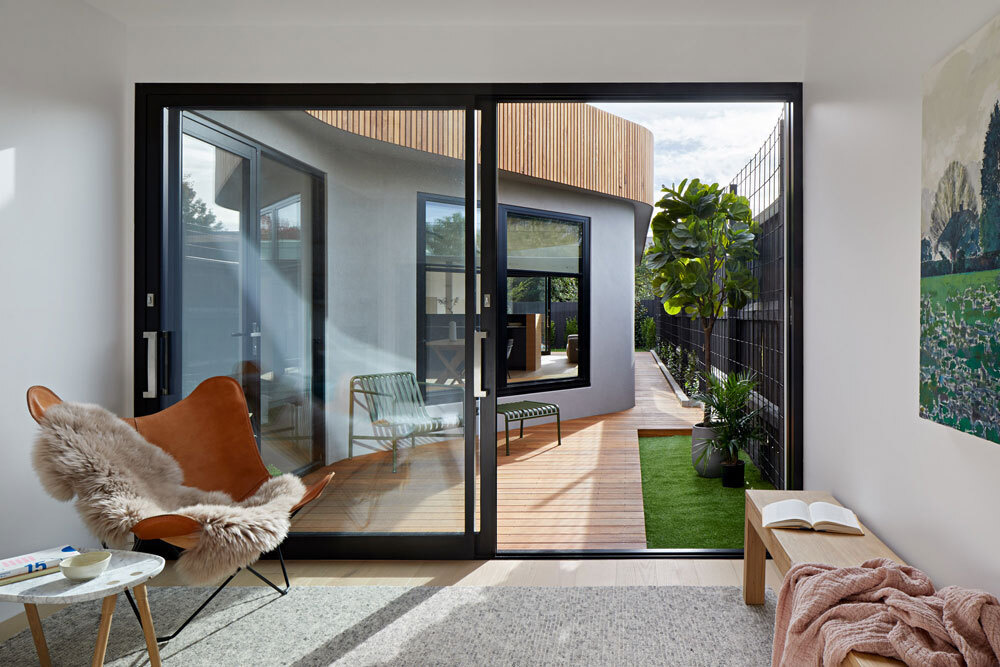
At the rear of the house, the extension reveals itself. One of its defining features is a 29 foot wrap around bench that follows the wall beneath large sliding glass windows. It acts as seating, a place to pause, and a continuous surface that leads directly into the kitchen.
This design encourages the family to open the house up completely, blurring the line between indoors and outdoors and making the most of the new relationship with the garden.
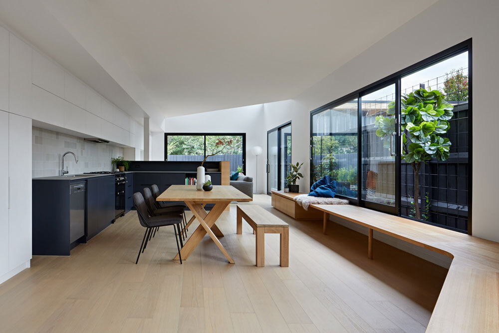
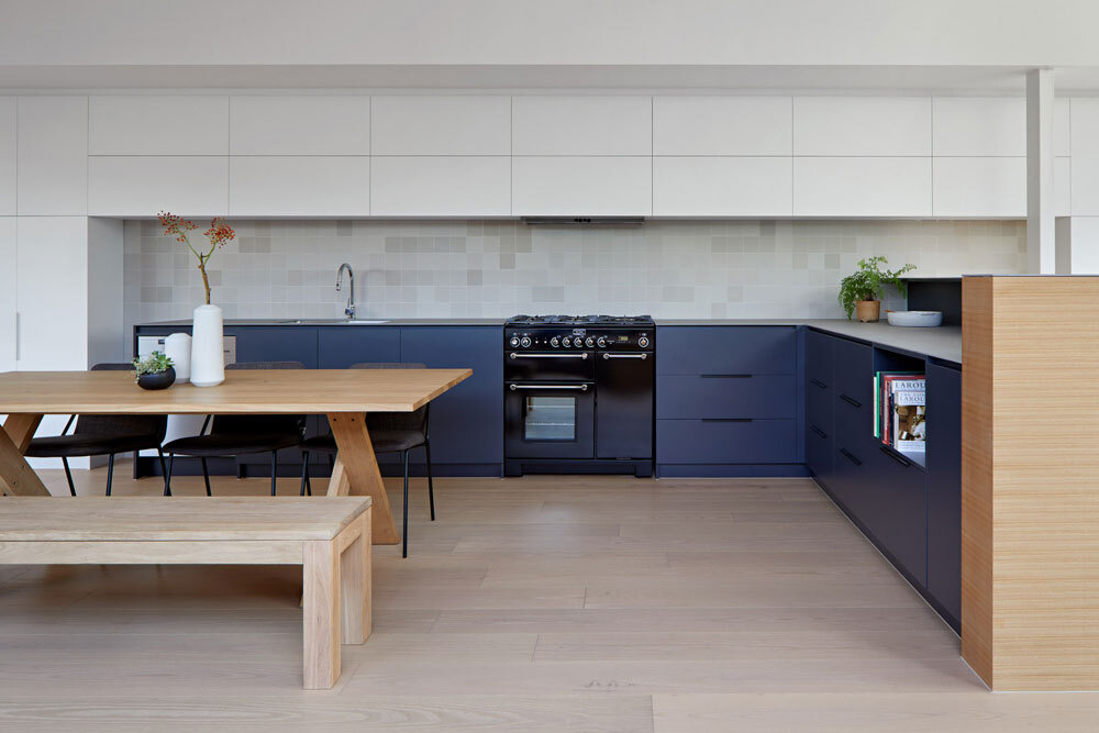
A calm two tone kitchen with hidden storage
The kitchen continues the restrained palette. Dark blue cabinetry grounds the lower units, while minimalist white cabinets above provide generous storage and blend seamlessly into the white walls. Rather than dominating the space, the kitchen feels calm and integrated, designed to support everyday use without visual clutter.
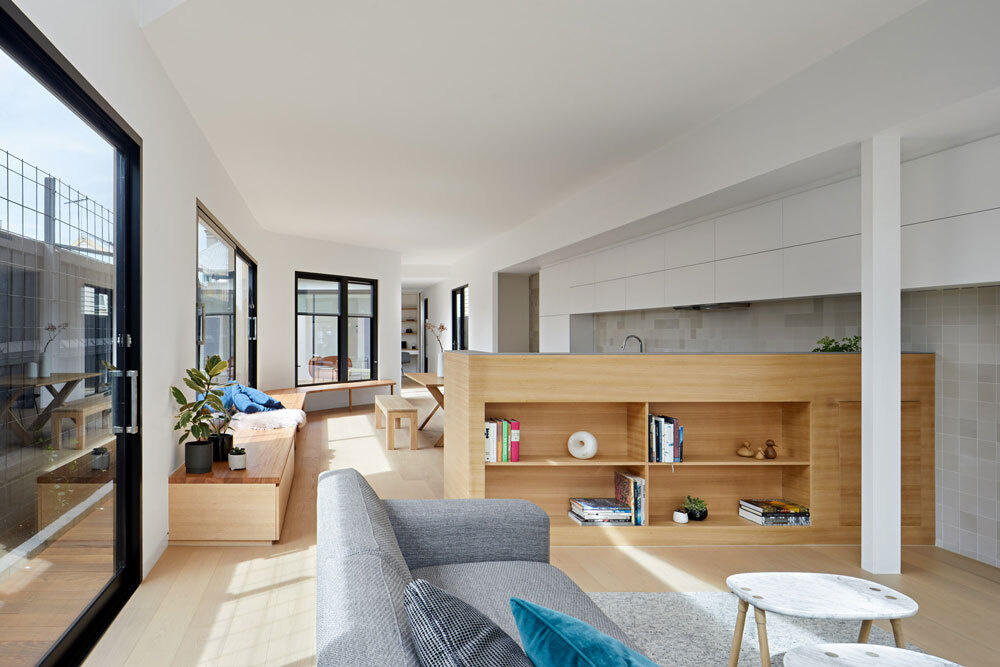
A low wall that keeps spaces connected
Between the kitchen and living room, a low timber wall introduces warmth and defines the zones without closing them off. Open shelving provides space to display objects, while the white cabinetry continues through into the living area.
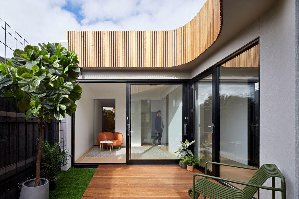
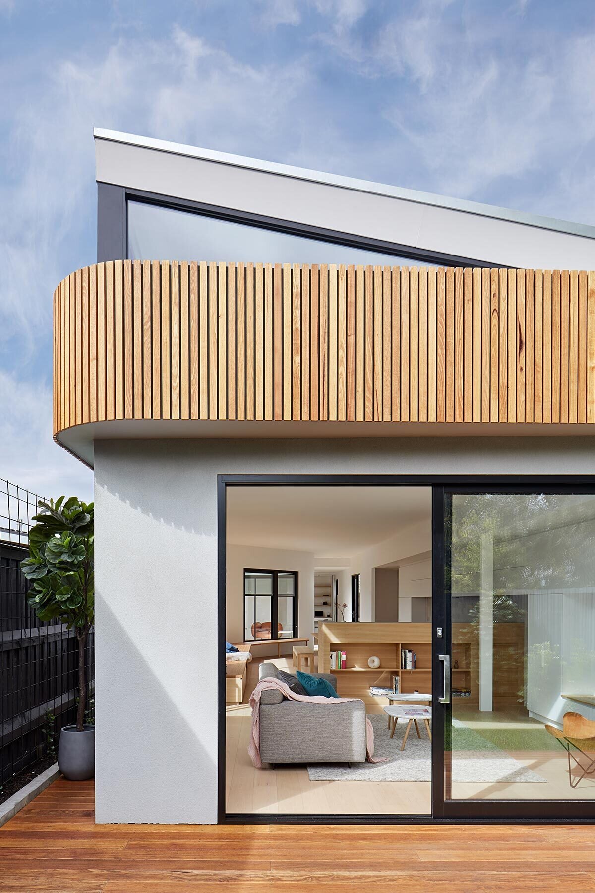
A curved exterior that softens the garden edge
Outside, the extension takes on a very different character. A curvaceous timber facade wraps the rear of the home, flowing out toward a timber deck and into the garden beyond.
Over time, climbers will cover the boundary fences, meaning the interiors will eventually look out onto a wall of green. The result is a private, garden facing retreat that feels removed from the density of the surrounding suburb.
Small moments of calm inside
Back indoors, the house offers quieter spaces alongside the open living areas. A small sitting room is simply furnished with a comfortable chair and bench, creating a spot for reading or retreating from the busier parts of the home.
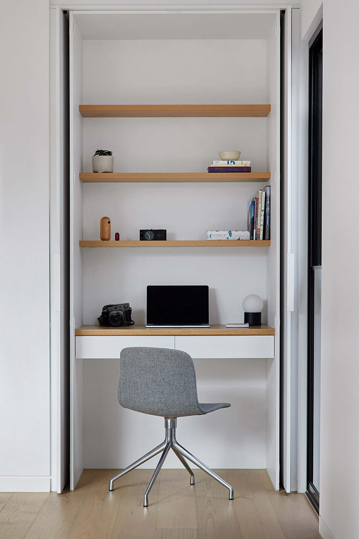
There is also a compact home office, neatly hidden within a closet. Wood shelving adds warmth, while the concealed design allows the space to disappear when not in use.
A bathroom that plays with contrast and light
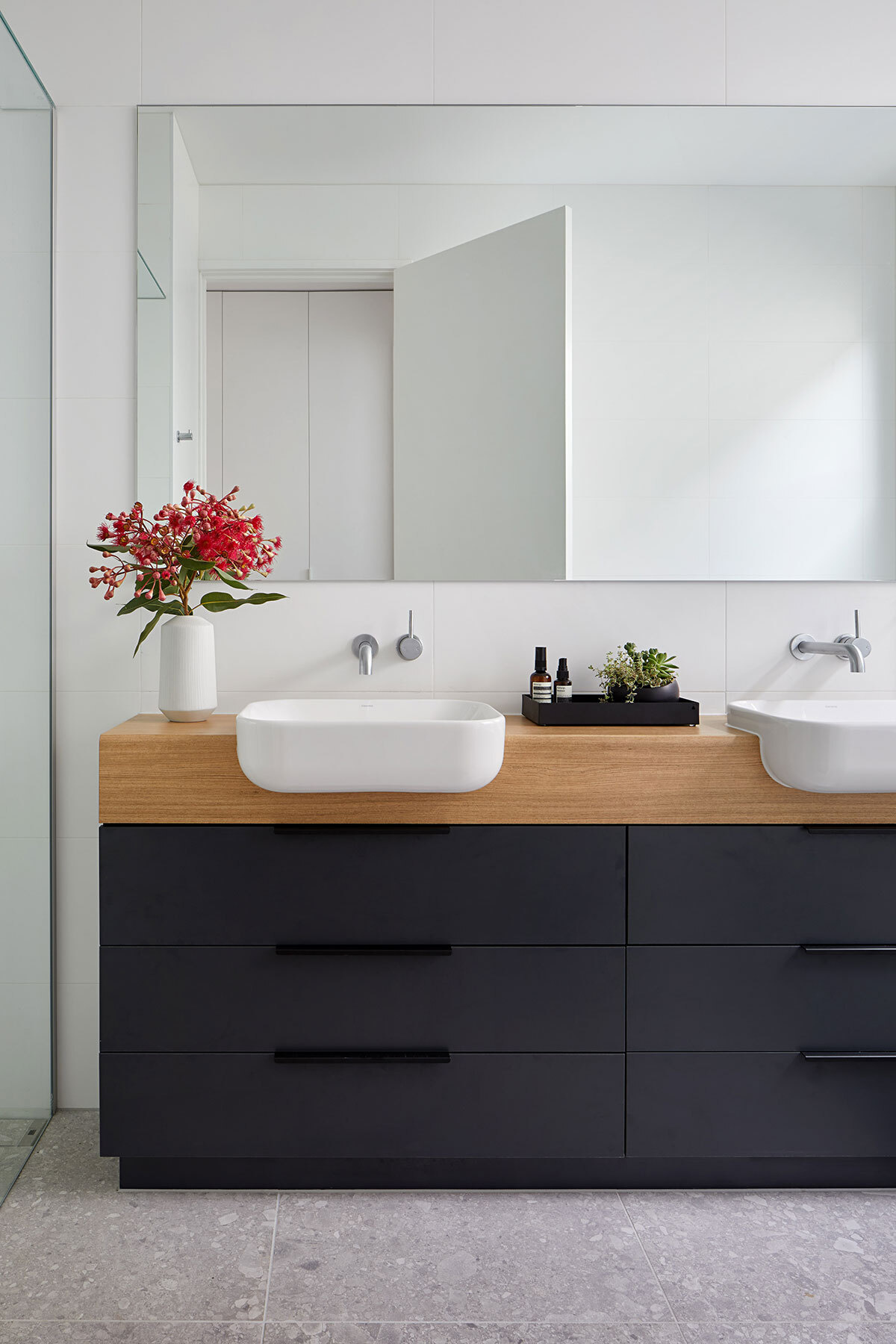
In one of the bathrooms, a black and wood vanity stands out against crisp white walls. The mirror reflects light throughout the space, making it feel larger and brighter despite its modest footprint.
The curved extension of this Melbourne cottage turns a tight site into a home that feels open, relaxed, and perfectly suited to family life.