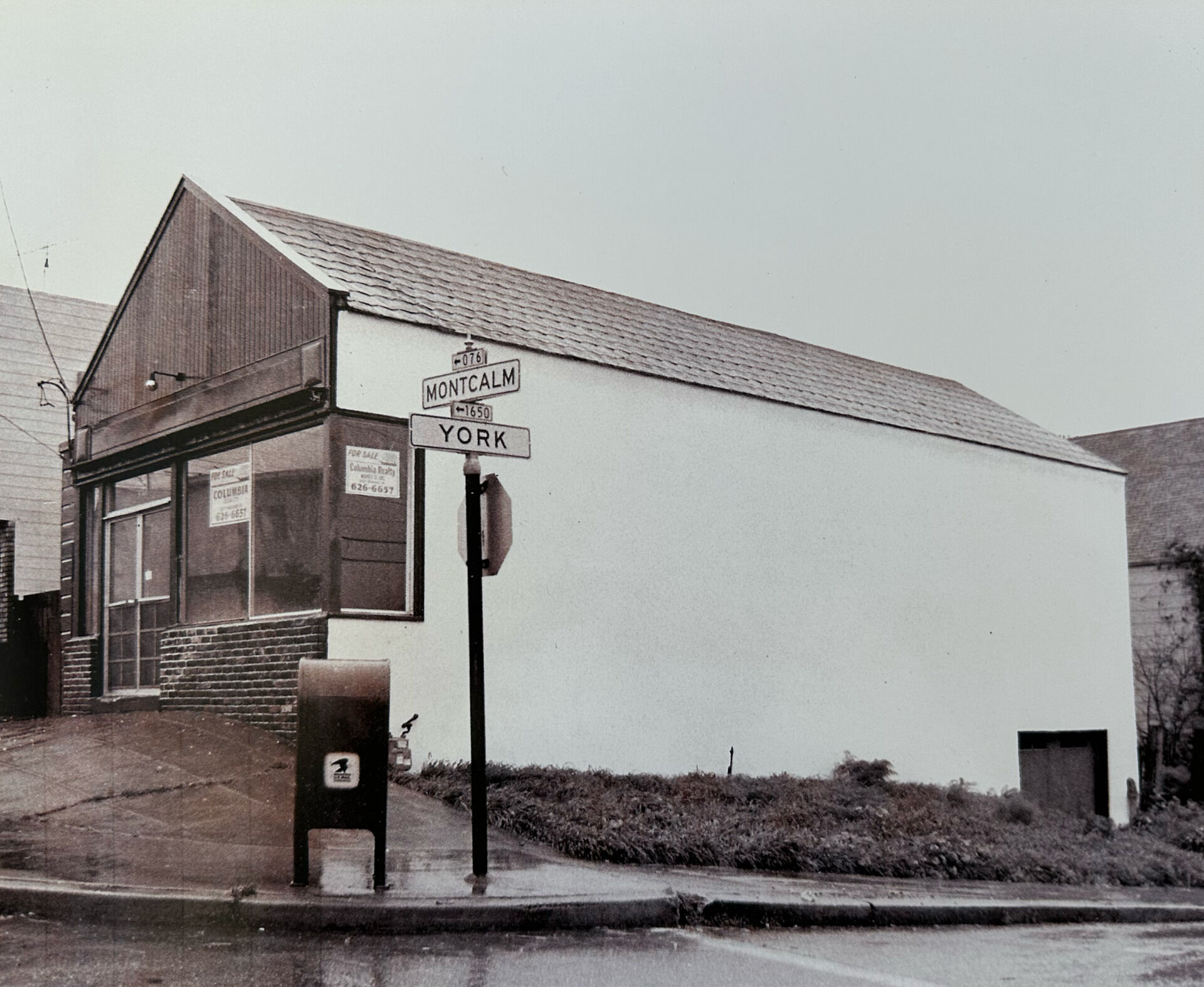
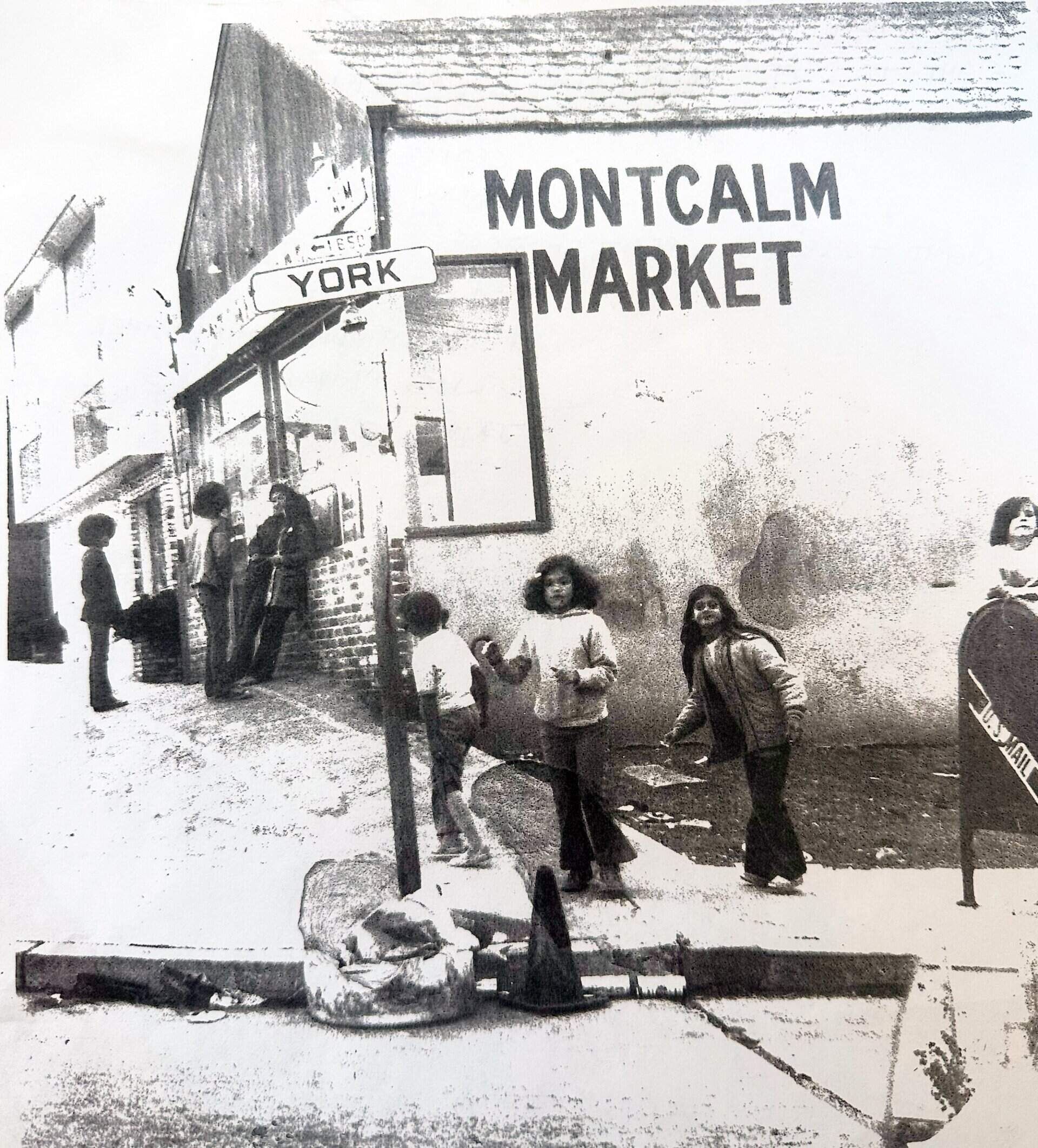
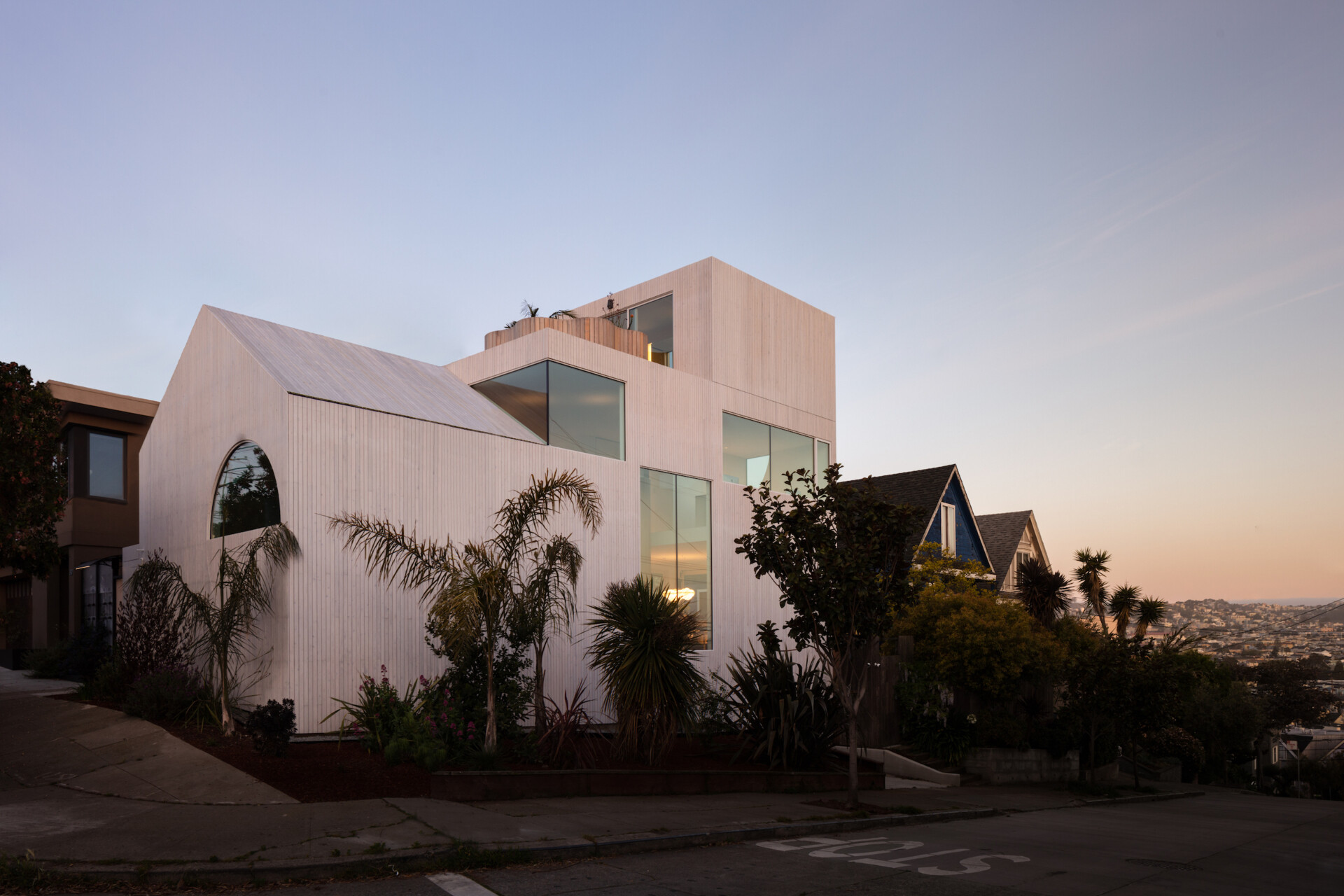
In a modest residential neighborhood of San Francisco, a disused corner store has found new life as a thoughtful family home, one that honors the past without being bound by it. Designed by Craig Steely Architecture, the project embraces the existing building, adapting it rather than erasing it.
Before
After
The transformation leans into the irregularities of the original structure, using creative spatial solutions to turn a once-commercial footprint into a layered and livable interior. Instead of starting from scratch, the design team chose to celebrate the building’s history and local identity, weaving old and new into a seamless whole.

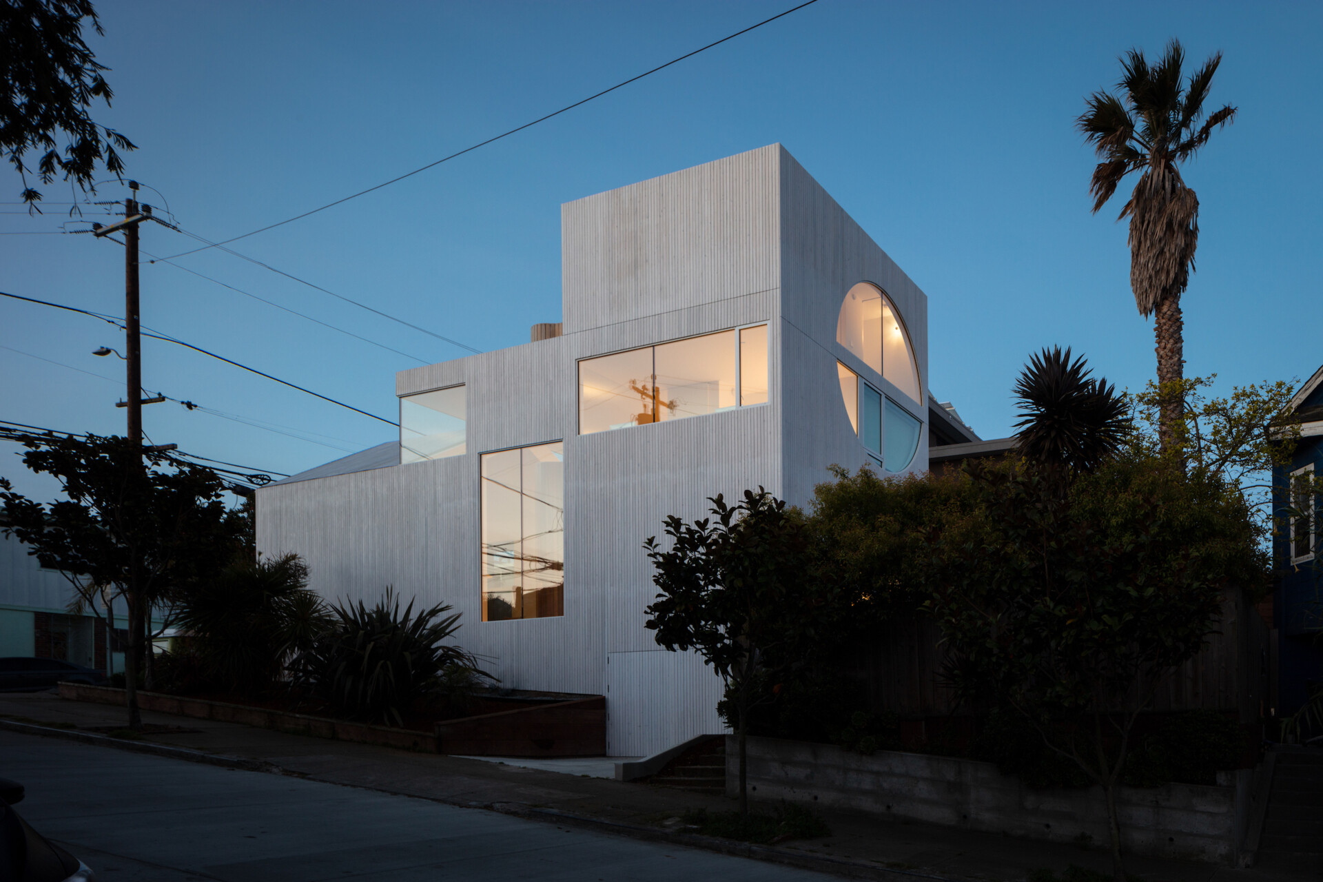
Outside, the former storefront remains legible. Its familiar silhouette and street-facing presence are preserved, now subtly refined with materials and gestures that speak to its new purpose. The result is a home that acknowledges its past while fully inhabiting the present.

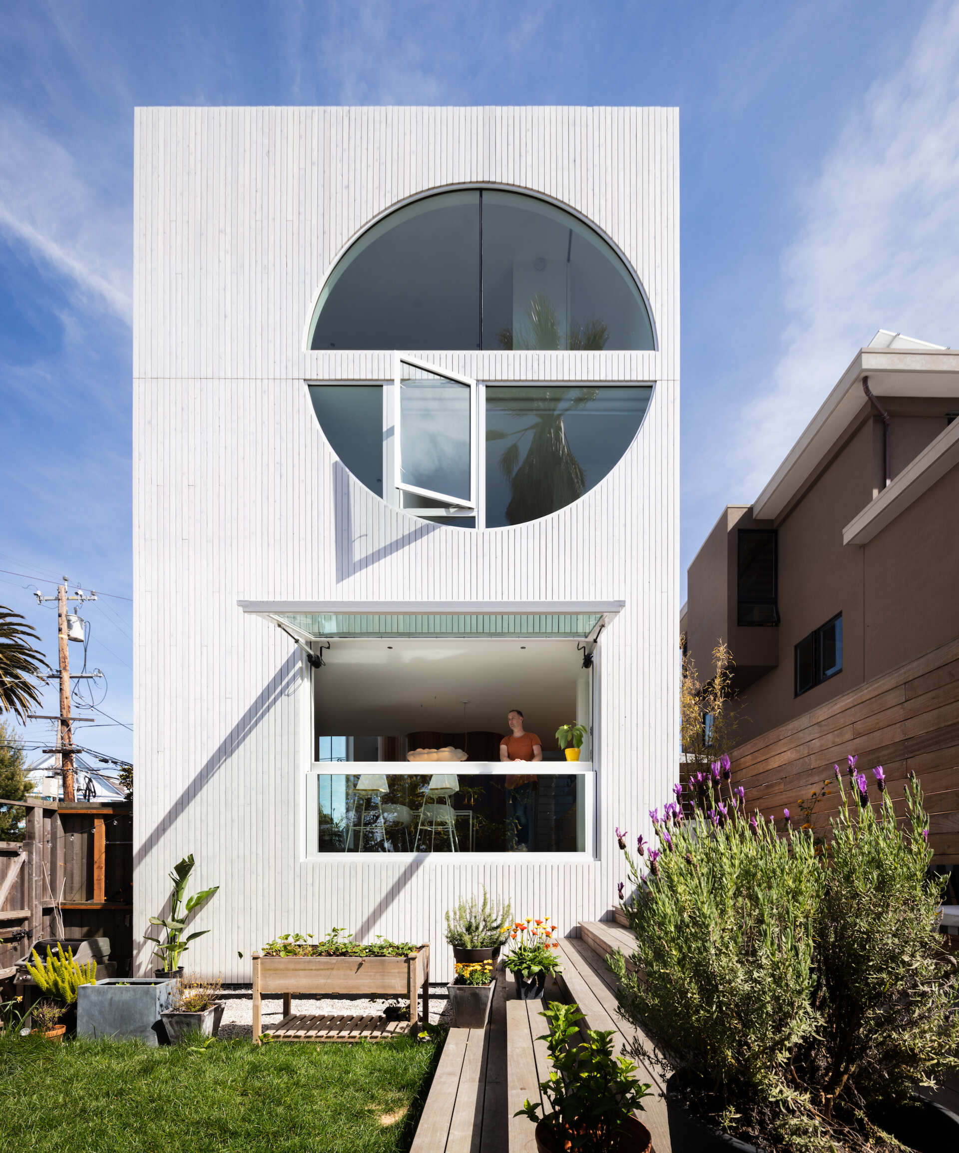
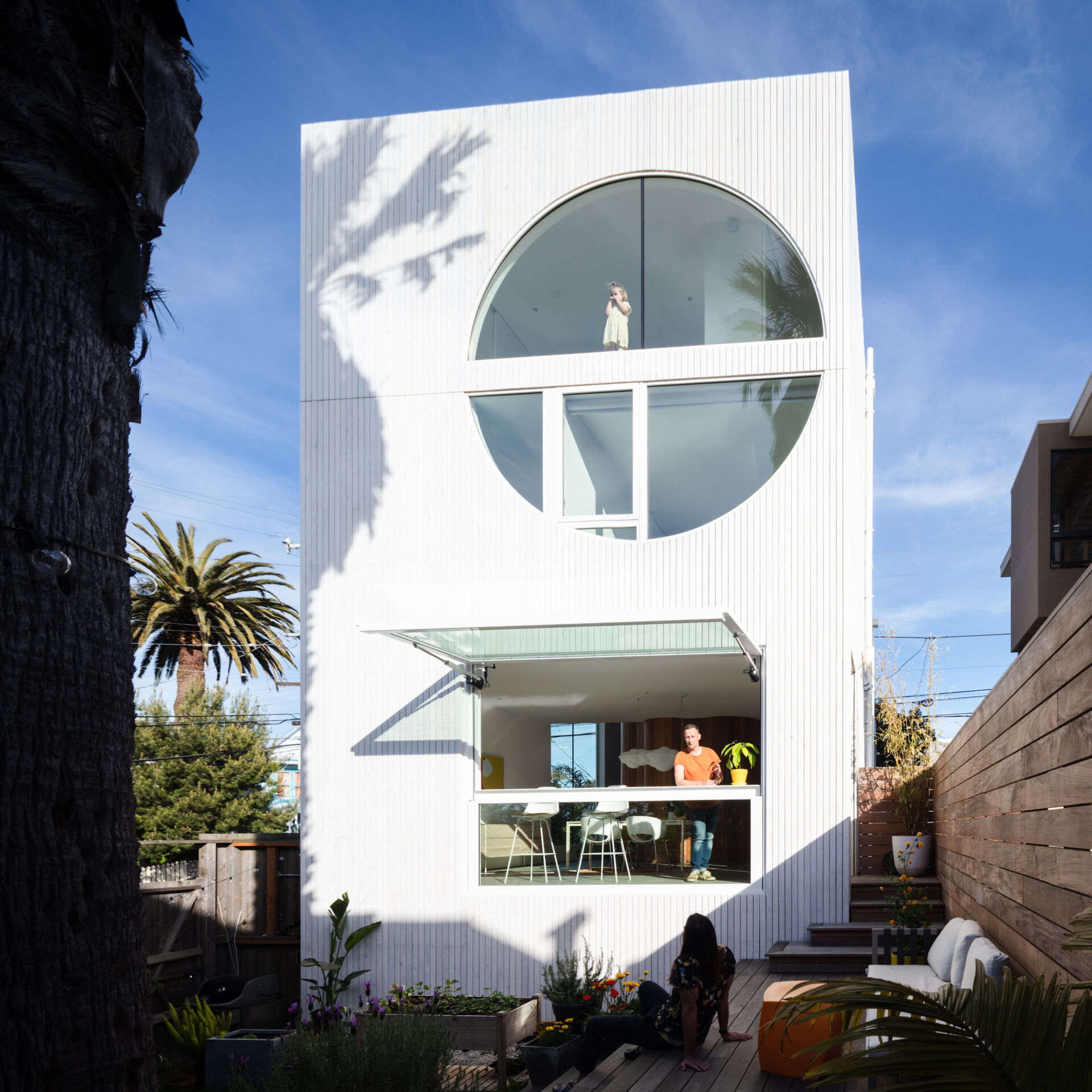
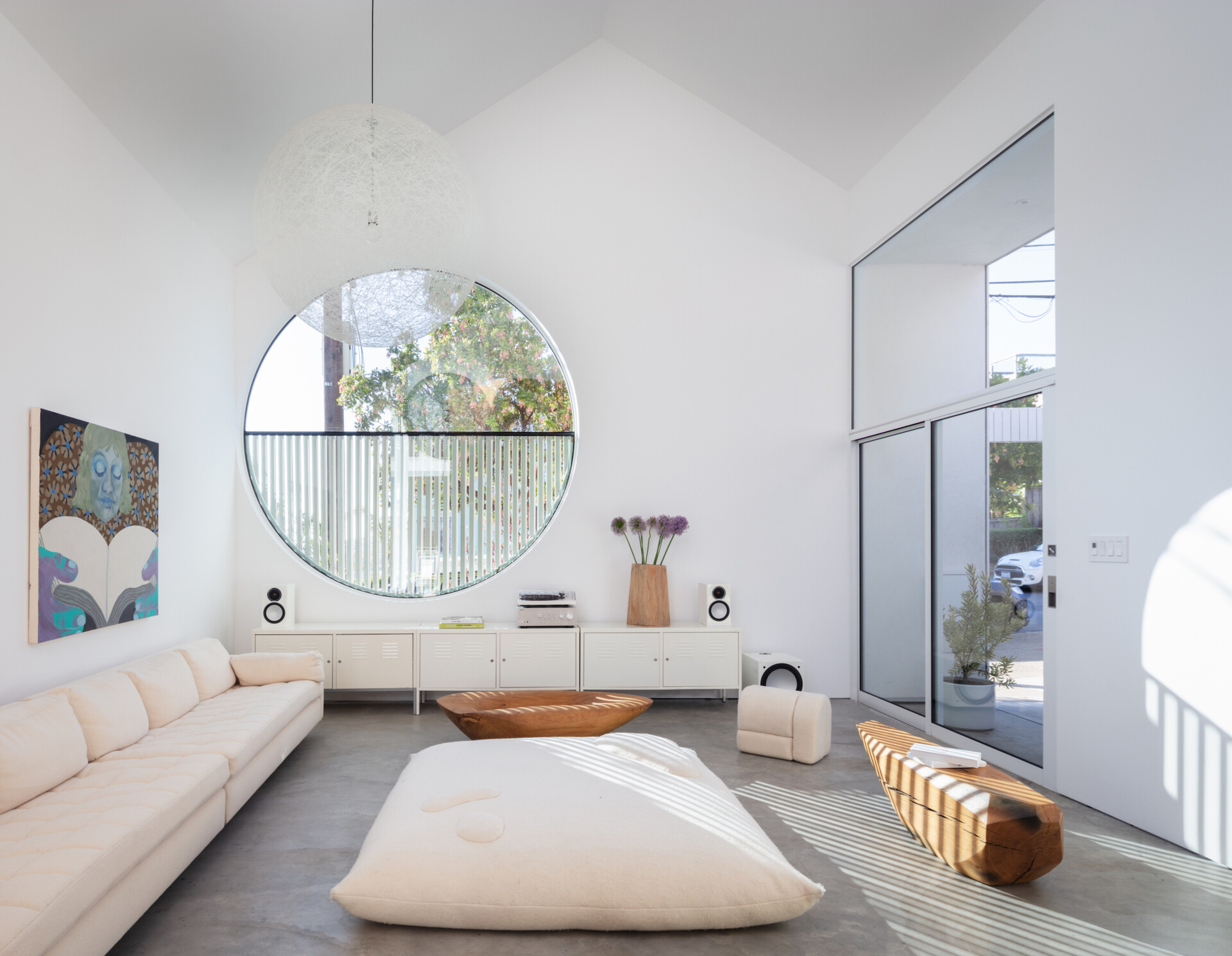
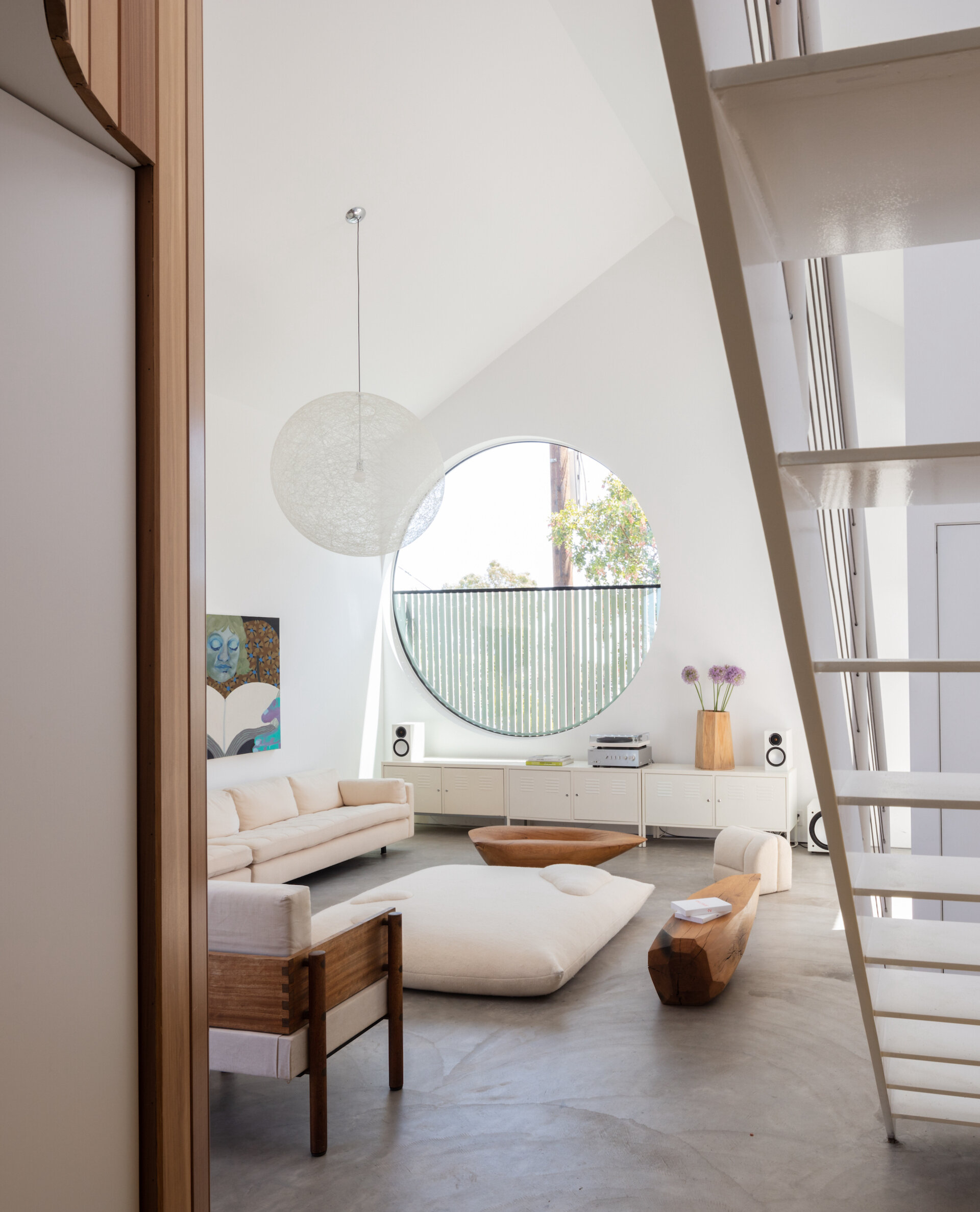
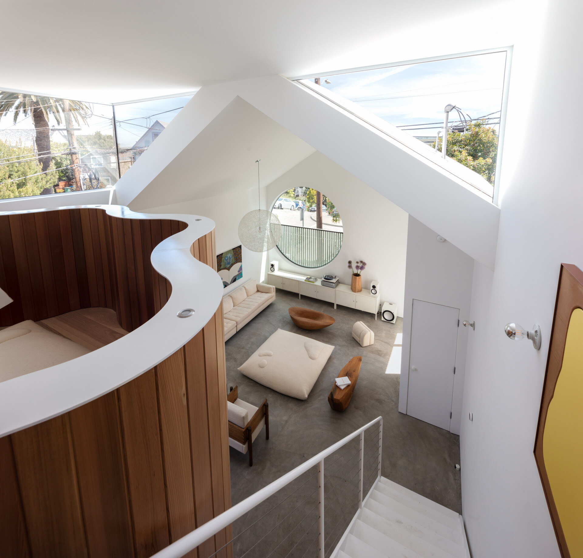
Clad in vertically ribbed white siding, the facade is defined by a striking circular window that cuts across the upper level, a modern gesture that recalls architectural precision and playfulness in equal measure.
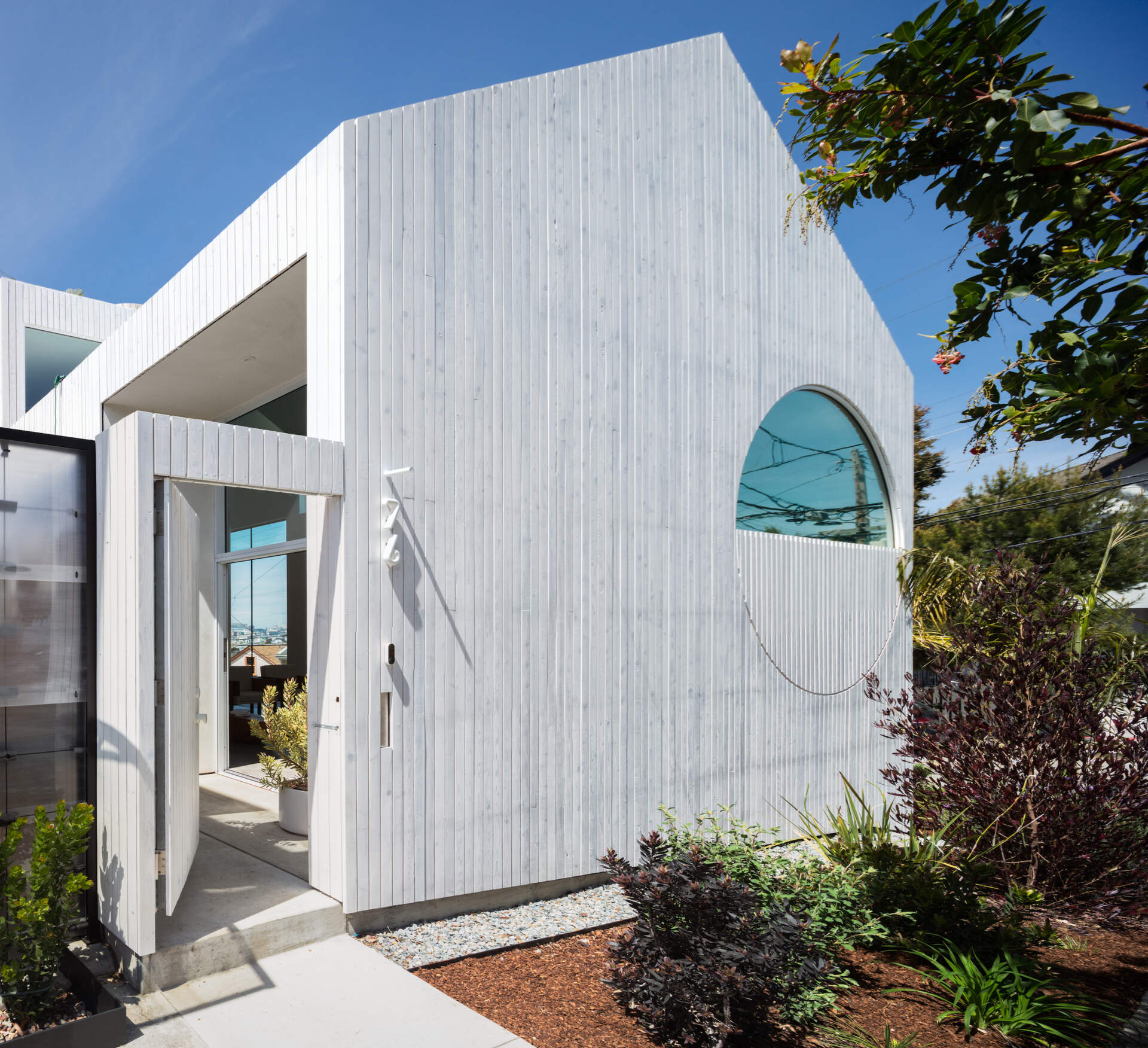
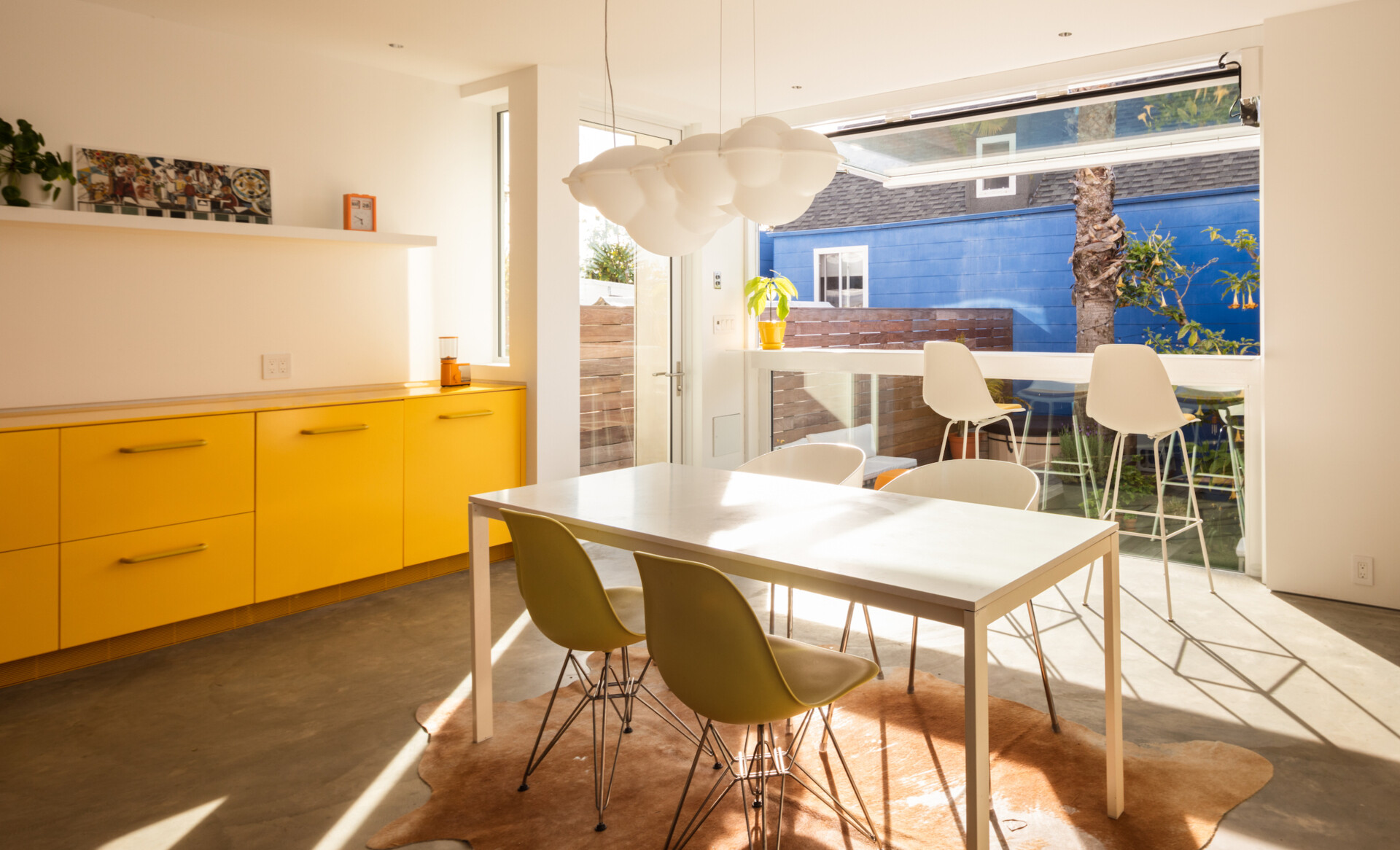
A garage-style glass window opens the kitchen directly to the garden, dissolving the boundary between inside and out. Raised garden beds, wild lavender, and timber decking create a soft, informal edge to the geometric structure, grounding the house in its corner-lot context and inviting daily life to spill naturally outdoors.
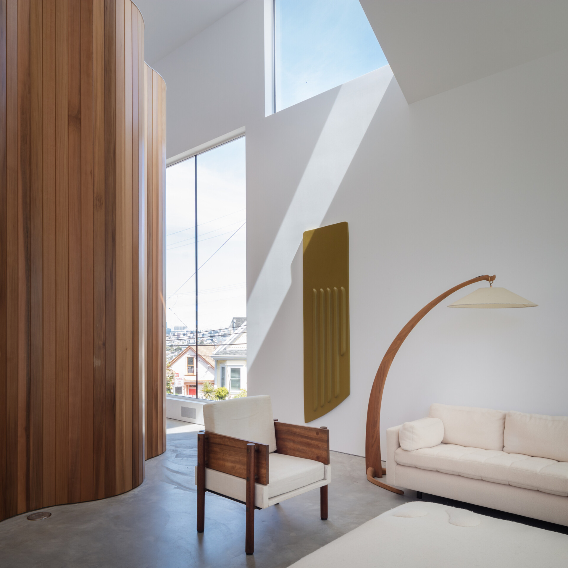
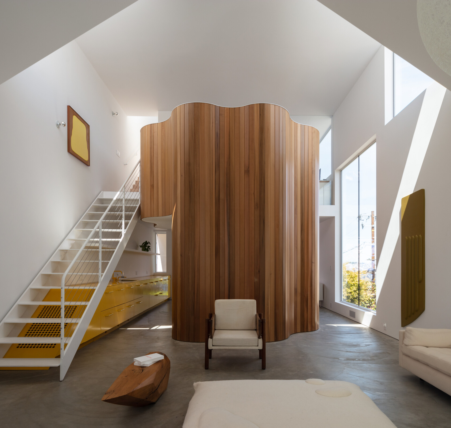
Inside, the living room is pared-back and luminous, shaped by clean lines and soft textures. A large circular window anchors the space, bringing in dappled light and framing views of the street while echoing the home’s bold exterior. Vaulted ceilings add height, while low, sculptural furniture keeps the atmosphere relaxed and grounded. Concrete floors and pale upholstery offer a muted backdrop for a carved wooden bench and playful details, creating a space that feels open, calm, and thoughtfully composed.
The kitchen brings a bold jolt of color into the home’s otherwise neutral palette. Bright yellow cabinetry runs along one wall in a crisp, angular line, adding energy and movement to the space. Open shelving and minimal decor keep the focus on form and color, allowing the kitchen to feel playful but not overwhelming.
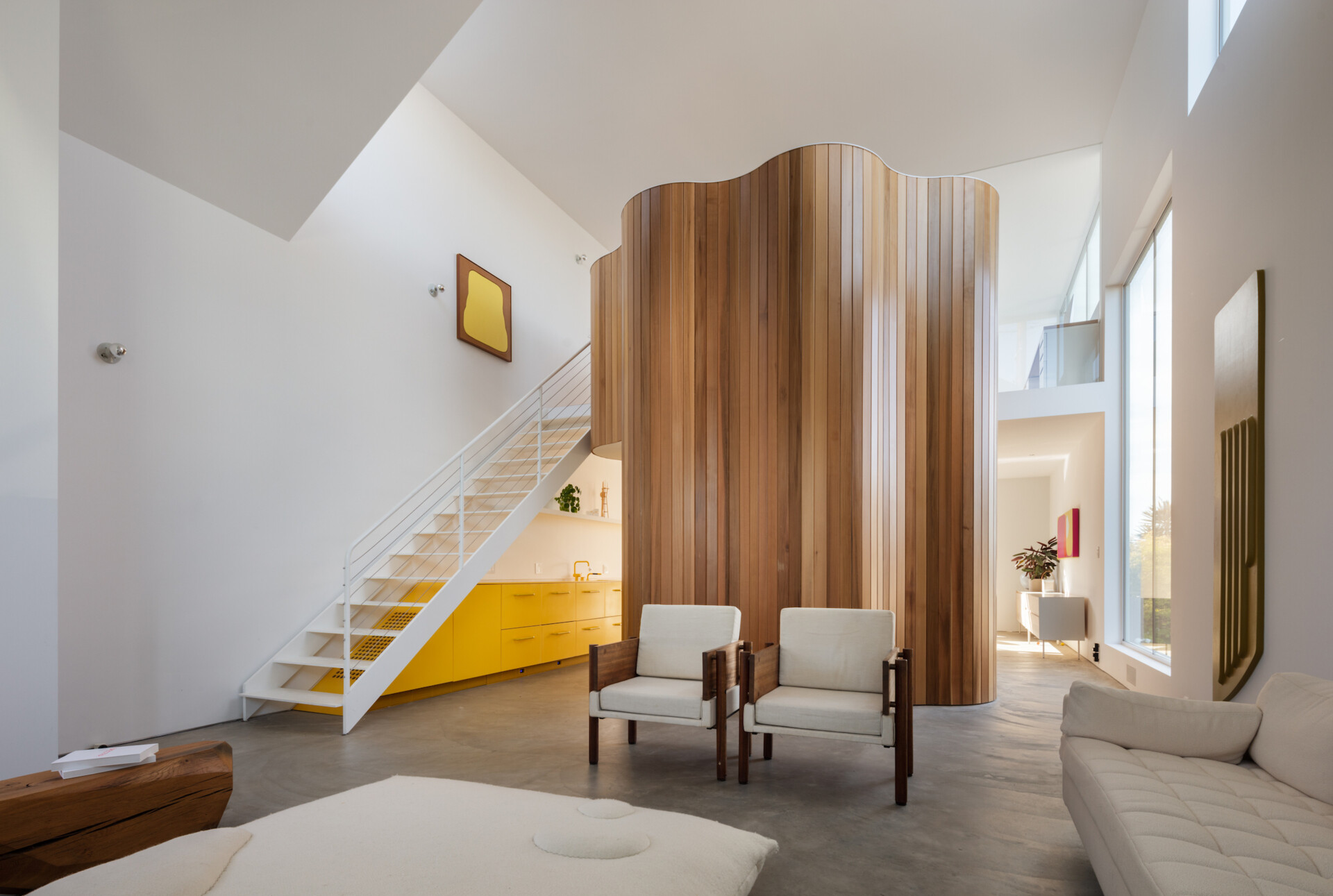
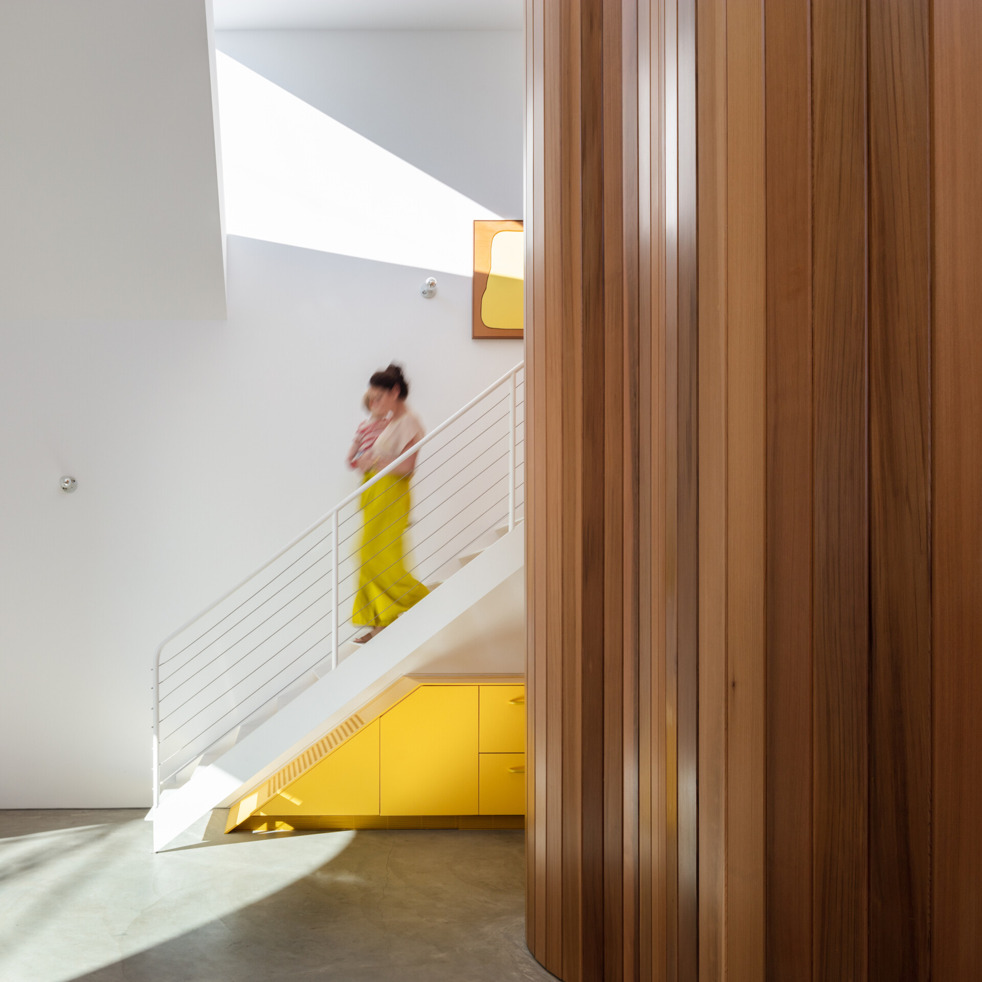
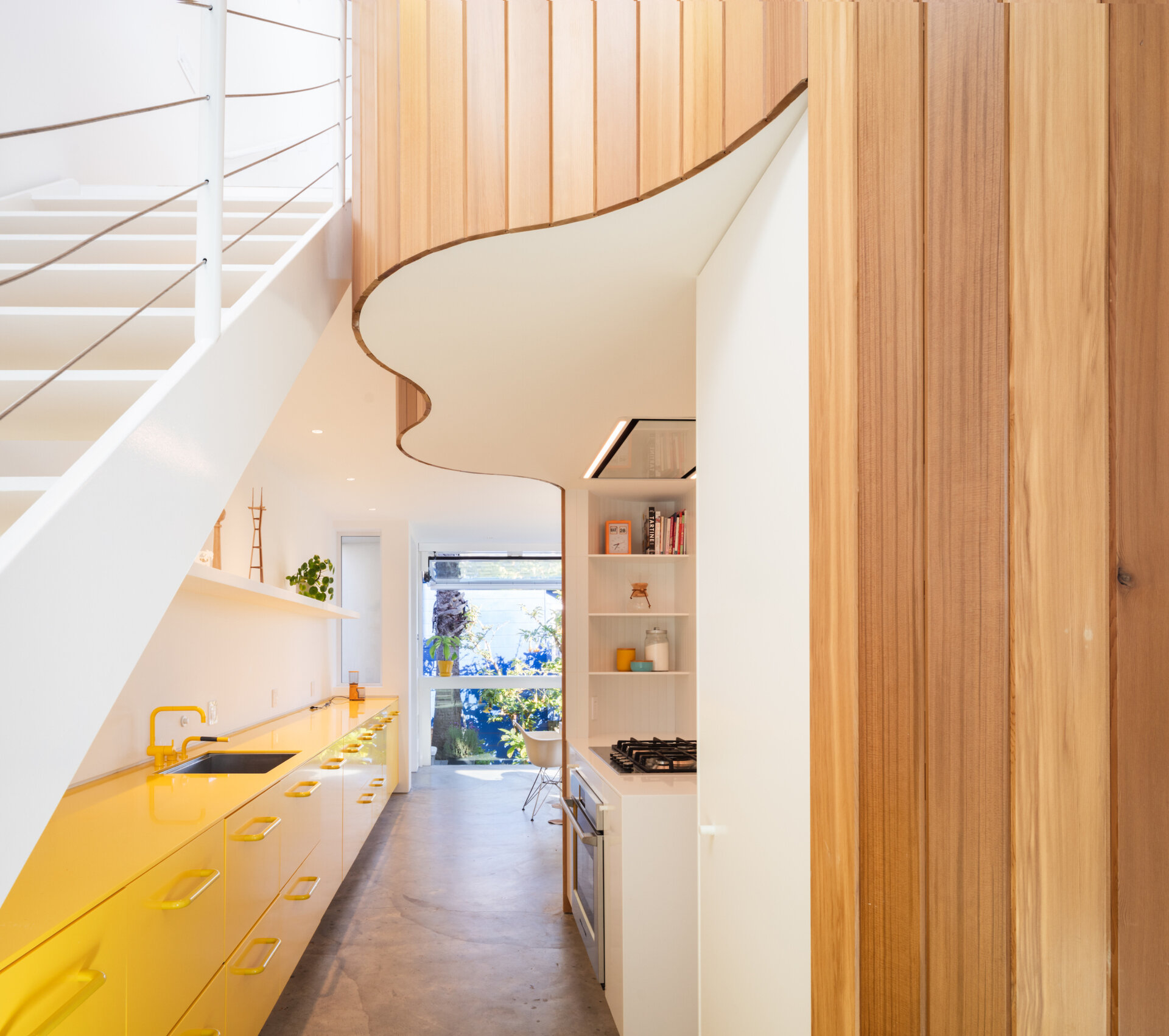
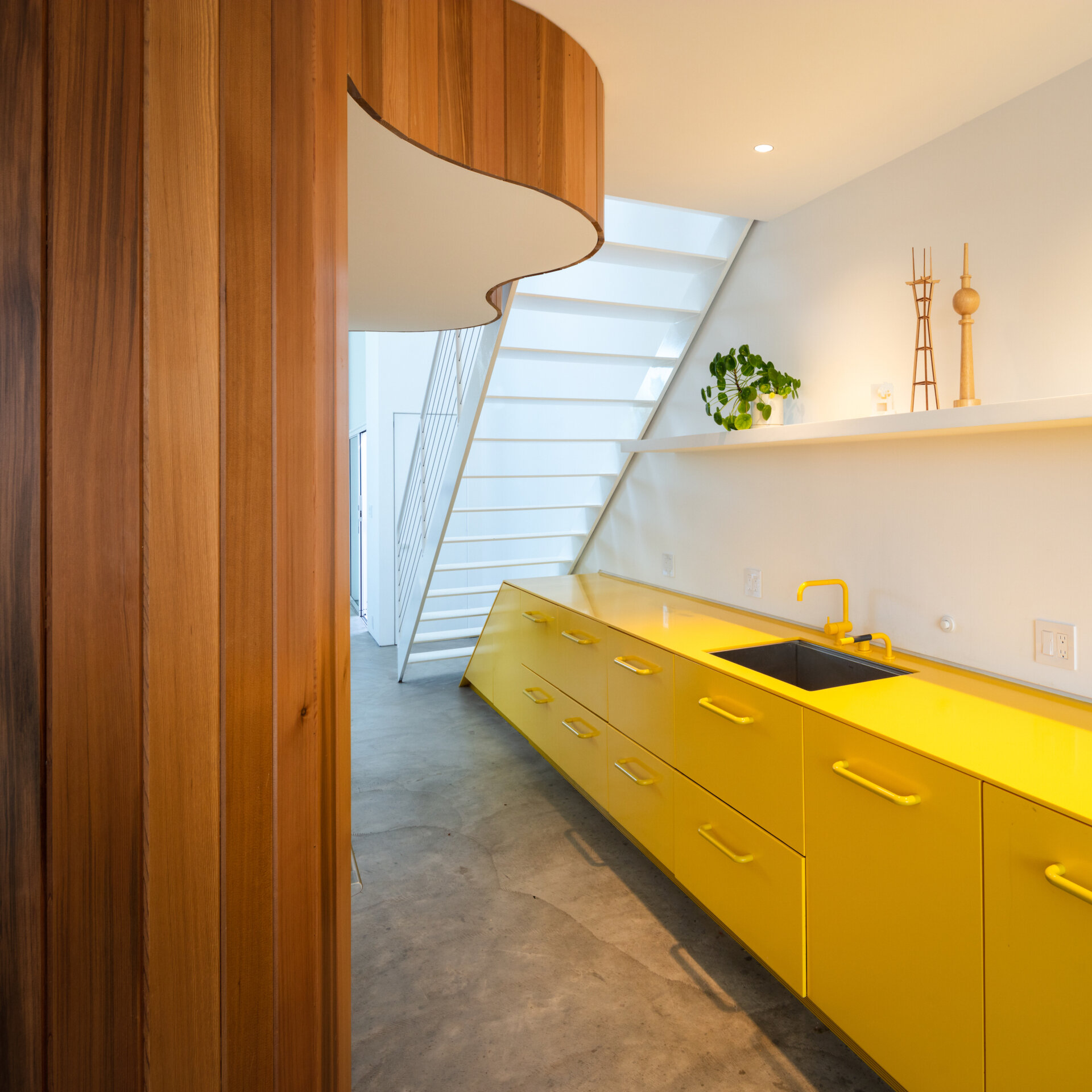
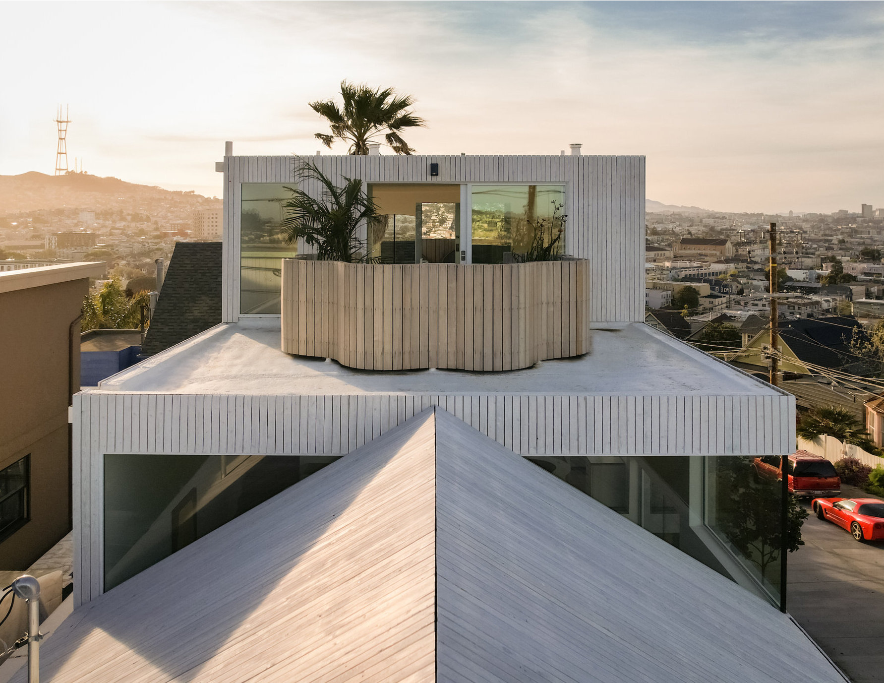
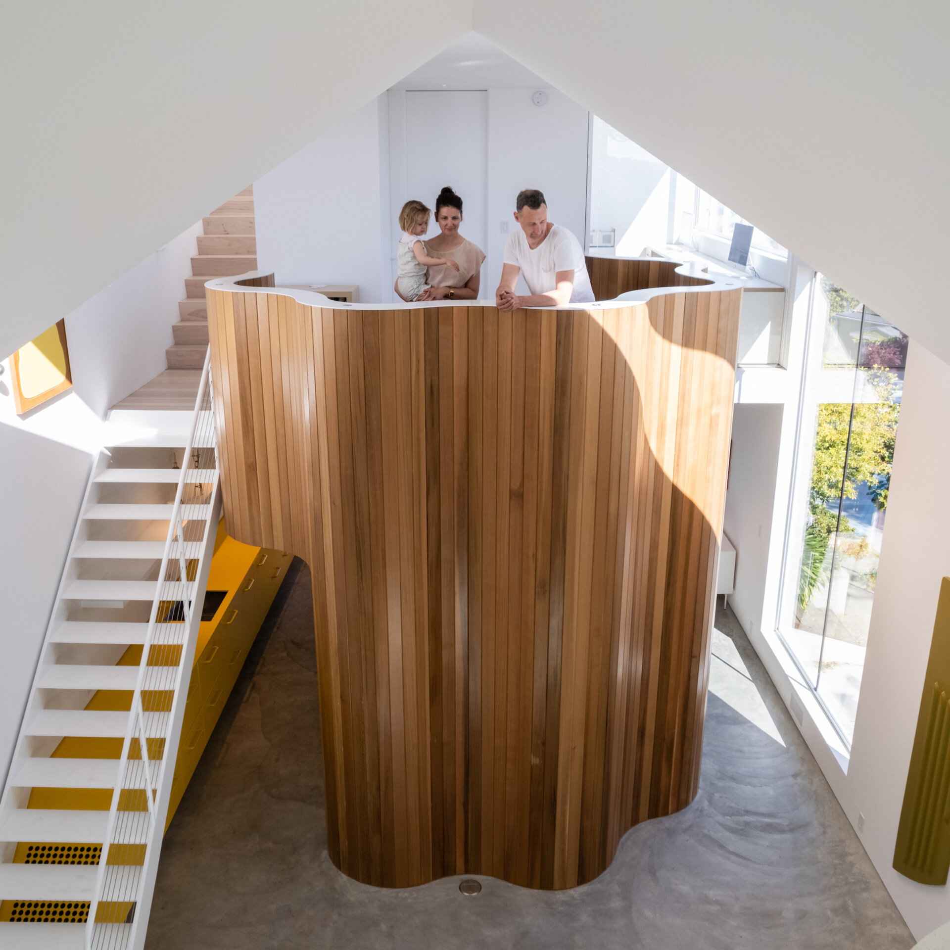
At the center of the open-plan interior, a sculptural flower-shaped tower defines the living spaces without enclosing them. This freestanding form acts like a gentle divider, softening the interior, shaping circulation, and adding a moment of whimsy to the architecture’s clarity. White metal stairs transition into wood stairs that connect the living spaces with the upper floors of the home.
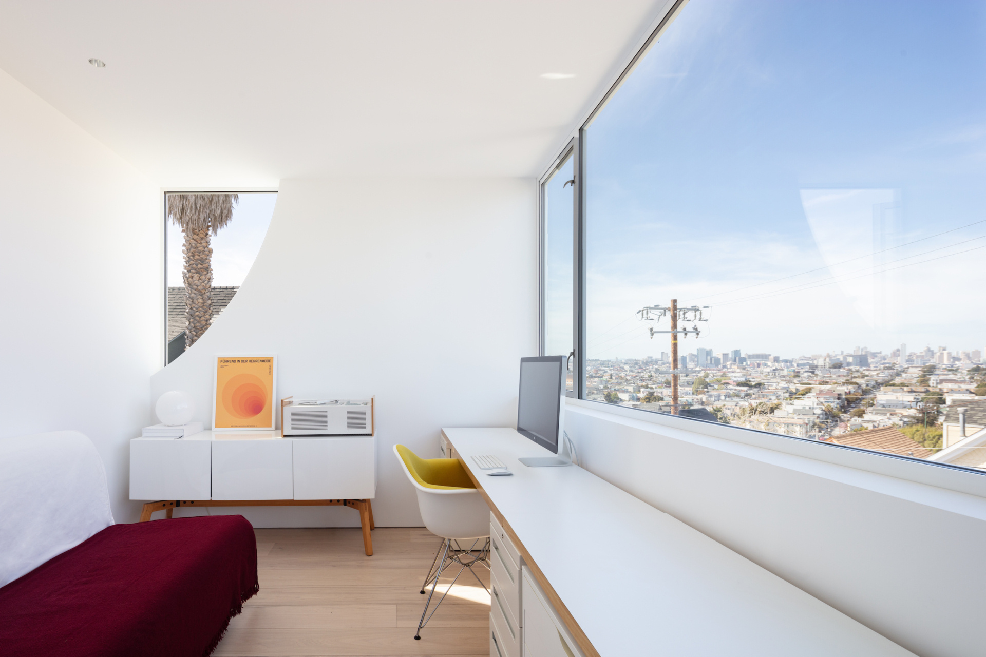
The home office makes the most of its sweeping city view. A wall-to-wall desk in clean white keeps the workspace calm and uncluttered, while warm wood floors and a mid-century style cabinet bring in a touch of softness. The subtle curve of the corner window adds character without distraction.
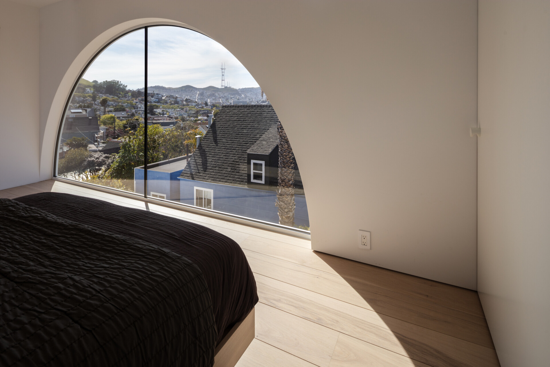
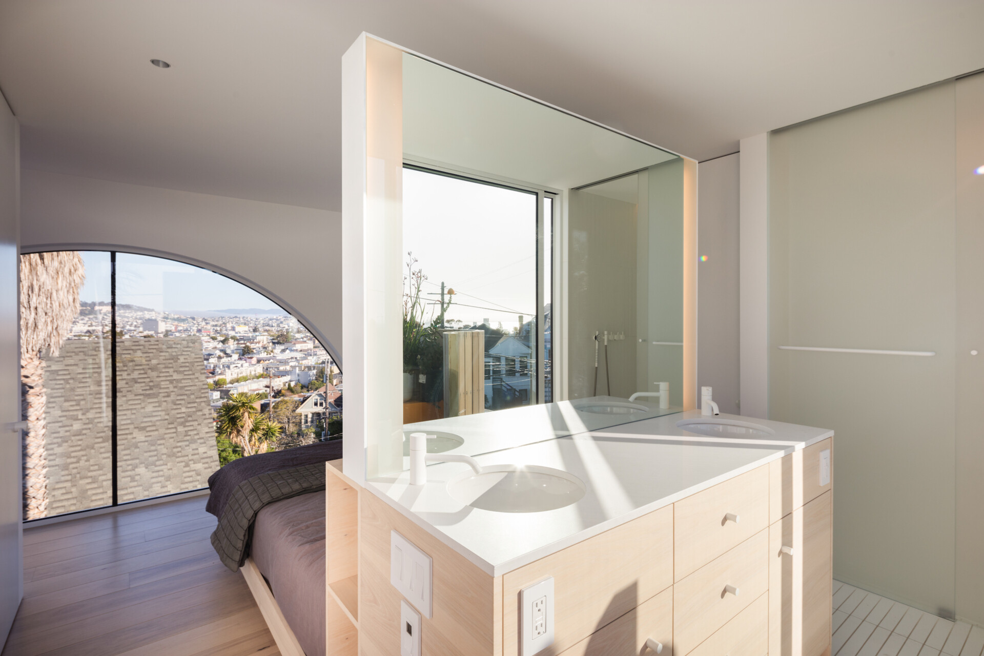
Framed by a graceful arched window, a bedroom captures the essence of quiet mornings and expansive views. Natural light washes across pale wood floors, softening the space and drawing your eye toward the city beyond. Behind the bed, a bathroom vanity with dual basins, lies below a mirror that reflects the view.
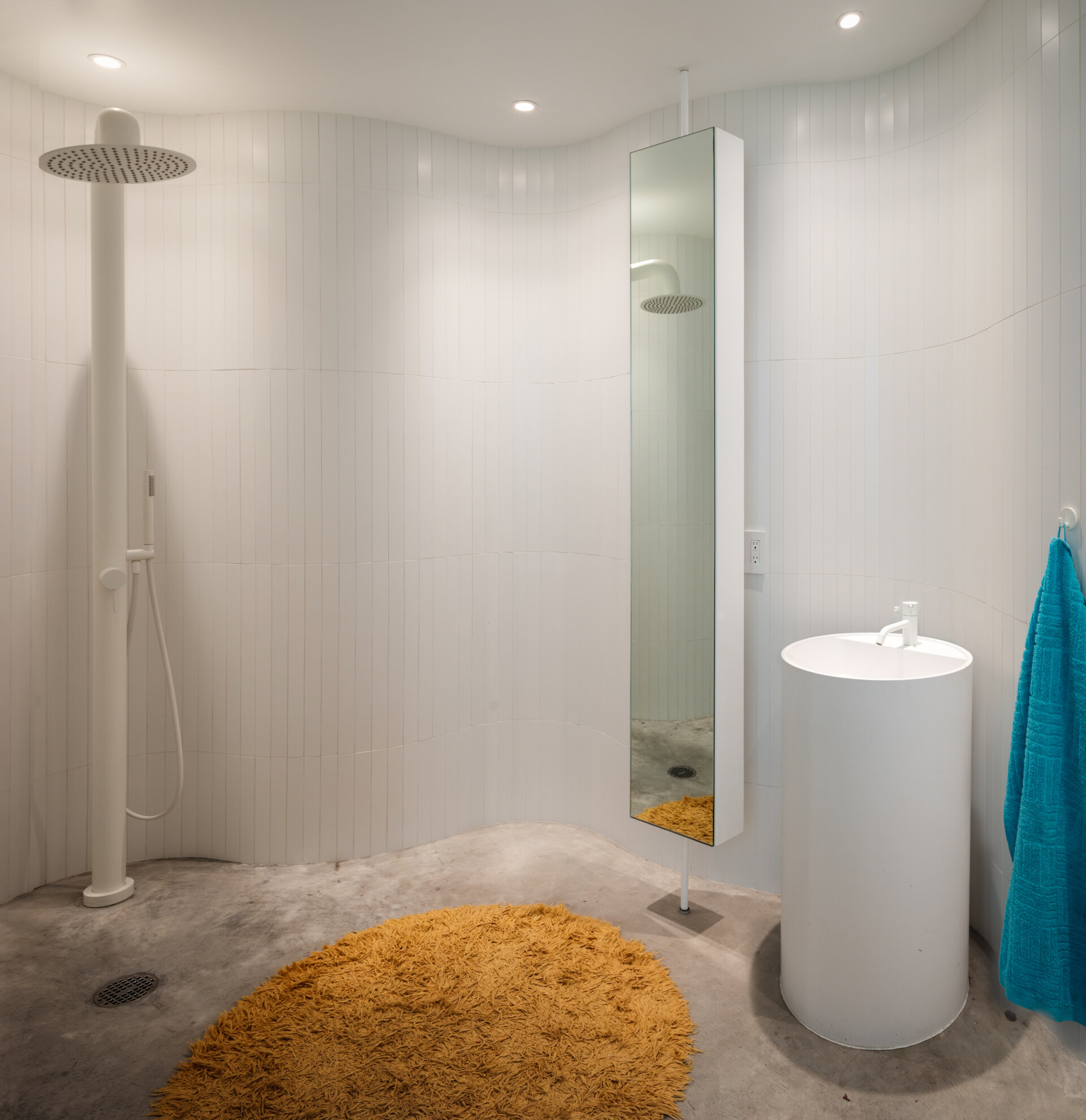
A second bathroom, just off the kitchen, offers a moment of calm, defined by soft curves and diffused light. White tiles wrap the walls in a continuous surface that folds into a gentle wave, adding quiet rhythm without distraction. Underfoot, concrete grounds the room in a subtle contrast, while a round mustard rug and teal towel break the palette with a playful jolt.
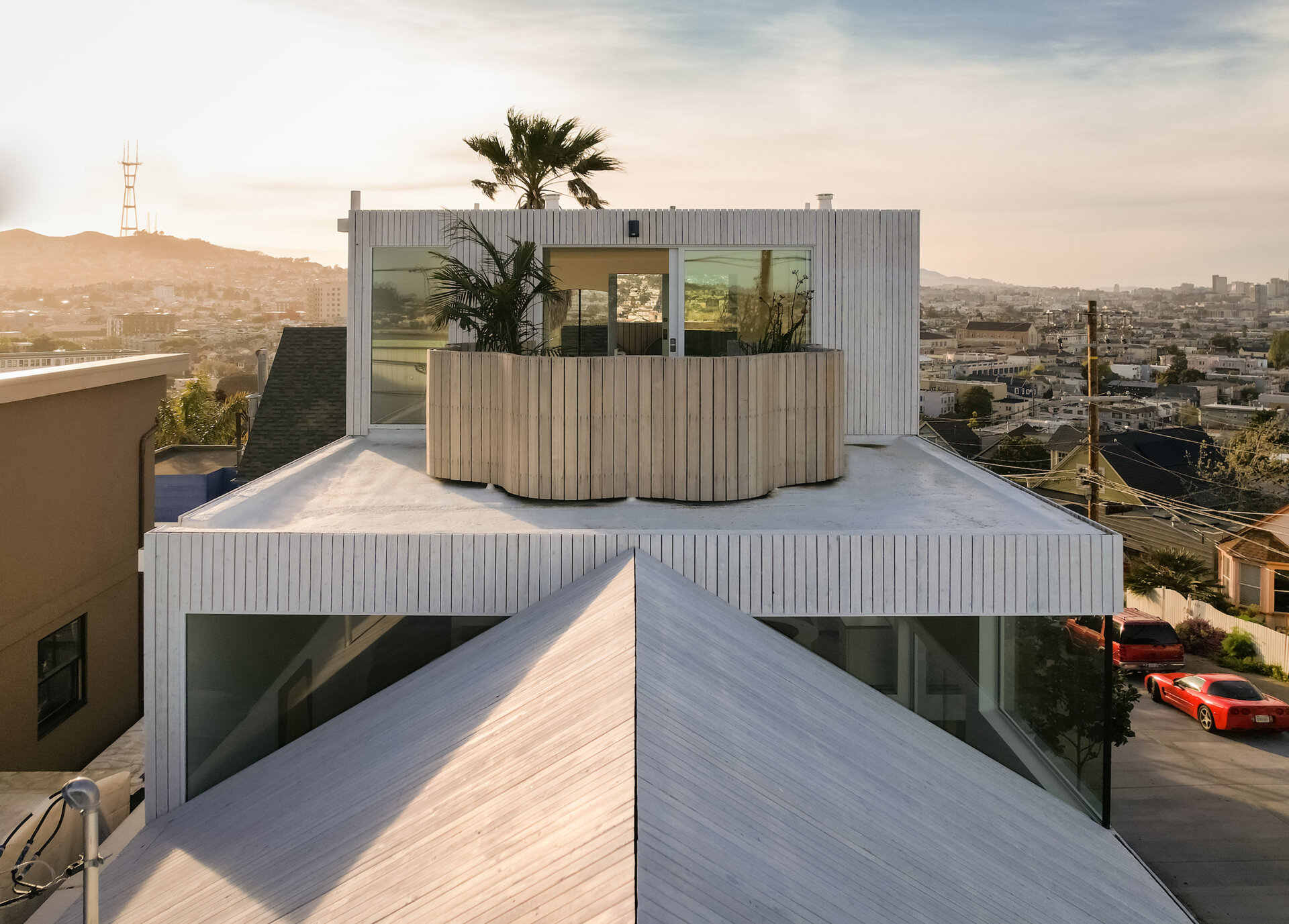
At the top of the house, a sliding glass door opens to the top of the sculptural flower-shaped tower, which is used as a rooftop terrace.
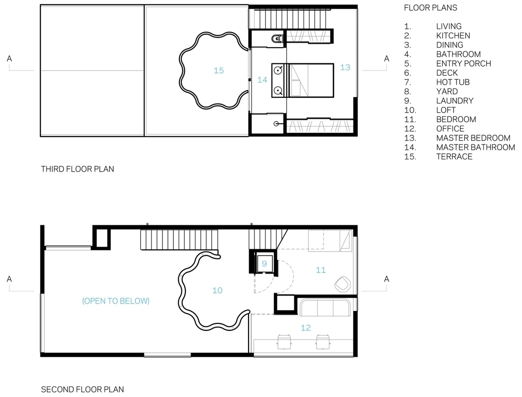
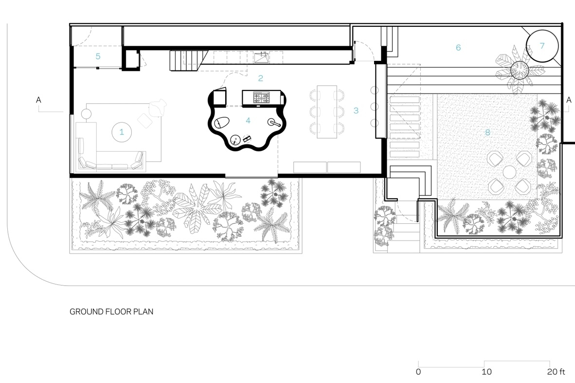
Here’s a look at the floor plan for the home.
Craig Steely’s reimagining doesn’t mimic history or overwrite it. It respects what came before, while confidently adding something original.