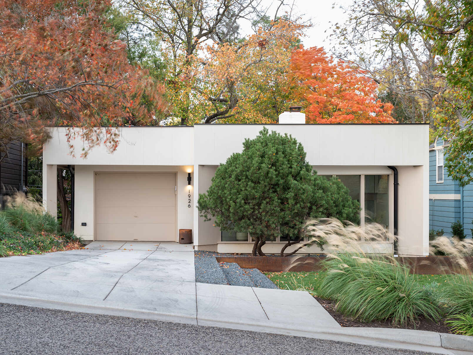
In Kansas City, Missouri, a 1957 mid-century modern home by Kivett and Meyers has been brought back into focus by FORWARD Design | Architecture. Years of piecemeal additions had blurred the original design, leaving behind a layout that felt disjointed. This renovation set out to clean that up, keeping what mattered while reshaping the home for how it’s used today.
Reworking the Entry and Front Addition
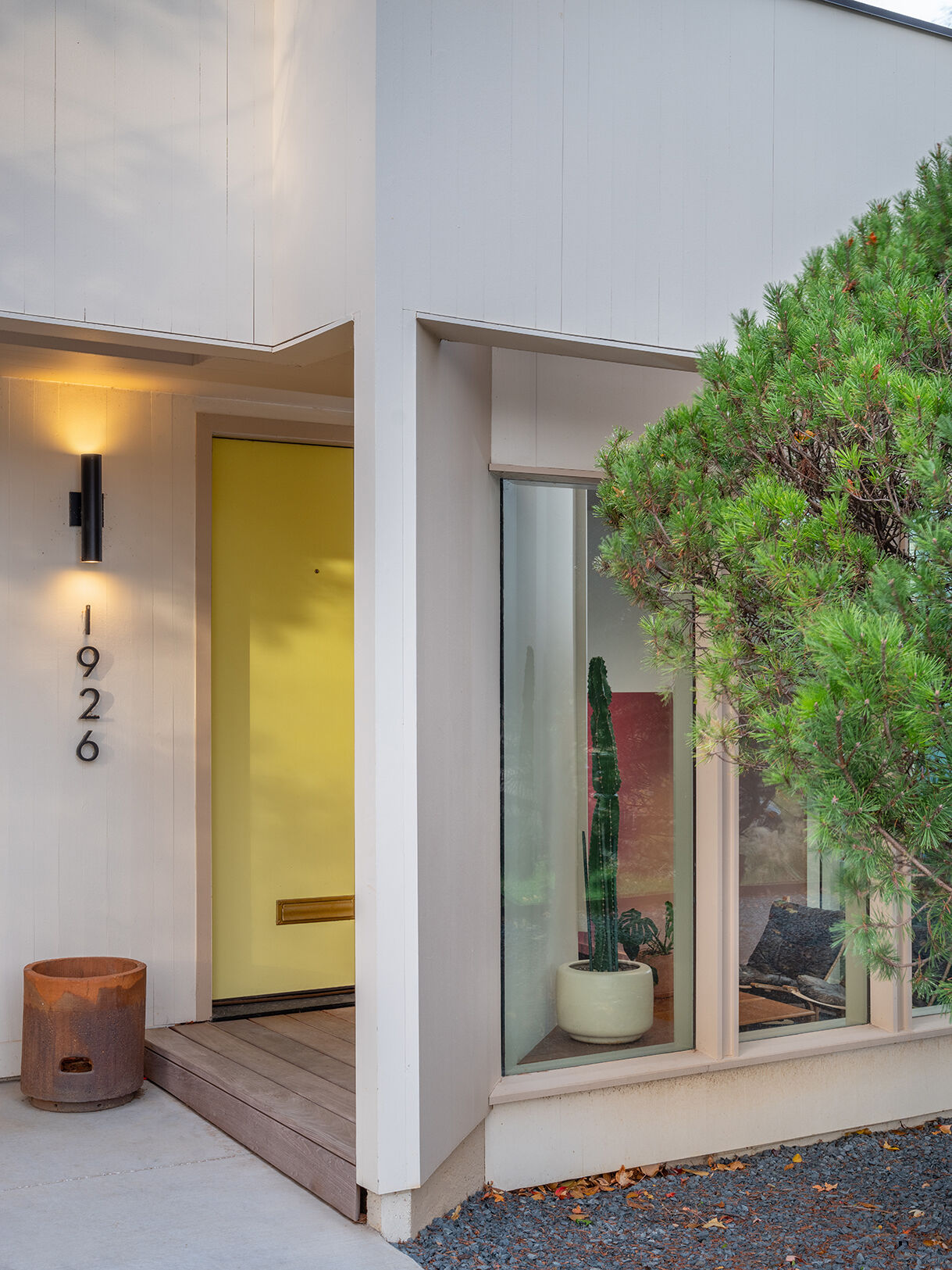
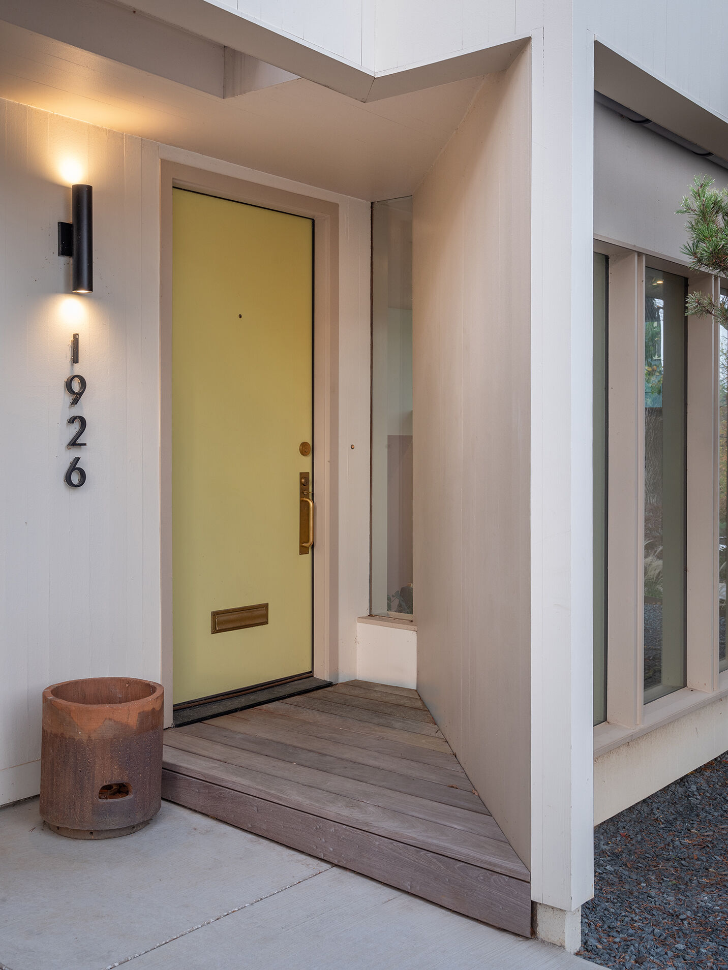
The house steps down the site across five split levels, and the entry had become one of its most confusing moments. A later sunroom addition sat higher than the original entry, creating a disconnect.
That front portion was redesigned to align with the language of the original house. The older lower-level entry was removed and absorbed into an existing wood-paneled room, helping the new entry feel consistent with the rest of the structure. What once felt like an add-on now reads as part of a single, cohesive idea.
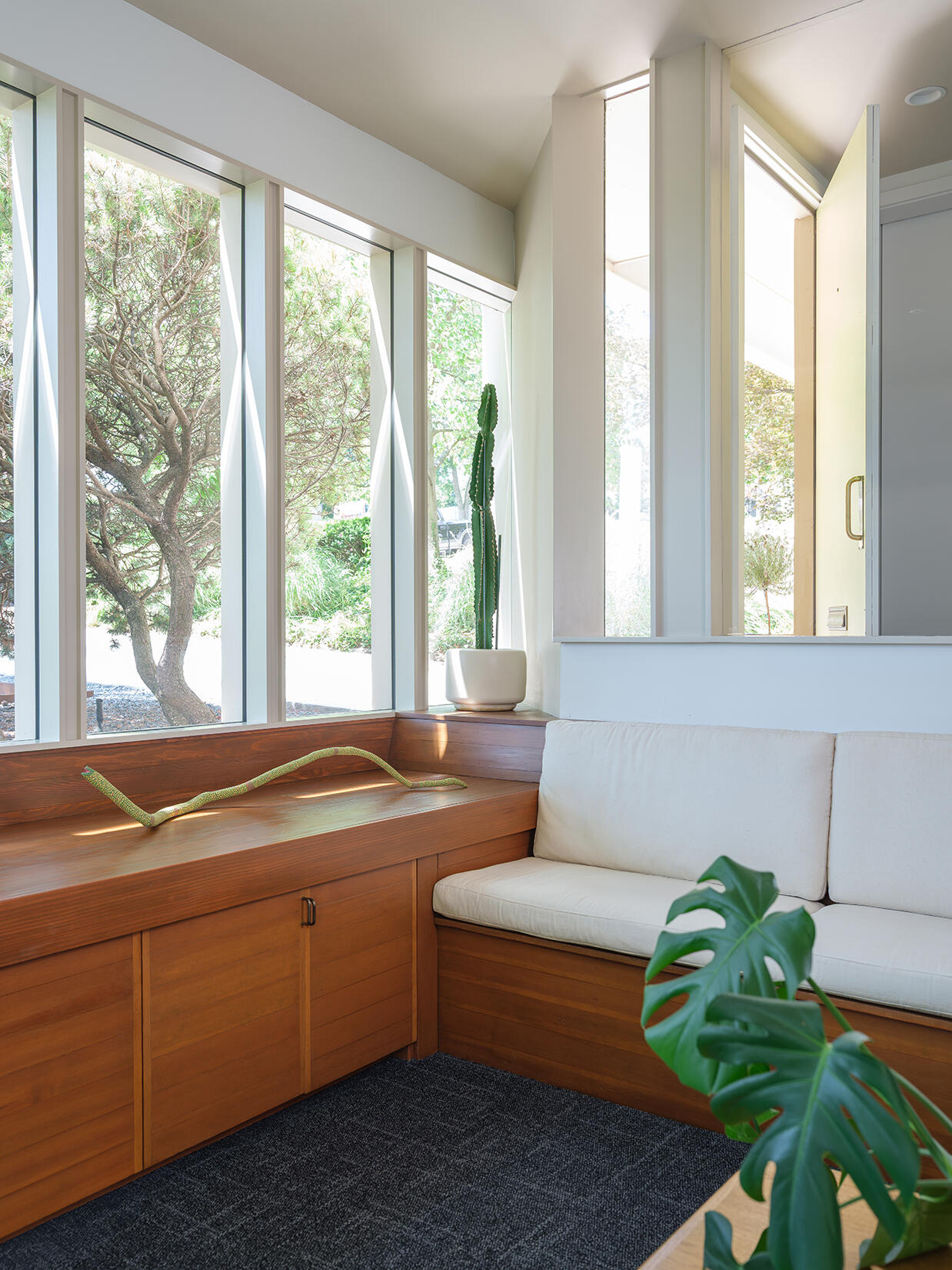
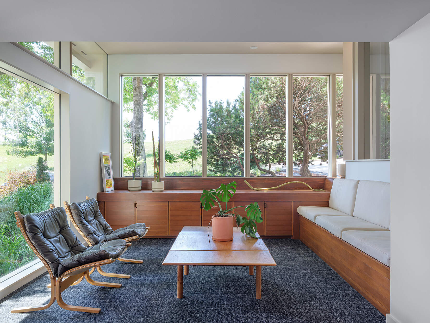
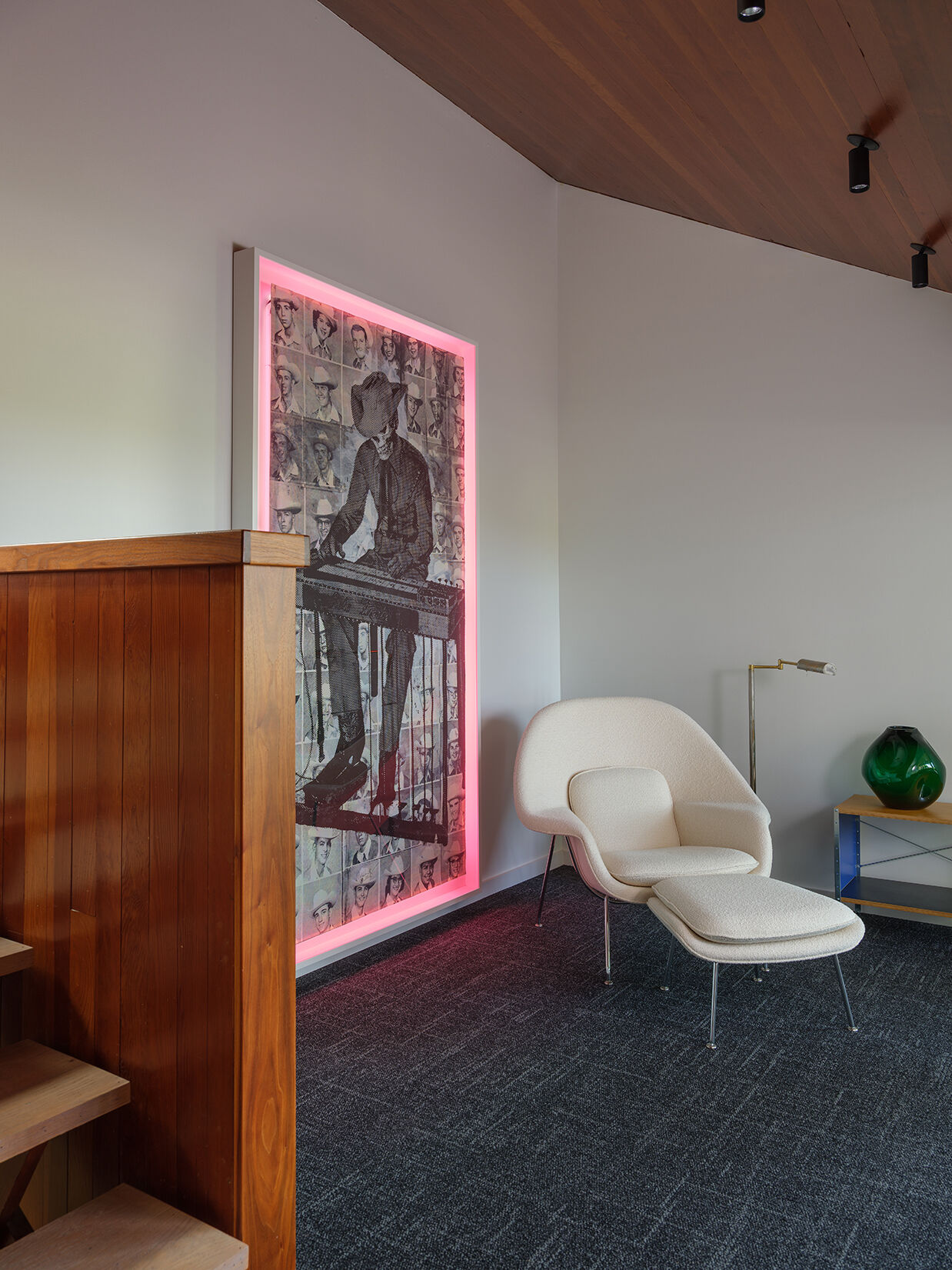
A Refined Sitting Room
Inside the sitting room, small changes made a noticeable difference. A bulky bar element was removed, opening up the space. The street-facing window wall was rebuilt to better reflect the home’s original intent, bringing in more light and cleaner lines.
Existing built-in seating and storage were kept and restored, holding onto a key part of the home’s character. A new, larger window adds another layer, giving the room a stronger connection to the site without disrupting its mid-century feel.
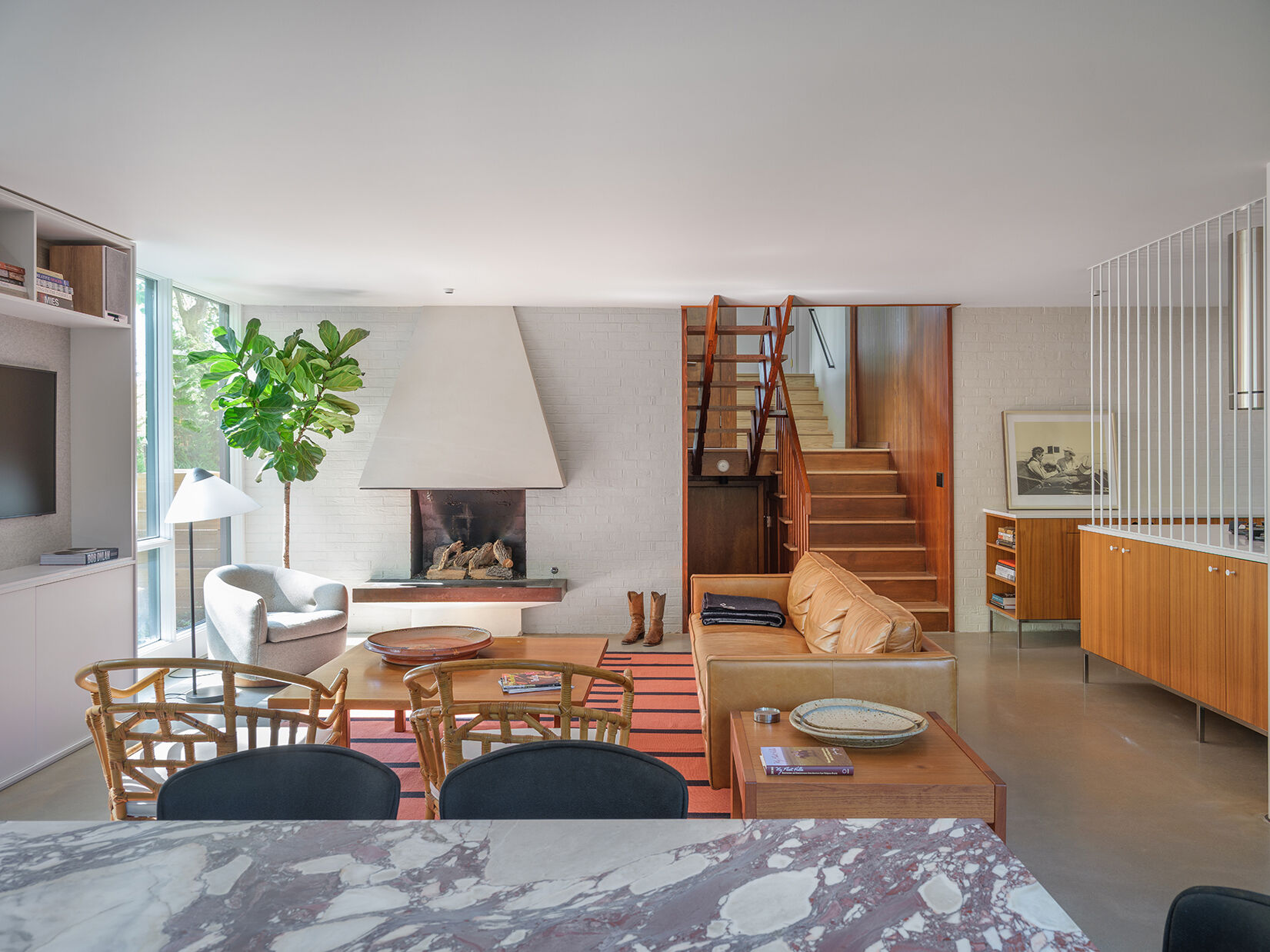
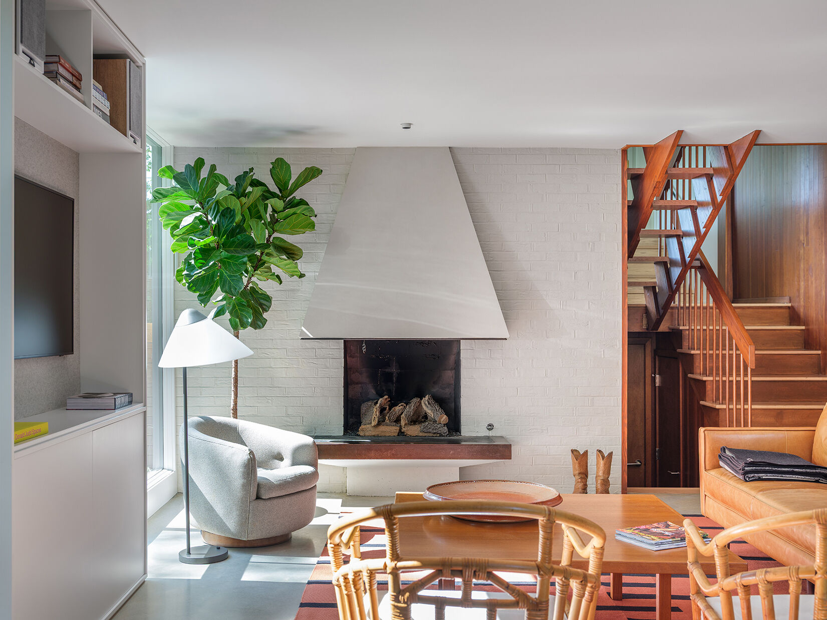
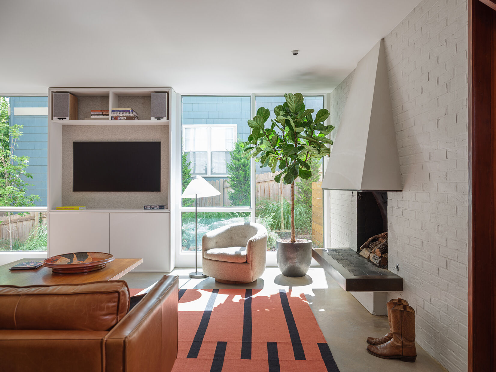
Opening Up the Living Room
The main living space had gradually taken on the feel of a basement due to previous additions. Structural elements like a centered column and dropped beams made the room feel compressed.
The redesign tackled this head-on. Beams that once marked the old exterior wall were lifted into the floor structure above, clearing the ceiling plane. The column was shifted off-center, no longer an obstacle but a tool to help organize the space. The result is a living area that feels open, grounded, and much closer to the home’s original spirit.
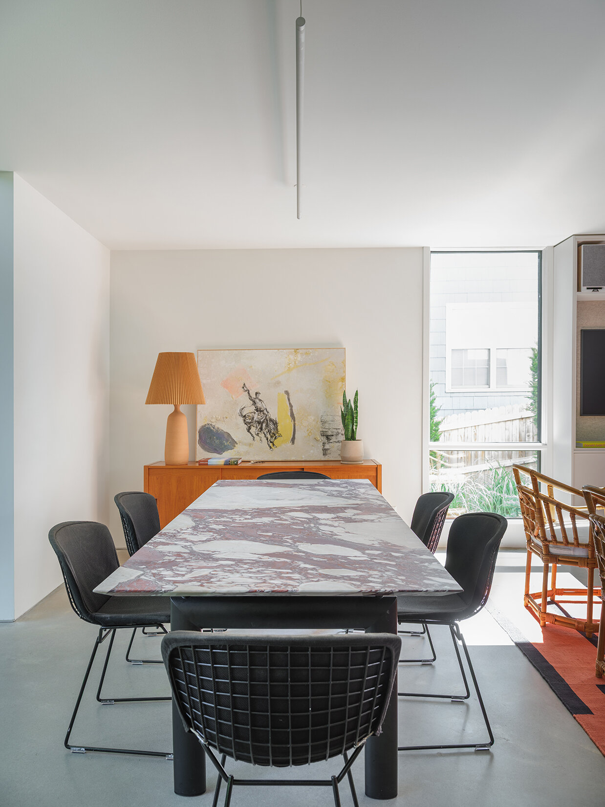
A Clearer Dining Area
With the plan reworked, the dining area now sits alongside the living space on the east side. Instead of feeling tucked away, it’s part of a more open and legible layout.
The relationship between dining and living is straightforward, allowing both areas to share light, views, and a sense of continuity across the main level.
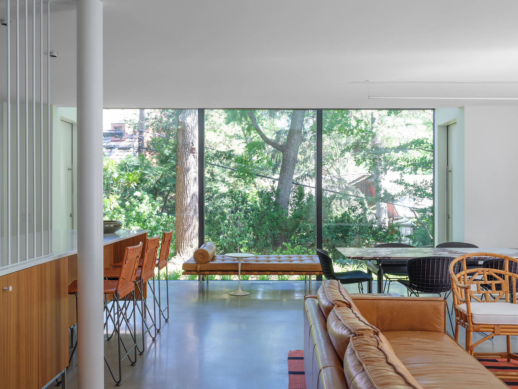
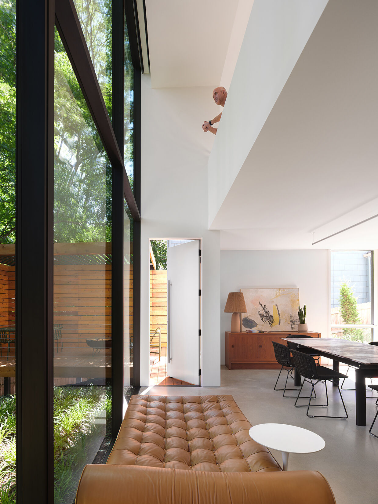
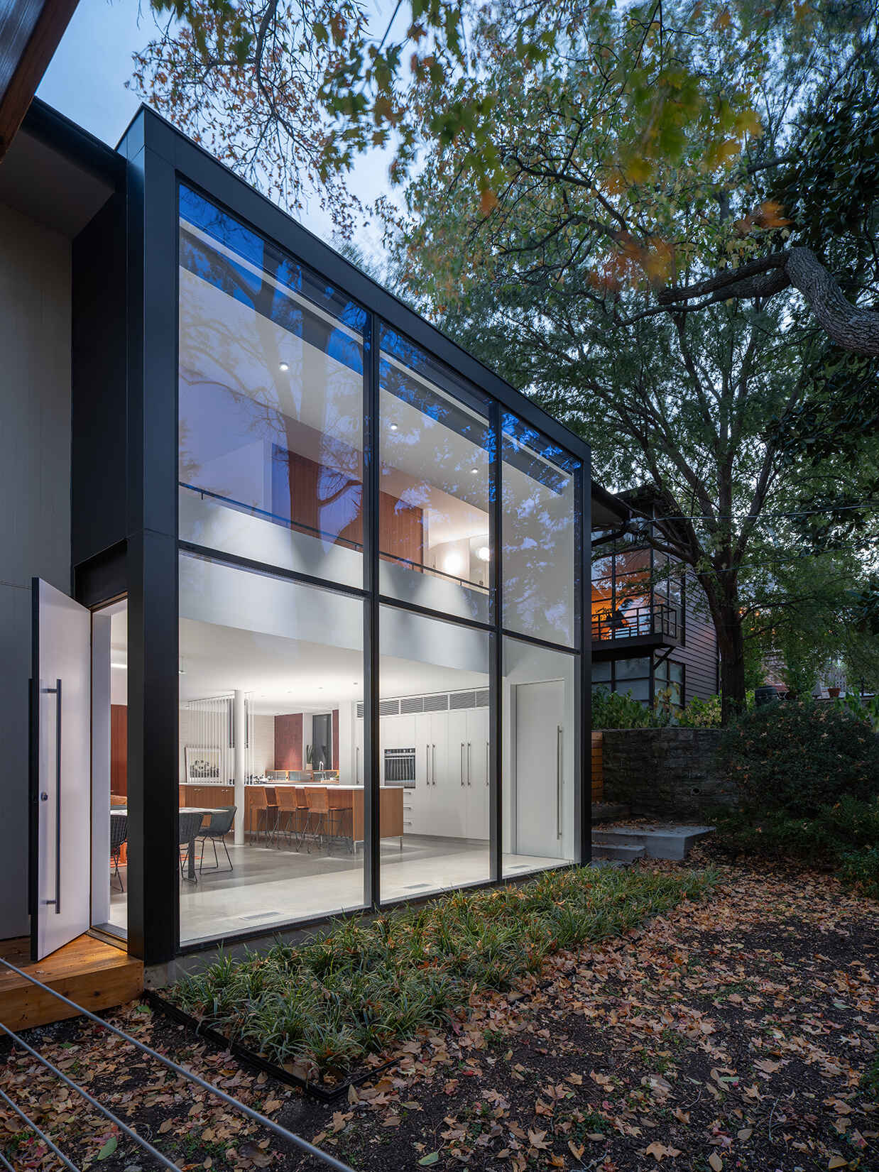
Framing Views with Glass
A new rear addition stretches along the back of the house, creating a long wall of glass that looks out to the wooded yard. This move brings in natural light and shifts the focus outward.
Doors along this wall provide direct access outside, turning the interior spaces into extensions of the landscape beyond.
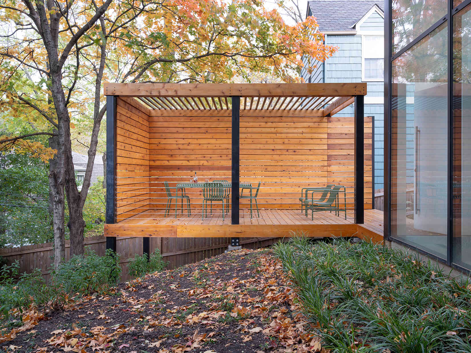
A Refined Rear Facade with a Raised Deck
The rear facade is now unified by a narrow addition that runs 28 feet along the back. On one side, a service patio connects to an outdoor kitchen. On the other, a raised deck becomes the main gathering spot.
A trellis pavilion and screen wall add privacy without blocking views from inside. Positioned carefully, the deck defines the edge of the yard while still keeping sightlines open from the living spaces.
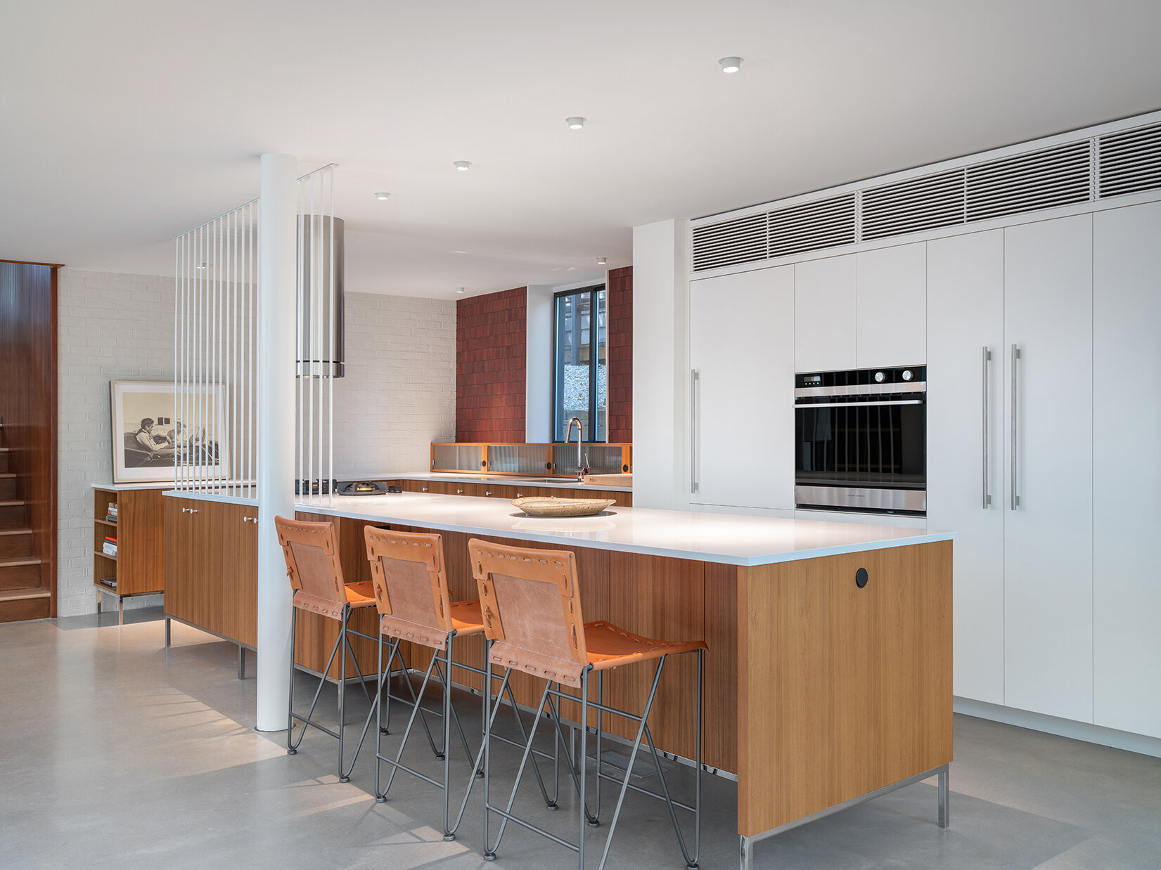
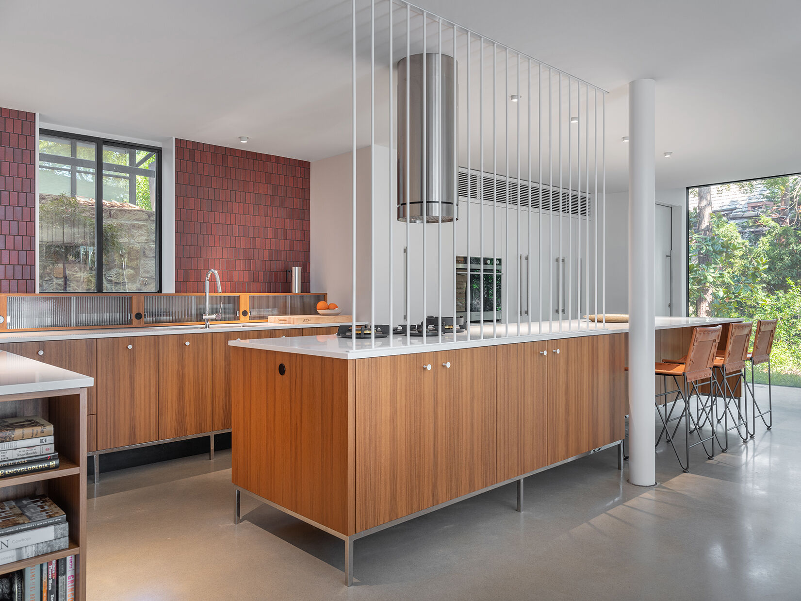
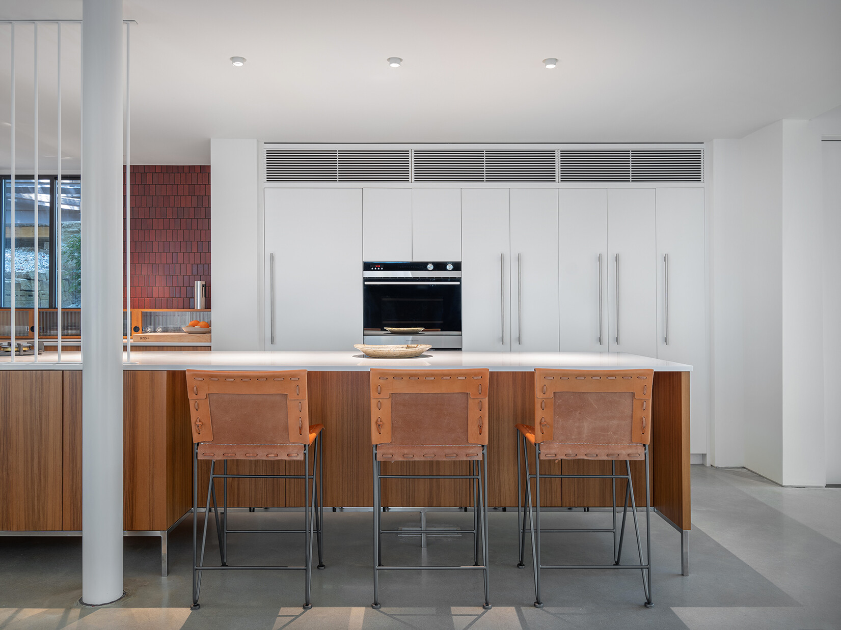
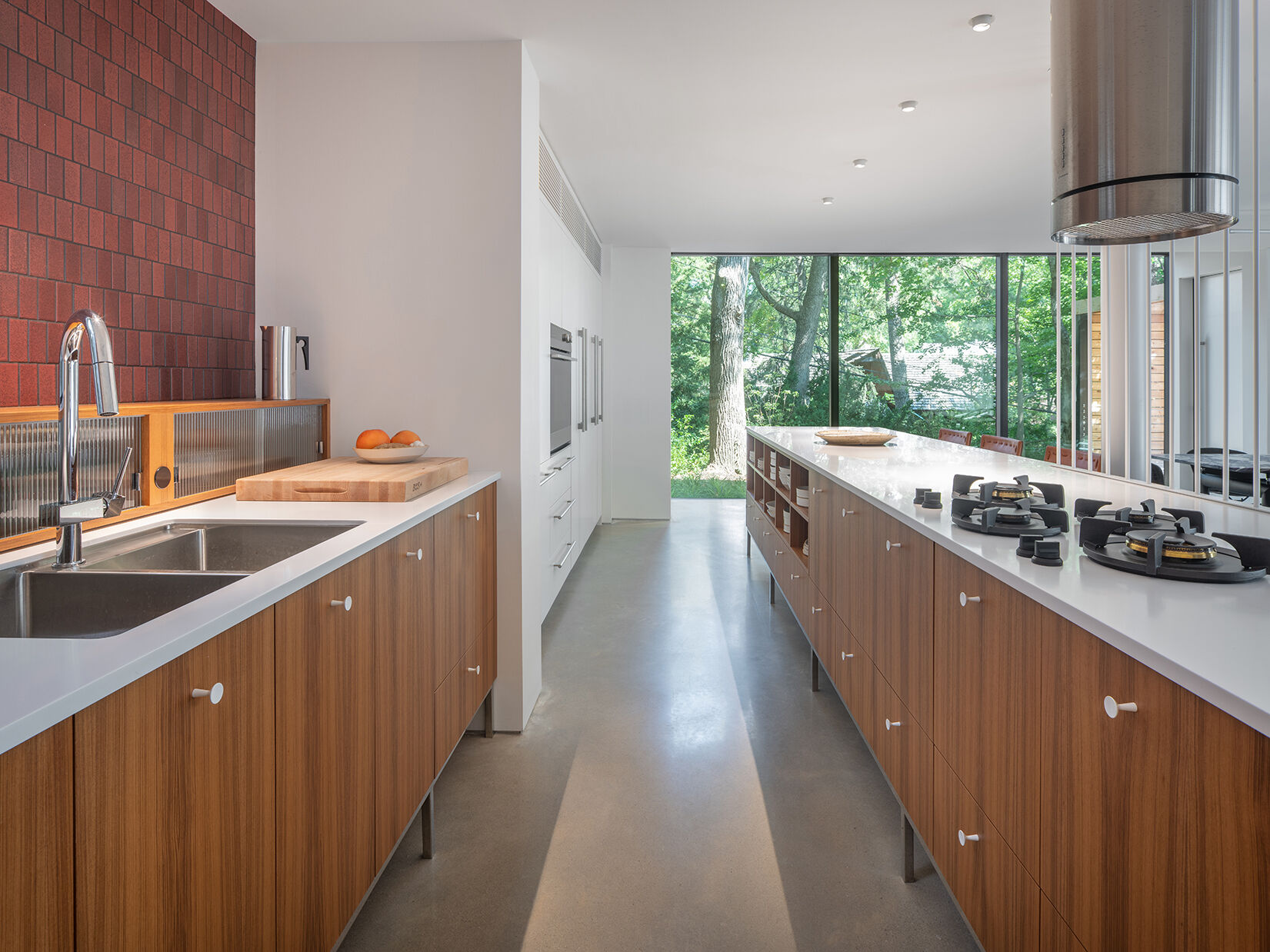
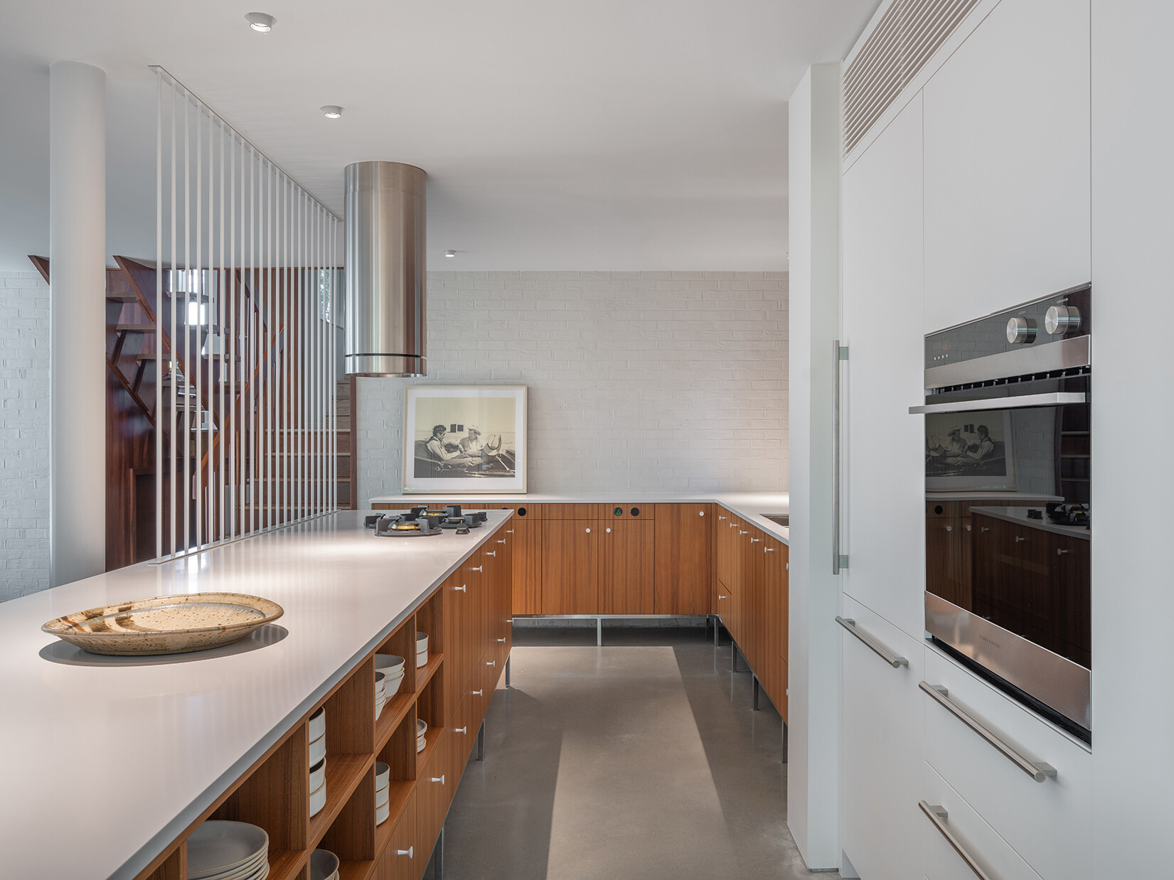
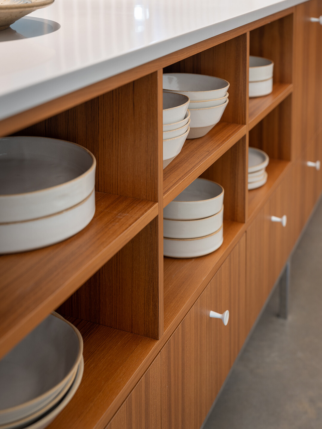
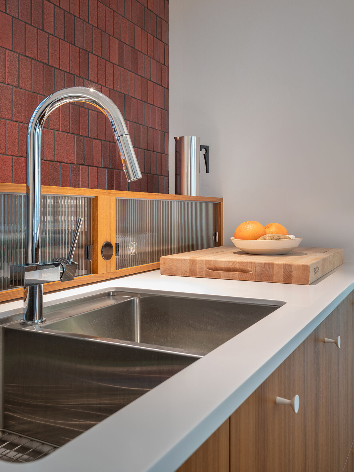
A Kitchen That Feels Like Furniture
Back inside, the kitchen shifts from a small, enclosed room into a central feature of the plan. Running north to south along the west side, it’s organized with clarity and purpose.
Its design takes cues from mid-century furniture, with clean lines and a lighter presence in the room. Only the appliance wall and pantry read as built-in elements, keeping the rest of the kitchen visually open to the surrounding spaces.
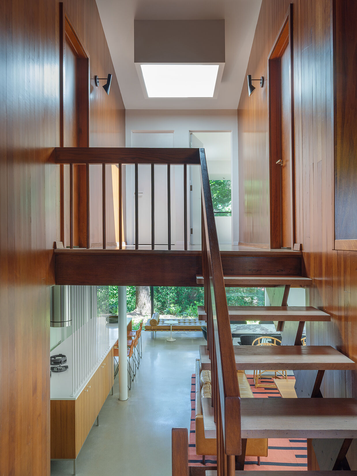
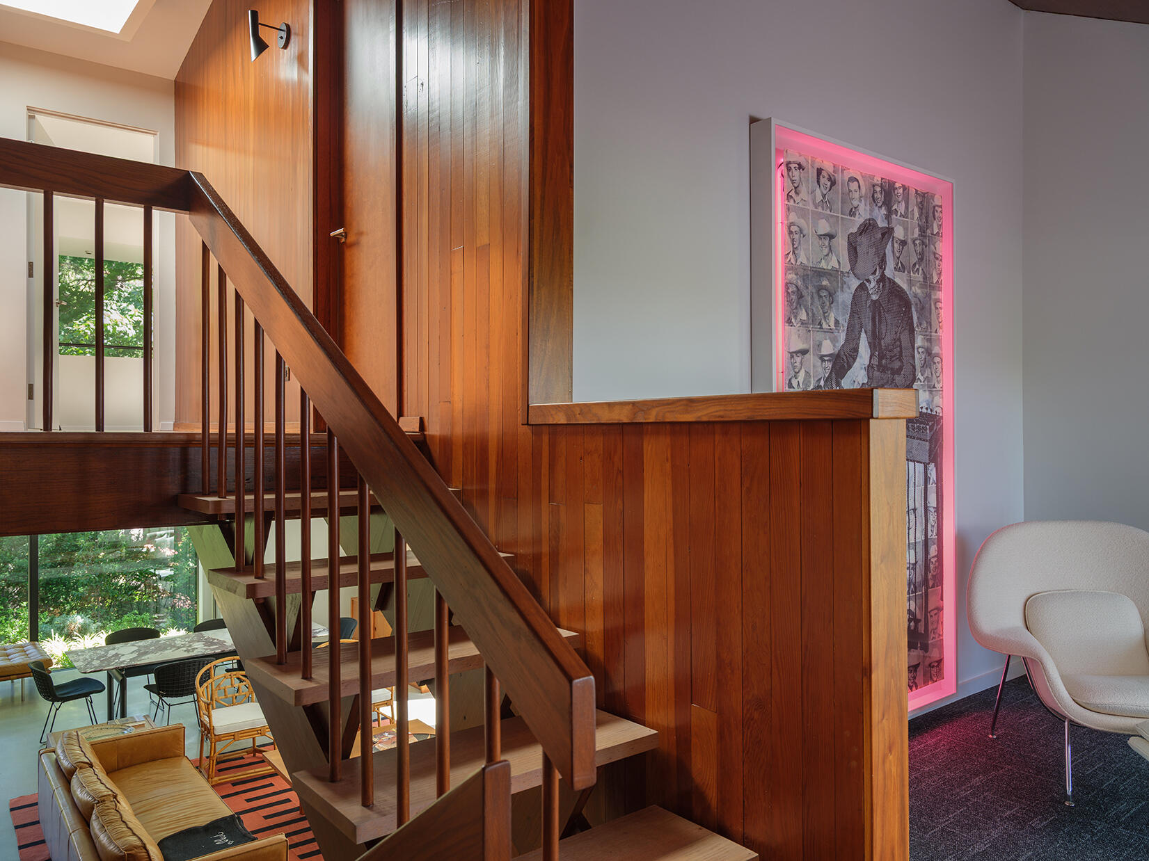
Restored Stairs as a Key Feature
The original stair was restored and remains a central part of how the house moves between levels. In a home defined by its split-level layout, the stair becomes more than circulation. It ties the five levels together, reinforcing the structure’s stepped design while preserving a key original element.
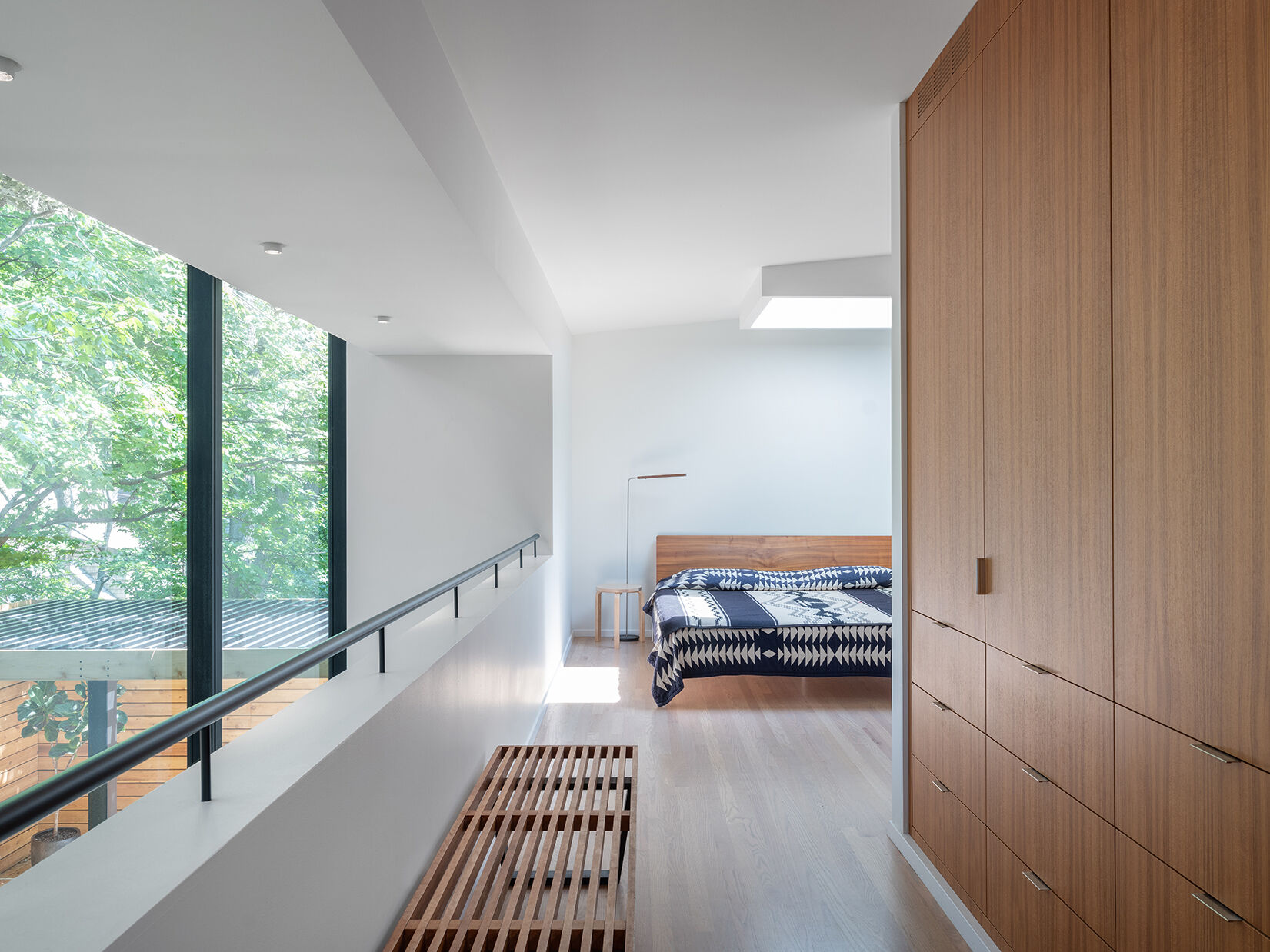
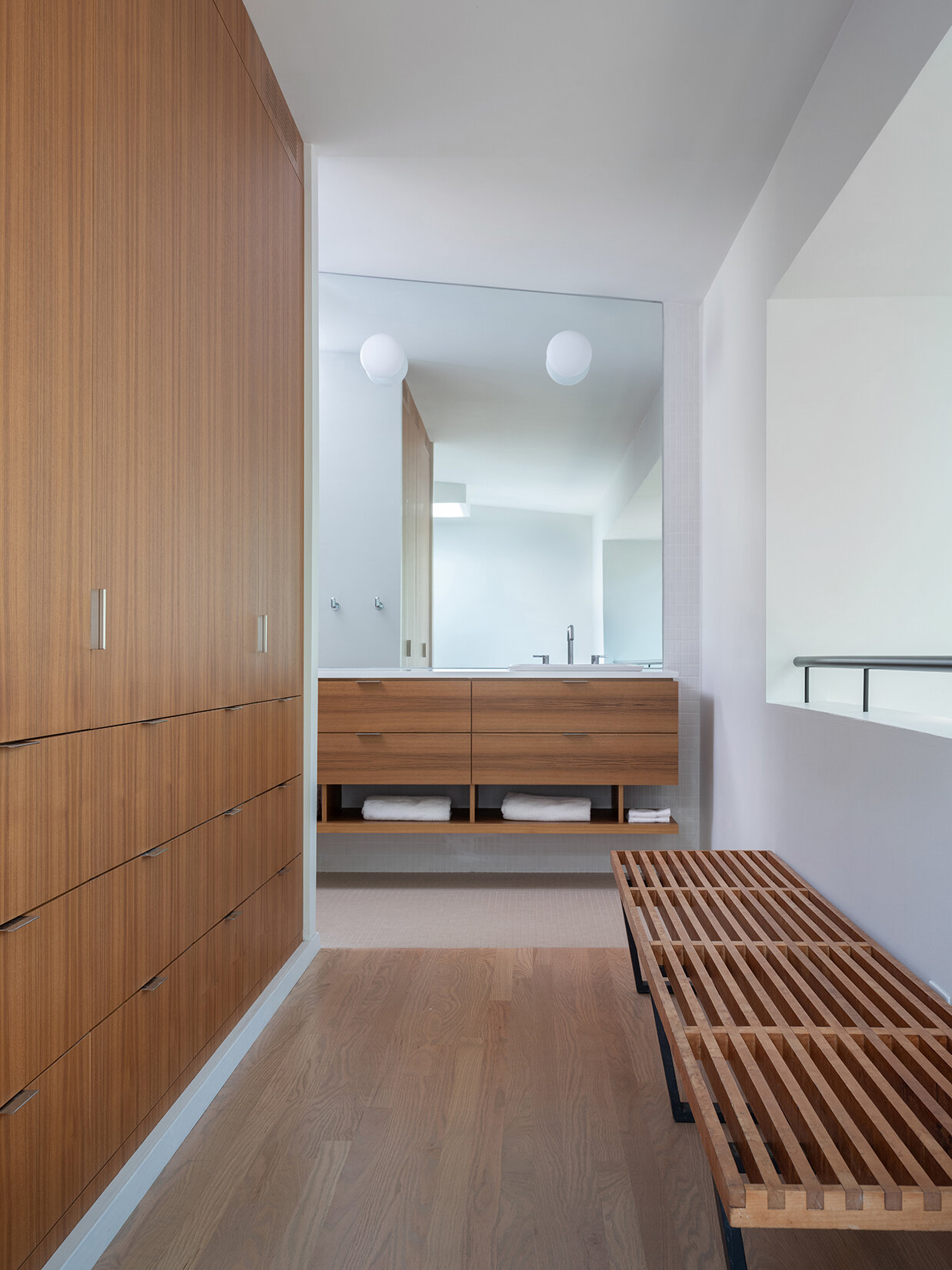
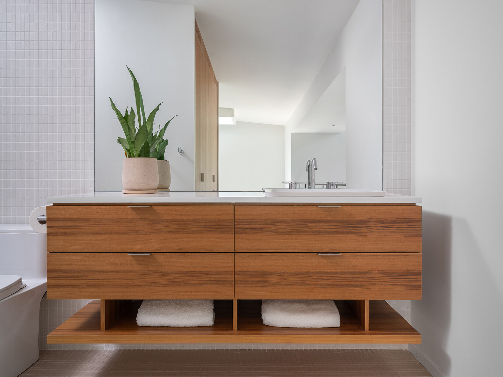
A Reworked Bedroom Suite
Upstairs, the bedroom level was completely reconfigured. What had once been a large, awkward U-shaped single bedroom is now divided into three bedrooms and two bathrooms.
The primary suite includes its own closet and bathroom, bringing the layout in line with modern expectations while making better use of the available space.
By removing what didn’t belong and refining what did, this renovation brings the house back to a clear, readable form. The updates meet current needs without losing the essence of the 1957 design.