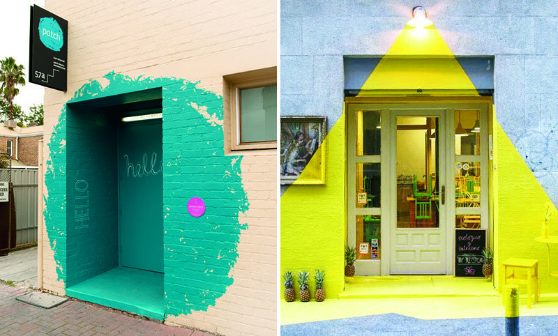
Sometimes you can walk straight past the store or restaurant you’re looking for without even realizing it, because it doesn’t have a great sign or it doesn’t grab your attention. Well, these two projects are some interesting examples of how using color can help to draw your eye to an entrance.
First up we have the entrance to the Patch Theatre Co. This painted bright blue/green entrance was created by Australian design firm Black Squid Design, as a way to let theatre patrons easily know where the entrance is. The design also reflects the theatre’s philosophy of ‘keeping the artist alive in the child’.
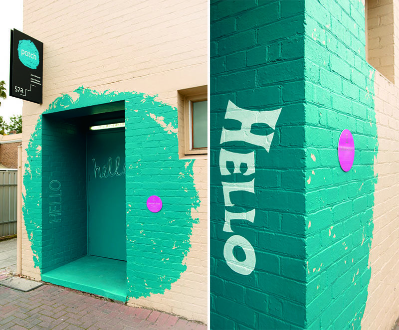
Photography by Black Squid Design
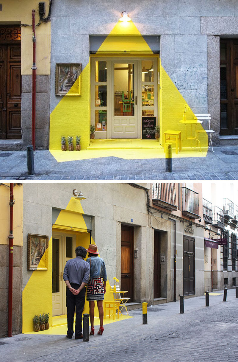
Next up, we have an art installation by multidisciplinary agency (fos). The installation was created for a restaurant in Madrid, and it was only there for a short time but it definitely made a statement, especially when compared to the other doorways on the same street.
By using bright yellow tape, the artists were able to create a visual illusion of a light beam projecting from a single lamp above the entrance. They also continued the light beam onto the artwork and outdoor furniture, and then onto the ground in front of the restaurant.
There’s no way you would walk past either of these places without noticing them.