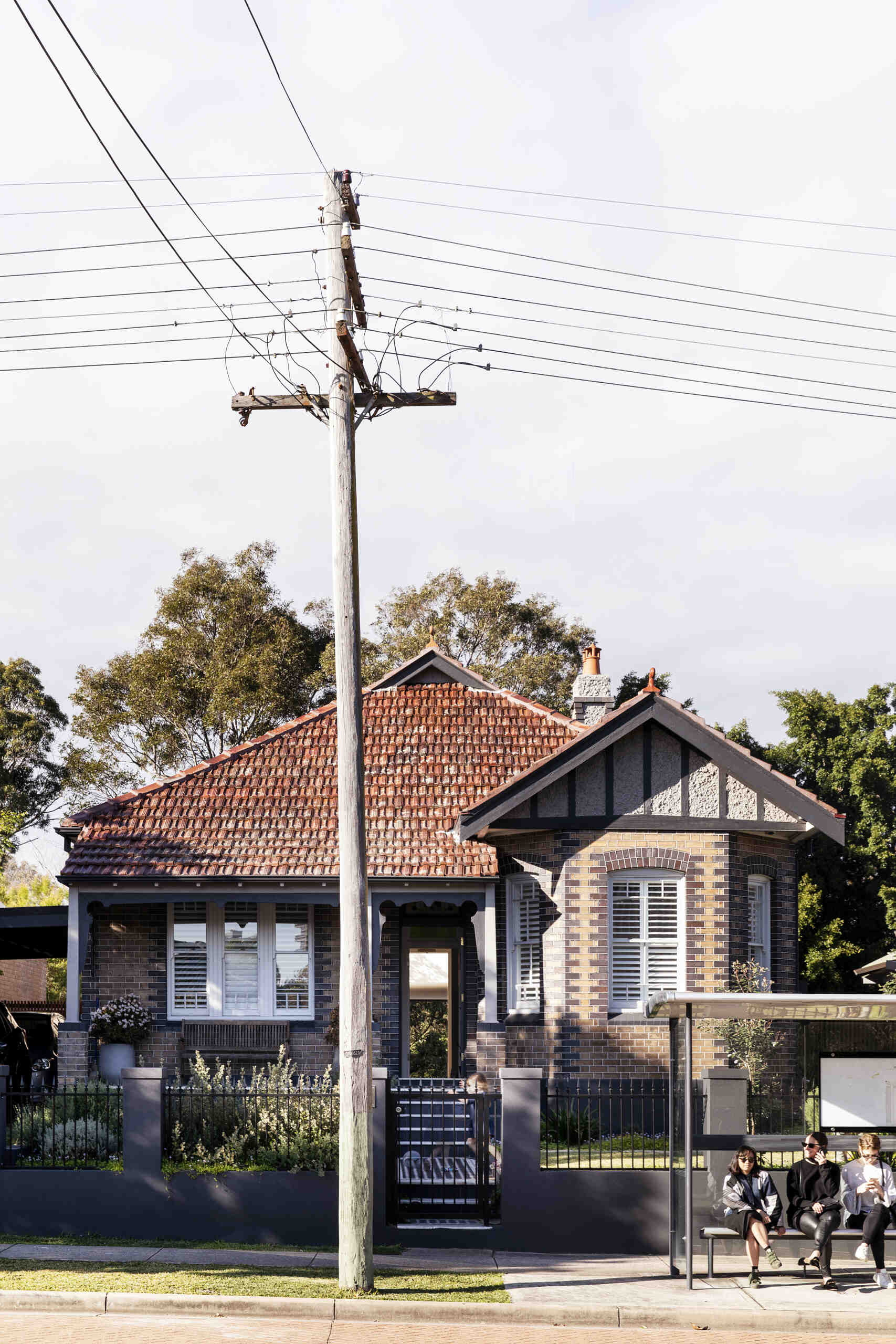
In Australia, architecture and interior design firm Studio Prineas has renovated a Federation-era home, restoring its original charm while introducing a modern extension that stays completely out of sight from the street.
From the front, the home remains familiar. A brick facade and covered porch preserve its historic character, aligning with strict conservation rules. Nothing about the exterior hints at what unfolds beyond.
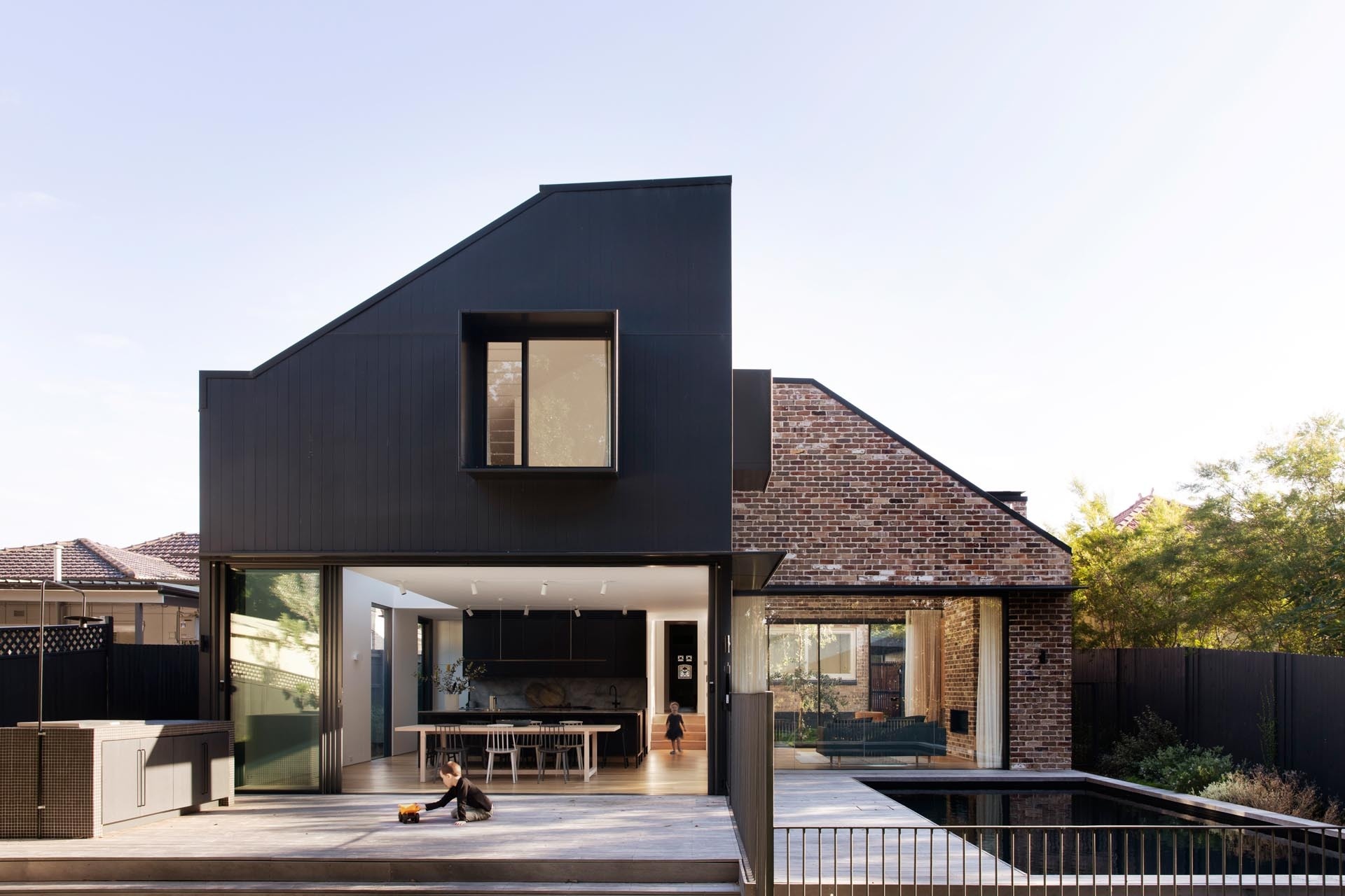
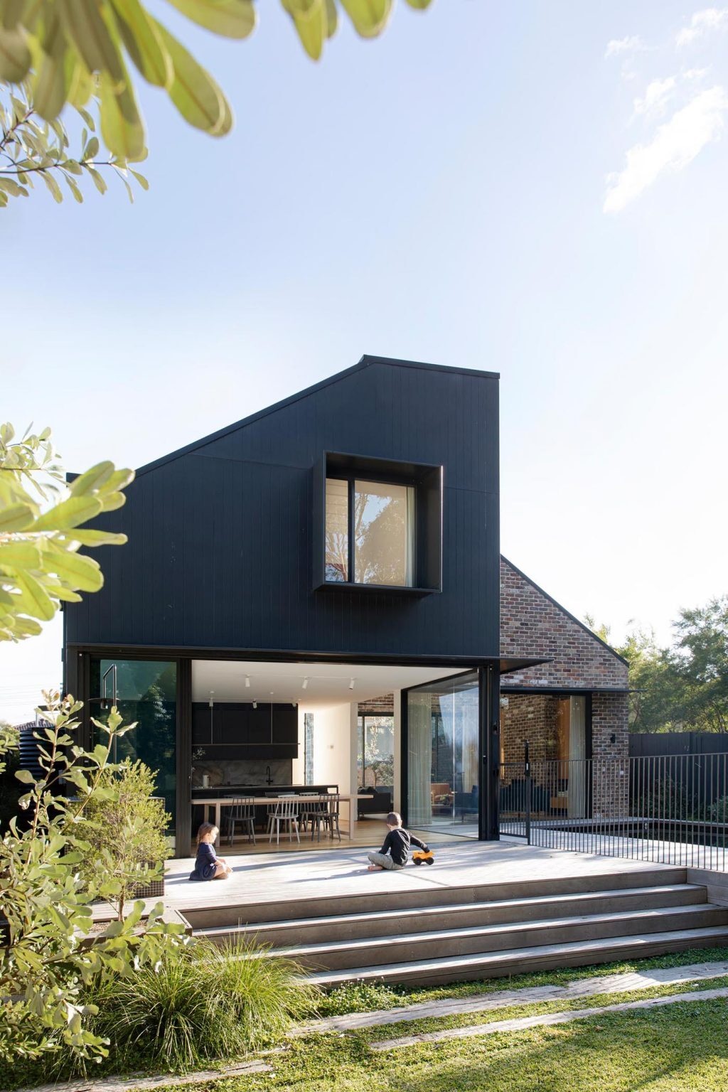
A Bold Rear Addition That Stays Out of View
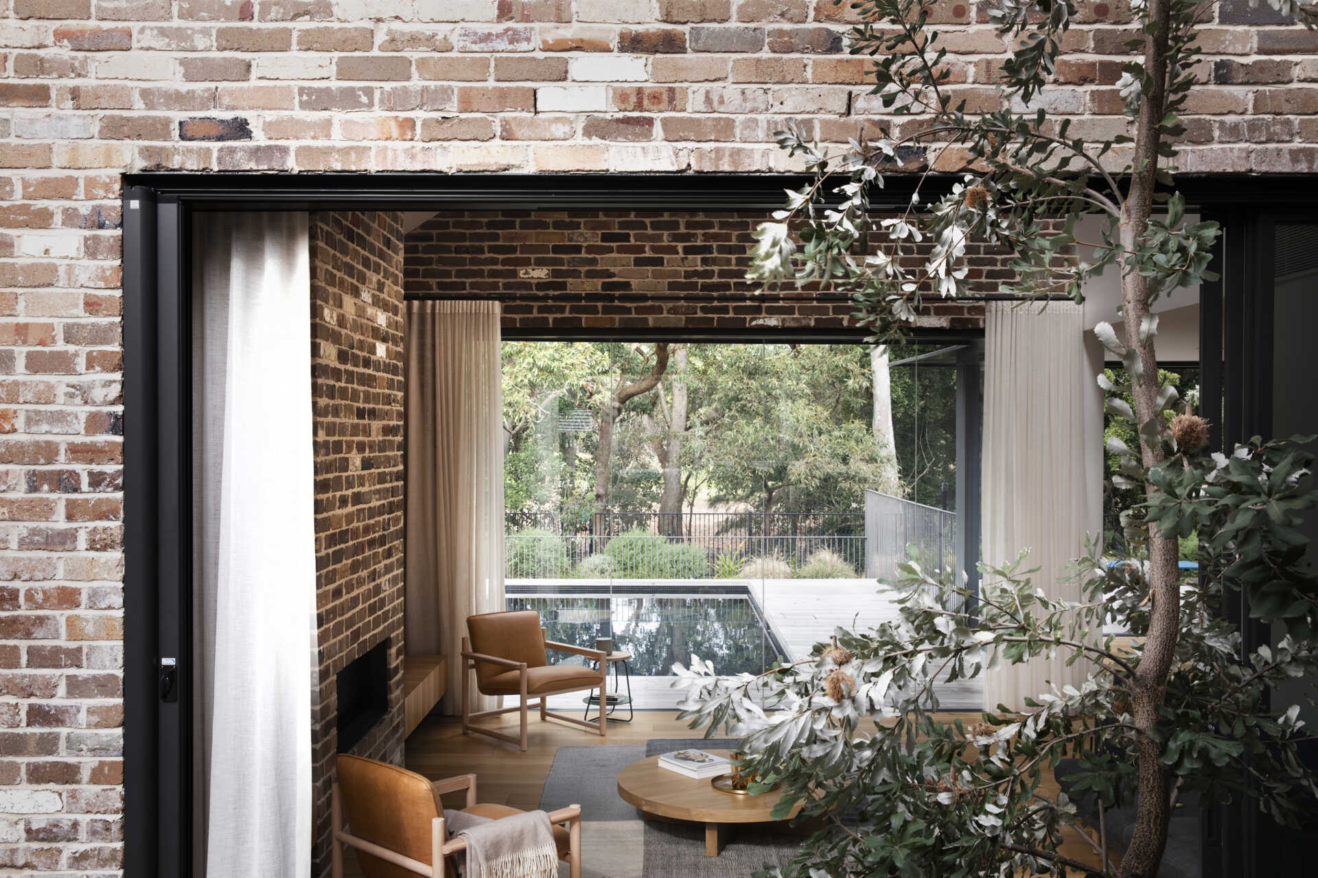
Step into the backyard, and the contrast becomes clear. A new extension appears in a minimalist form, wrapped in blackened timber. Recycled red brick ties it back to the original structure, creating a subtle visual link between old and new.
The addition has been positioned slightly lower than the original house, keeping its scale hidden from the street while opening up generous new spaces at the rear.
Indoor Living That Spills Outdoors
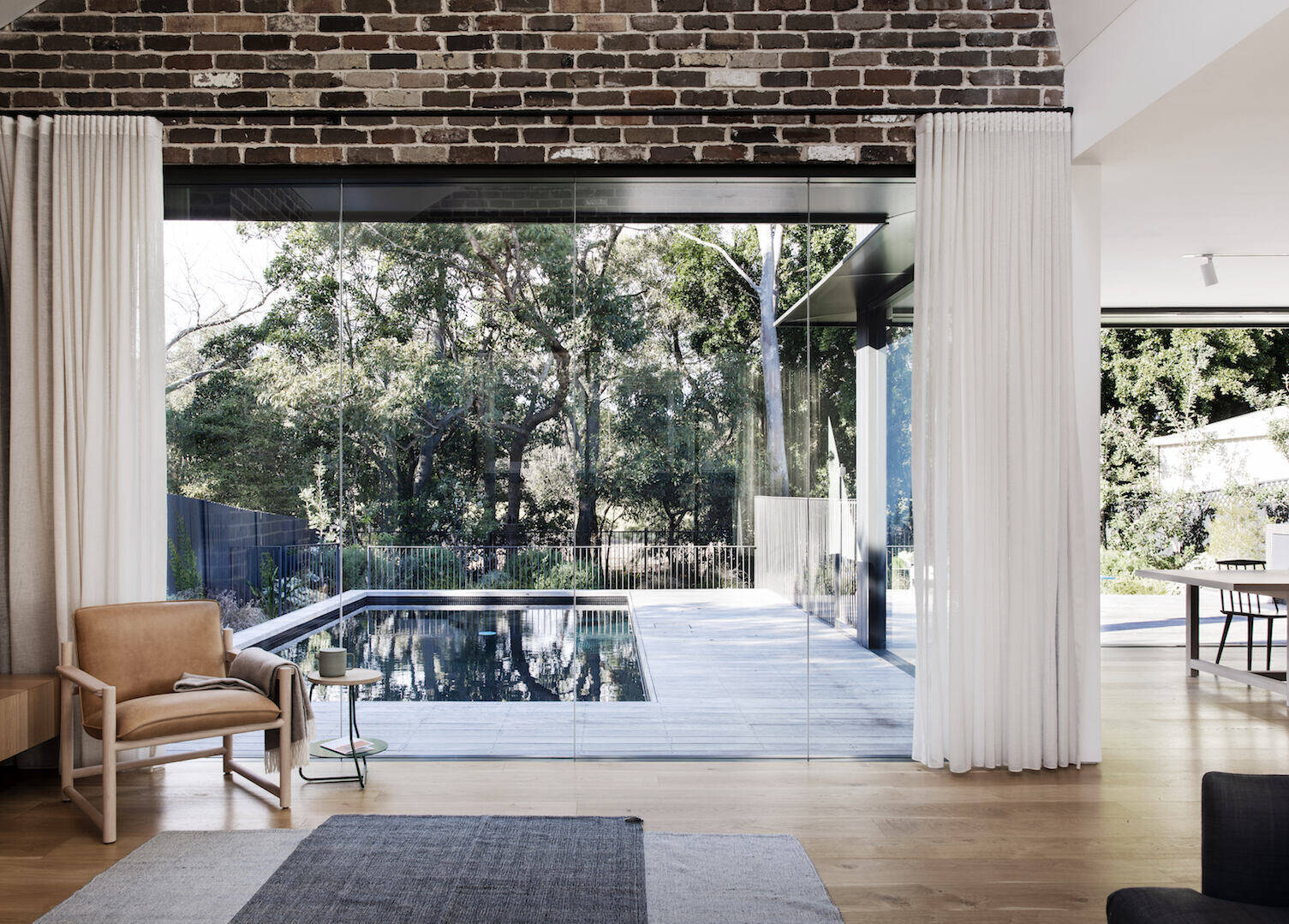
The rear living spaces are designed to open completely to the outdoors. A sliding glass wall connects the interior to a greyed Blackbutt deck, where an outdoor kitchen overlooks the yard and swimming pool.
The transition from inside to outside feels effortless, with steps leading down to the lawn and pool area, making it ideal for gatherings and long afternoons outside.
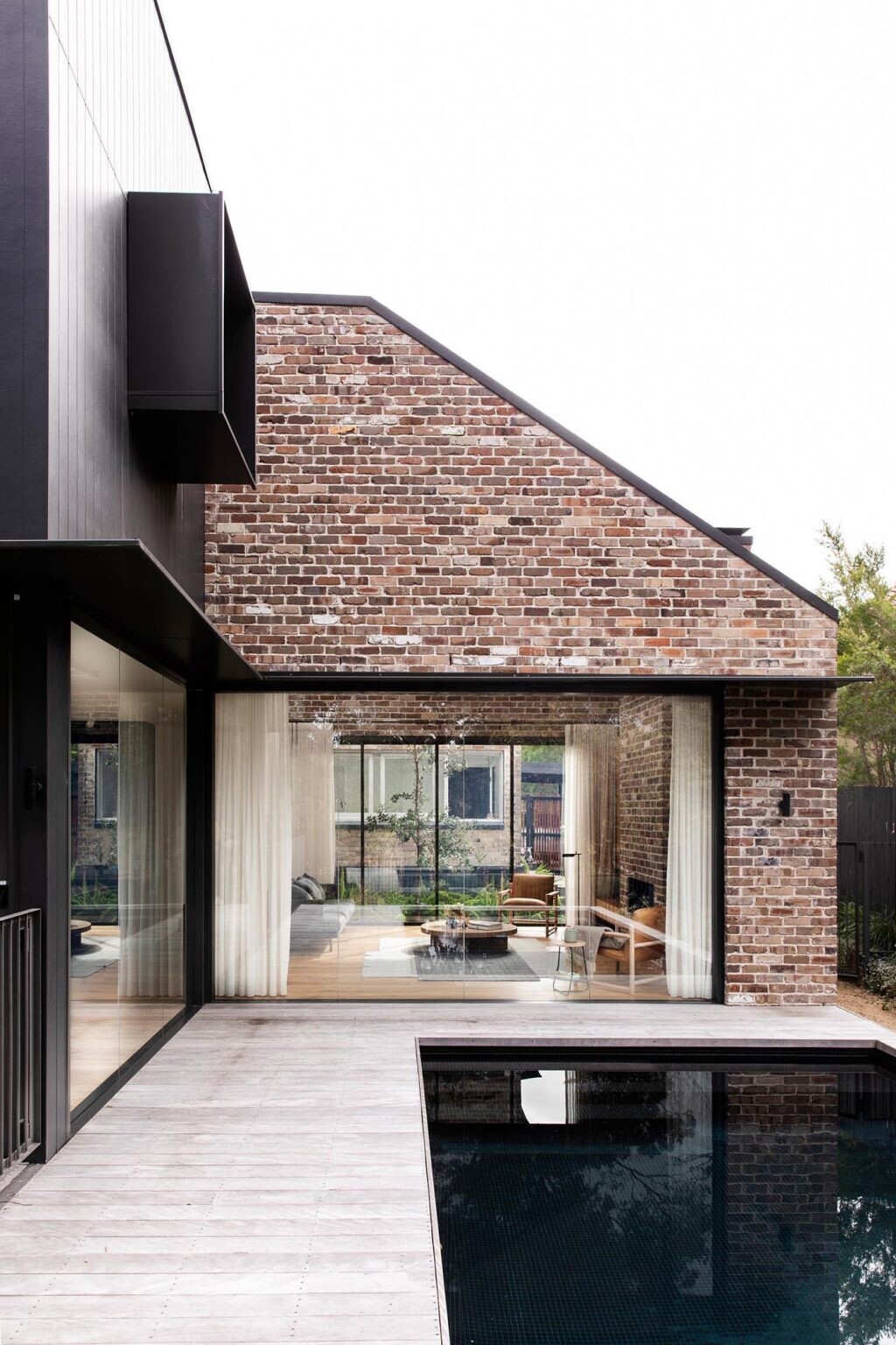
Light, Views, and a Courtyard Connection
Inside the new addition, the living room is framed by glass on both sides. One wall looks out to the pool, while the other opens to a small courtyard filled with water-wise Australian native plants. This dual outlook brings in natural light throughout the day and creates a quiet visual break between spaces.
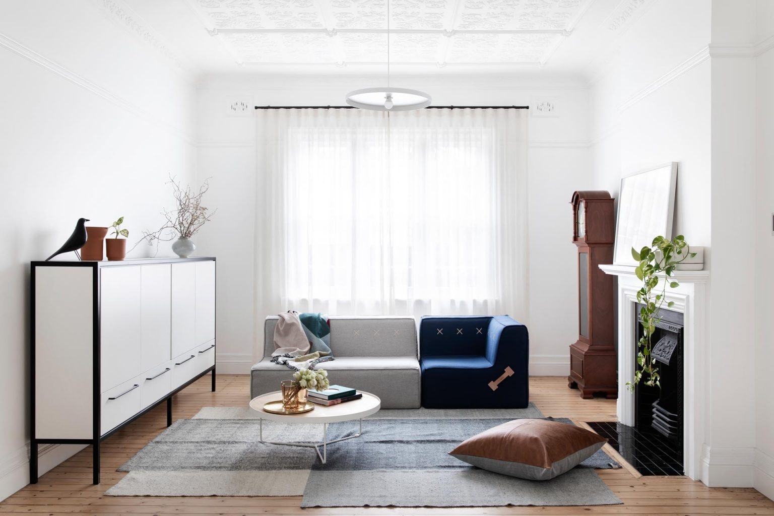
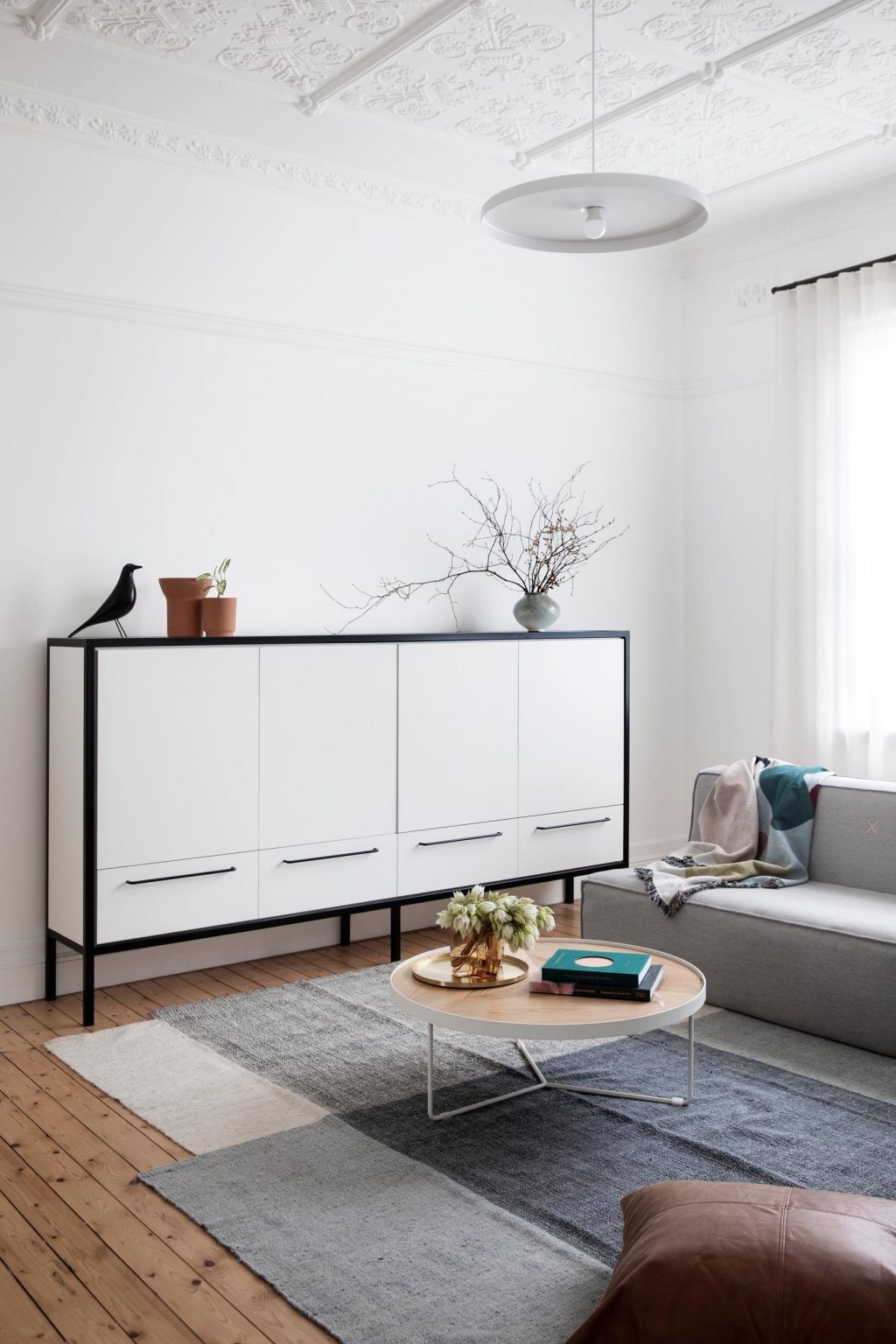
An Open-Plan Living Space With Texture and Warmth
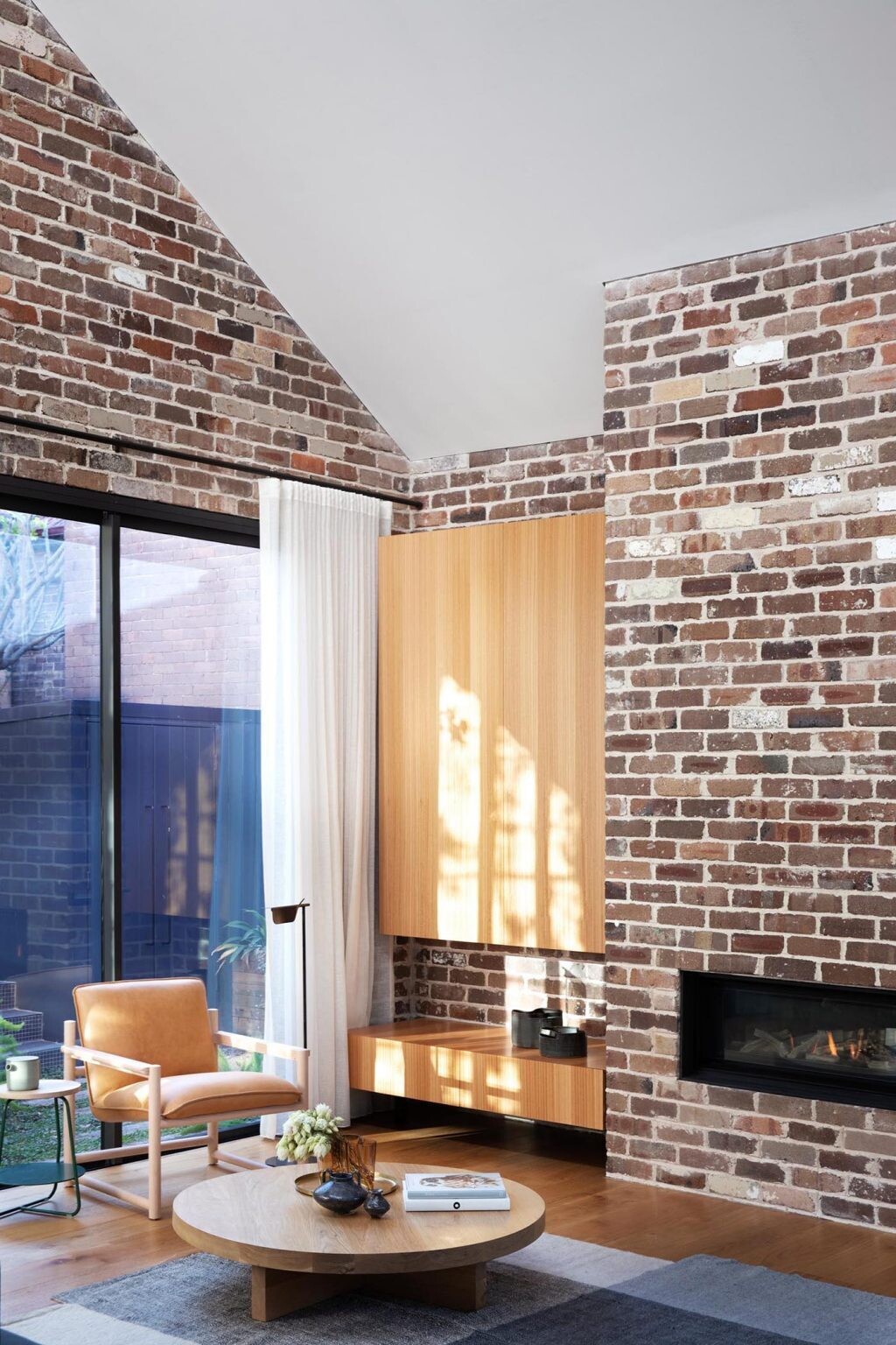
The living room flows directly into the dining area and kitchen, forming a large open-plan space. A fireplace with a brick surround anchors the room, while custom wood cabinetry adds warmth against the otherwise minimal palette. The simplicity of the design allows the materials to stand out, creating a calm and inviting atmosphere.
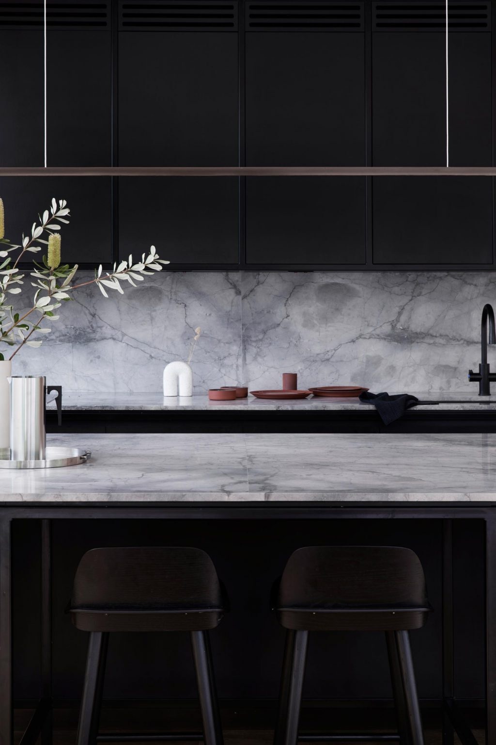
A Kitchen Built on Simplicity and Material Focus
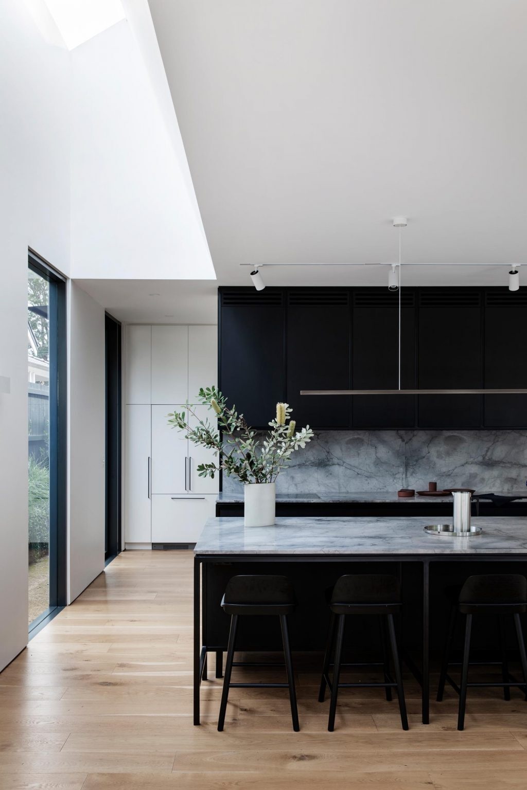
The adjacent kitchen continues the restrained palette with matte black cabinetry made from Paperock, a sustainable material formed from compressed layers of renewable paper. Grey marble surfaces, black hardware, and a slim horizontal light fixture complete the space, keeping the look clean and refined.
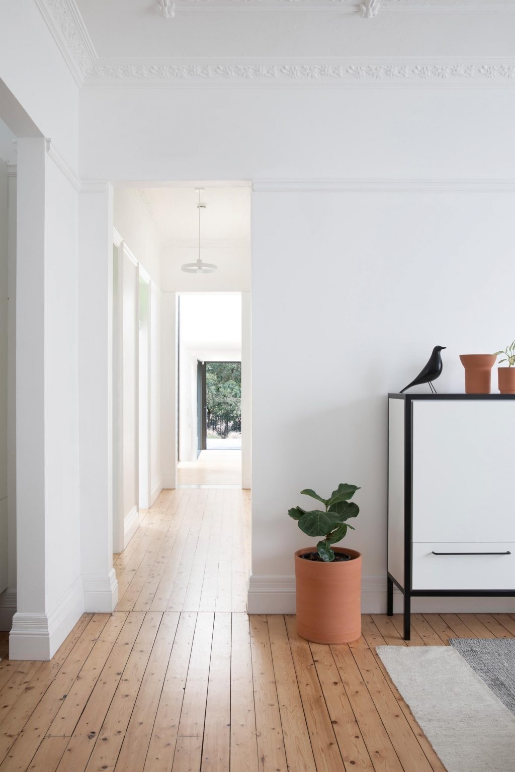
Preserving Character Through Original Details
Throughout the home, wood floors and white walls highlight original features like ornate pressed-tin ceilings and cast-iron fireplaces. These elements remain visible, especially in a more casual living room that celebrates the home’s heritage.
The contrast between historic detailing and modern updates gives the interiors a layered feel without overwhelming the space.
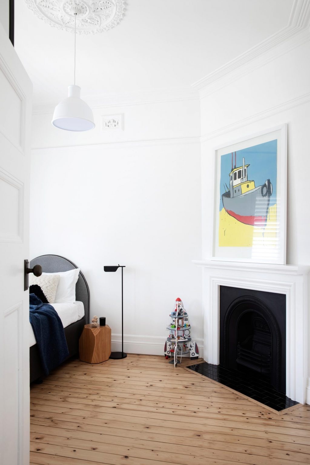
Bedrooms That Balance Old and New
One of the updated bedrooms features a cast-iron fireplace, paired with modern furnishings that bring the space into the present. The mix of original architecture and contemporary styling keeps the room feeling fresh while respecting its past.
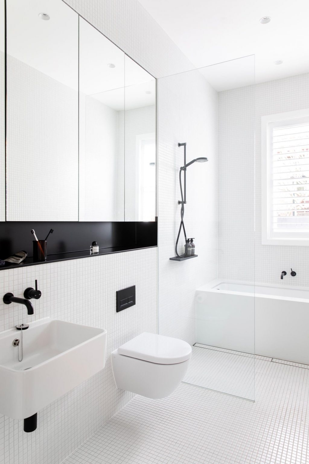
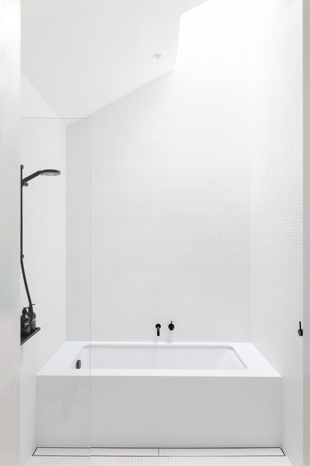
Clean, Graphic Bathroom Design
The bathroom follows a simple white scheme with black accents. Small square tiles cover both the walls and floor, while a built-in bathtub sits beneath a window and skylight that bring in natural light.
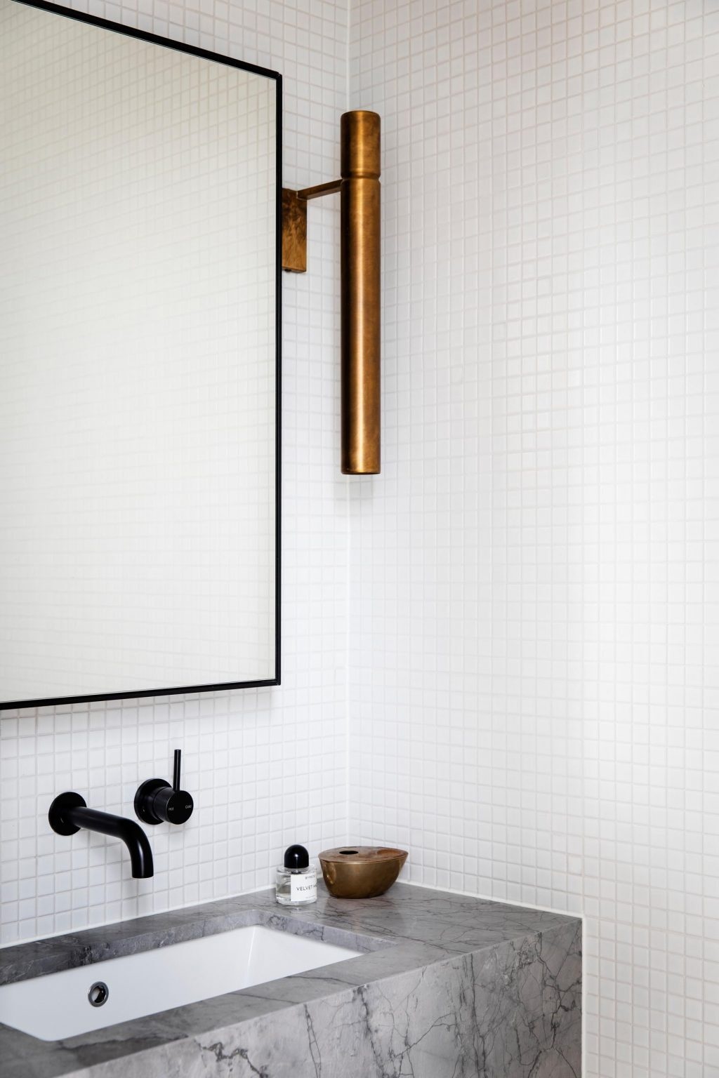
A Powder Room With Subtle Contrast
In the powder room, the same small tiles are used, but the addition of a grey stone vanity and black-framed mirror introduces contrast. A brass light fixture adds a metallic detail that stands out against the otherwise restrained palette.
This project by Studio Prineas shows how a historic Federation home can expand without losing its street presence. What appears modest from the front unfolds into a spacious, light-filled home at the rear, where modern design and original details sit comfortably side by side.